
User Experience Web Design: Best Practices for 2026
TL;DR:
- Effective UX design guides visitors smoothly toward their goals by emphasizing clarity, consistency, and performance. Neglecting performance and accessibility harms user engagement, search rankings, and legal compliance. Continuous testing with data ensures UX improvements align with user needs and drive high conversion rates.
User experience web design is the practice of building websites that guide visitors to their goals with minimal friction, maximum clarity, and consistent accessibility. Known formally as UX design, it sits at the intersection of psychology, information architecture, and visual communication. Strong UX is not a cosmetic layer added at the end of a project. It is the structural logic that determines whether a visitor completes a task or leaves. Well-designed UX can increase conversion rates by up to 400%, which makes it one of the highest-ROI investments a web team can make. Google's Core Web Vitals and page experience signals confirm that UX quality now directly affects search rankings, not just user satisfaction.
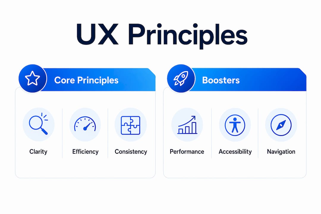
What are the core principles of user experience web design?
The five principles that define effective UX are clarity, efficiency, consistency, accessibility, and performance. Each one addresses a different failure mode. Clarity prevents confusion. Efficiency reduces the number of steps to complete a task. Consistency builds trust by making every page feel like part of the same system. Accessibility removes barriers for users with disabilities. Performance keeps the experience intact under real-world network conditions.
Jesse James Garrett's five-plane model from his book The Elements of User Experience gives designers a practical framework for structuring these principles. The planes move from abstract to concrete: strategy (user needs and business goals), scope (features and content), structure (information architecture), skeleton (interface layout), and surface (visual design). Most design failures happen at the strategy and structure planes, not the surface. Designers who skip to visual decisions before resolving structure produce sites that look polished but perform poorly.
Best practices like clear visual hierarchy and predictable navigation are proven by user research and testing, not personal opinion. That distinction matters because it shifts design decisions from subjective debates to evidence-based choices. When a client pushes for a non-standard layout, the right response is user data, not preference.
Pro Tip: Run a five-second test on your homepage with real users. If they cannot name the site's purpose after five seconds, your visual hierarchy needs work before anything else.
| UX principle | Impact on usability and SEO |
|---|---|
| Clarity | Reduces bounce rate by making purpose immediately obvious |
| Efficiency | Increases task completion and lowers drop-off at key steps |
| Consistency | Builds user confidence and reduces cognitive load across pages |
| Accessibility | Expands audience reach and satisfies WCAG 2.2 compliance requirements |
| Performance | Directly affects Google Core Web Vitals scores and engagement rates |
How can designers improve performance and accessibility to boost UX?
Performance and accessibility are the two most commonly neglected UX principles in 2026, yet they carry the heaviest penalties when ignored. A slow page costs conversions. An inaccessible page excludes users and creates legal exposure under standards like the Americans with Disabilities Act (ADA) and the Web Content Accessibility Guidelines (WCAG) 2.2. Both issues are measurable and fixable without a full redesign.

Page speed improvements follow a clear priority order. Compress and serve images in next-generation formats like WebP. Eliminate render-blocking JavaScript by deferring non-critical scripts. Use a content delivery network (CDN) to reduce latency for geographically distributed users. Minify CSS and JavaScript files. Each of these changes targets a specific bottleneck in the browser's rendering pipeline, and each one shows up directly in Google's Lighthouse audit scores.
Accessibility improvements follow a similar logic. The WCAG 2.2 standard organizes requirements around four principles: perceivable, operable, understandable, and robust. Designers who audit against these four categories catch the majority of barriers before launch.
Common accessibility improvements to prioritize:
- Add descriptive alt text to every image that conveys information
- Ensure color contrast ratios meet the WCAG AA minimum of 4.5:1 for normal text
- Make all interactive elements keyboard-navigable without a mouse
- Use semantic HTML elements (header, nav, main, footer) to support screen readers
- Label all form fields explicitly rather than relying on placeholder text alone
- Test with real assistive technology, including NVDA or VoiceOver, before launch
Pro Tip: Run Google Lighthouse on your three most trafficked pages monthly. It scores performance, accessibility, best practices, and SEO in one report and flags the highest-impact fixes first.
Both performance and accessibility feed directly into UX-driven SEO improvements. Google treats page experience signals as ranking factors, which means fixing these two areas serves both users and search visibility simultaneously.
What role does navigation play in user-centered design?
Navigation labels should match user terminology, not business jargon, and consistent placement improves usability more than any creative layout experiment. This is one of the most common places where client preferences override user needs. A company might call its services "solutions" internally, but users search for "pricing," "services," or "how it works." When the menu reflects internal language, users cannot find what they need and leave.
Consistent menu placement is equally important. Users expect primary navigation at the top of the page and secondary navigation in the footer. Deviating from this pattern forces users to relearn the interface on every page. That cognitive cost accumulates and drives drop-off, especially on mobile where screen real estate is limited.
Designing for users, not clients, is the most critical mistake designers make. Creative Director Collins Bolinger frames it directly: the site exists to serve the audience, not to express the brand owner's preferences. When a client insists on a navigation structure that mirrors their org chart rather than user tasks, the designer's job is to redirect that decision with user research.
Steps to audit and improve navigation:
- List every label in your current navigation and ask five users what they expect to find behind each one.
- Compare user expectations against actual page content and flag every mismatch.
- Replace jargon-based labels with the exact words users used in step one.
- Test the revised navigation with a card sorting exercise to validate groupings.
- Confirm that the primary navigation appears in the same position on every page template.
- Check mobile navigation for tap target size (minimum 44x44 pixels per Apple's Human Interface Guidelines) and collapse behavior.
User-centered design also means resisting the urge to add navigation items for every internal stakeholder. Every additional menu item dilutes the visibility of the items that matter most. A focused navigation with five to seven items outperforms a sprawling one with fifteen, because it forces the team to prioritize what users actually need.
How does continuous usability testing drive better UX outcomes?
Analytics tell you what users do. Usability testing tells you why. Both are necessary, and neither replaces the other. A high exit rate on a pricing page is a signal. A usability session showing users confused by the pricing structure is the diagnosis. Without the second layer, fixes are guesswork.
A professional UX audit starts by evaluating three high-value pages: the homepage, the primary service page, and the lead generation page. Baseline metrics for each include engagement rate, scroll depth, form starts, and form completions. These four metrics reveal where users lose interest and where they abandon tasks. They also create a before-and-after benchmark for measuring the impact of changes.
Ongoing usability testing includes lightweight quarterly tests and twice-yearly moderated sessions to keep UX aligned with evolving user behavior. Quarterly tests can be unmoderated remote sessions with five to eight participants focused on a single task. Biannual moderated sessions go deeper, capturing verbal reasoning and emotional responses that click data cannot reveal.
UX professionals prioritize fixes using an Impact vs. Effort matrix based on concrete user data like heatmaps and session recordings. High-impact, low-effort fixes go first. These are typically changes to navigation labels, CTA placement, form field reduction, or page speed. Full redesigns sit at the high-effort end and rarely deliver proportional returns compared to targeted fixes to navigation, forms, and page speed.
Pro Tip: Use heatmap data to identify the exact point where scroll depth drops on your highest-traffic pages. Place your primary CTA just above that point, not at the bottom of the page.
Combining expert reviews, user testing, and analytics creates a complete picture for conversion rate optimization (CRO). Each method catches different failure types. Expert reviews catch structural problems. User testing catches comprehension failures. Analytics catch behavioral patterns at scale. Together, they produce a prioritized roadmap that removes guesswork from the improvement process.
Key Takeaways
Strong user experience web design requires evidence-based decisions across five principles: clarity, efficiency, consistency, accessibility, and performance, with continuous testing to validate every change.
| Point | Details |
|---|---|
| UX drives conversions | Well-designed UX can increase conversion rates by up to 400%, making it a high-ROI investment. |
| Performance and accessibility are critical | These two principles are most often neglected yet directly affect engagement, rankings, and legal compliance. |
| Navigation must use user language | Labels matching user terminology and consistent placement reduce drop-off more than creative layouts. |
| Test continuously, not just at launch | Quarterly lightweight tests and biannual moderated sessions keep UX aligned with real user behavior. |
| Fix before you redesign | Targeted fixes to navigation, forms, and page speed deliver better results than full site overhauls. |
Why I stopped trusting my instincts and started trusting the data
After years of working on web projects, the most expensive lesson I learned was this: good UX is invisible. Effective UX works quietly in the background, guiding users without drawing attention to itself. The moment a user notices the design, something has gone wrong. That realization changed how I approach every project.
The second lesson was harder to accept. Clients are not users. A client who loves a bold, unconventional navigation structure is not the person who will use the site to book a service or buy a product. Designers must remind clients that UX reflects user needs, not site owner preferences. That conversation is uncomfortable, but skipping it produces sites that win internal approval and lose real users.
The third lesson is about restraint. Over-designing is a real failure mode. I have seen teams spend weeks on micro-animations and custom scroll effects while ignoring a form with eight unnecessary fields that was killing lead generation. The Impact vs. Effort matrix is not just a prioritization tool. It is a discipline that forces you to ask whether a design decision actually serves a user goal or just satisfies a creative impulse.
The designers I respect most are the ones who can defend every decision with user data. Not trends. Not personal taste. Data.
— Juan
How Gostellar supports UX professionals testing design changes
Testing UX changes without reliable data is the fastest way to make expensive mistakes. Gostellar's A/B testing platform gives UX professionals a direct way to validate design decisions against real user behavior before committing to them.
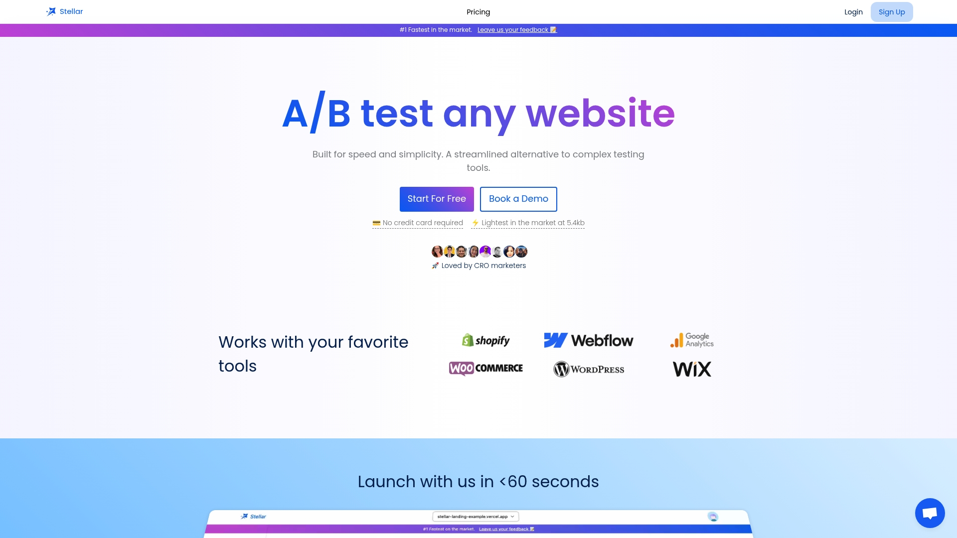
Gostellar's no-code visual editor lets you test navigation labels, CTA placement, form layouts, and page structure without writing a single line of code. Its 5.4KB script adds no meaningful load time, which means your performance scores stay intact while you run experiments. Real-time analytics show which variant wins and by how much, so every design decision rests on evidence rather than opinion. For teams running continuous UX improvements, Gostellar removes the gap between identifying a problem and testing a fix.
FAQ
What is user experience web design?
User experience web design is the practice of designing websites that are intuitive, accessible, and aligned with user goals. It covers information architecture, visual hierarchy, navigation, performance, and accessibility.
How much can good UX improve conversion rates?
Well-designed UX can increase conversion rates by up to 400%, according to industry reports. The gains come from reducing friction at key steps like navigation, forms, and calls to action.
What are the most neglected UX factors in 2026?
Performance and accessibility are the two most commonly neglected UX principles. Both directly affect engagement, search rankings, and legal compliance under standards like WCAG 2.2 and the ADA.
How often should designers run usability tests?
Lightweight unmoderated tests work well on a quarterly basis. Moderated sessions with verbal feedback should run twice a year to capture deeper behavioral and comprehension insights.
What is the fastest way to improve website UX?
Start with a UX audit of your homepage, primary service page, and lead generation page. Measure engagement rate, scroll depth, and form completions, then apply an Impact vs. Effort matrix to prioritize fixes.
Recommended
Published: 7/2/2026