
How to Check Your Website on Mobile: Tools and Methods
Mobile now accounts for the majority of global web traffic, according to Statista's mobile internet data, which means a layout that breaks on a 390px screen is a real business problem. The fastest way to check your website on mobile depends on what you need to know right now.
Quick visual check: Open Chrome DevTools (F12), press Ctrl+Shift+M (Cmd+Shift+M on Mac), and pick a device preset. You get a responsive preview in under 10 seconds. For an even faster zero-setup option, paste your URL into Mobileviewer and see it rendered inside accurate device frames instantly.
Layout and CSS debugging: Stay in Chrome DevTools Device Toolbar or switch to Firefox Responsive Design Mode. Both let you tweak breakpoints and inspect elements live.
Functional debugging on iOS: Connect your iPhone to a Mac and use Safari Web Inspector. For Android, use Chrome remote debugging via chrome://inspect.
Performance verification: Run Google Lighthouse on the Mobile setting inside DevTools.
Final QA: Use BrowserStack's real-device cloud or a physical device for release candidates.
| Job | Best method | Speed vs. fidelity |
|---|---|---|
| Quick visual preview | Chrome DevTools Device Toolbar / MobileViewer.pro | Fast, low fidelity |
| CSS and layout debug | DevTools + Firefox Responsive Design Mode | Fast, medium fidelity |
| iOS-specific bugs | Safari Web Inspector (remote debug) | Moderate, high fidelity |
| Android interaction bugs | Chrome remote debug via adb | Moderate, high fidelity |
| Performance baseline | Google Lighthouse (mobile mode) | Fast, quantitative |
| Final release QA | BrowserStack Live / physical device | Slow, the highest fidelity |
Key Takeaways
The most reliable mobile testing workflow moves from fast emulation in DevTools to remote debugging on a real device, then to a device cloud for final release verification.
| Point | Details |
|---|---|
| Start with Chrome DevTools | Toggle Device Toolbar (Ctrl+Shift+M) for instant layout previews at zero cost. |
| Escalate to remote debugging | Use Safari Web Inspector (iOS) or Chrome adb (Android) for interaction and rendering bugs emulation misses. |
| Reserve real-device clouds for QA | BrowserStack covers 3000+ devices; use it for release candidates, not daily checks. |
| Run Lighthouse on Mobile | Measure LCP, TBT, and CLS before and after any change, including experiment scripts. |
| Gostellar for lightweight experiments | Its 5.4KB script keeps Core Web Vitals stable when running A/B tests on mobile traffic. |
Table of Contents
- How to check your website on mobile using Chrome DevTools
- How to debug iOS layouts with Safari Web Inspector
- How to remote-debug Android devices with Chrome
- Which tool should you use? Emulators, previewers, and real-device clouds compared
- How to run performance and accessibility checks for mobile
- When can you trust emulation, and when do you need a real device?
- Checklist for mobile A/B tests and keeping scripts lightweight
- A practitioner's view on daily mobile testing habits
- Gostellar runs experiments without weighing down your mobile pages
- Sources
How to check your website on mobile using Chrome DevTools
Chrome DevTools Device Toolbar is the right first stop for layout checks, viewport debugging, and CSS fixes. It costs nothing, requires no setup, and you can get a mobile preview open in seconds from any desktop Chrome window.
Step-by-step:
- Open the page you want to test in Chrome.
- Press F12 (Windows/Linux) or Cmd+Option+I (Mac) to open DevTools.
- Press Ctrl+Shift+M (Windows/Linux) or Cmd+Shift+M (Mac) to toggle the Device Toolbar, or click the phone/tablet icon in the DevTools toolbar.
- In the device dropdown at the top, choose a preset (iPhone 14 Pro, Pixel 7, Samsung Galaxy S21, etc.) or select Responsive to drag the viewport freely.
- Set the device pixel ratio (DPR) if you want to simulate a high-density screen.
- Rotate the viewport with the orientation icon to test landscape mode.
- Open the Network panel, click the throttle dropdown, and choose Slow 3G or Fast 3G to approximate mobile network conditions.
- For CPU throttling, go to the Performance panel, click the gear icon, and set CPU slowdown to 4x or 6x to approximate a mid-tier Android phone.
- To emulate sensors, open More Tools > Sensors and set a geolocation or device orientation.
Pro Tip: Save custom device sizes you test against regularly. In the device dropdown, choose "Edit" and add your own width, height, and DPR. This is faster than re-entering dimensions every session and keeps your team testing against the same breakpoints.
The Chrome DevTools device mode documentation describes this as a "first-order approximation" — accurate enough for layout and styling, but not a substitute for real hardware. The desktop rendering engine still runs underneath, so GPU-accelerated animations, touch latency, and OS-specific font rendering won't match what a real phone produces. If you spot a visual issue in DevTools, fix it there. If the issue involves scroll behavior, tap targets, or anything that feels wrong on the actual device, escalate to remote debugging or a real device.
Where DevTools falls short:
- Touch event latency is simulated, not real.
- Safari iOS rendering quirks won't appear in Chrome's engine.
- Hardware sensor behavior (accelerometer, gyroscope) is approximated.
- Mobile GPU performance is not replicated.
How to debug iOS layouts with Safari Web Inspector
Safari Web Inspector is the right tool when you need to see exactly what Safari on iOS renders, inspect WebViews inside native apps, or debug touch behavior that Chrome DevTools can't reproduce. The setup takes about two minutes.
Step-by-step:
- On your iPhone or iPad, go to Settings > Safari > Advanced and toggle Web Inspector on.
- Connect the device to your Mac with a USB cable.
- When prompted on the device, tap Trust and enter your passcode.
- On your Mac, open Safari and go to Safari > Settings > Advanced. Check Show features for web developers (or "Show Develop menu in menu bar" on older macOS versions).
- In Safari's menu bar, click Develop. Your connected device appears in the list.
- Hover over the device name to see open tabs and WebViews. Click the page you want to inspect.
- A full Web Inspector window opens, connected to the live page on your device. You can inspect the DOM, edit CSS, set breakpoints, and view console output in real time.
Troubleshooting: If the device doesn't appear in the Develop menu, check that the iOS version and macOS version are reasonably current. A mismatch between a very new iOS and an older Safari can prevent the connection. Also confirm the cable is a data cable, not a charge-only cable — this is the most common reason the device never shows up.
Pro Tip: No physical device available? Open Xcode, go to Xcode > Open Developer Tool > Simulator, and launch an iPhone simulator. Then use Safari Web Inspector to inspect pages running inside it. It's not identical to real hardware, but it catches most Safari-specific CSS bugs and is much faster than waiting for a device to be free.
For non-Mac users, Safari Web Inspector isn't an option. The practical alternatives are BrowserStack Live (which streams a real iOS device in your browser) or borrowing a physical device. Safari on iOS uses the WebKit engine, which behaves differently from Chrome's Blink engine on several CSS properties, form inputs, and scroll behaviors. Skipping Safari checks entirely is a real risk for any site with significant iPhone traffic.
How to remote-debug Android devices with Chrome
Chrome remote debugging gives you a full DevTools session connected to a real Android device, including live DOM inspection, console access, and network monitoring. It's the most reliable path for catching interaction bugs, scroll bounce, and touch-event issues that emulation misses.
Step-by-step:
- On your Android device, go to Settings > About Phone and tap Build Number seven times to unlock Developer Options.
- Go to Settings > Developer Options and enable USB Debugging.
- Connect the device to your computer with a USB cable.
- On the device, tap Allow when the USB debugging authorization prompt appears.
- On your desktop, open Chrome and navigate to chrome://inspect.
- Under Devices, your connected device and its open Chrome tabs appear. Click Inspect next to the tab you want to debug.
- A full DevTools window opens, mirroring the live page on the device.
If the device doesn't appear:
- On Windows, install the correct ADB (Android Debug Bridge) driver for your device manufacturer. Samsung, Google Pixel, and OnePlus each have their own driver packages.
- Check that the USB connection mode is set to File Transfer (MTP), not Charging Only. Swipe down the notification shade and change the USB mode there.
- Run
adb devicesin a terminal to confirm the device is recognized. If it shows "unauthorized," unplug, re-plug, and accept the prompt again on the device. - If
adbisn't in your PATH, install Android Studio or the standalone Platform Tools from developer.android.com.
Pro Tip: For teams that don't have USB access — remote workers, CI environments, or cross-timezone QA — skip the cable entirely and use BrowserStack's device testing environment, which streams a real Android device over the browser with full touch interaction.
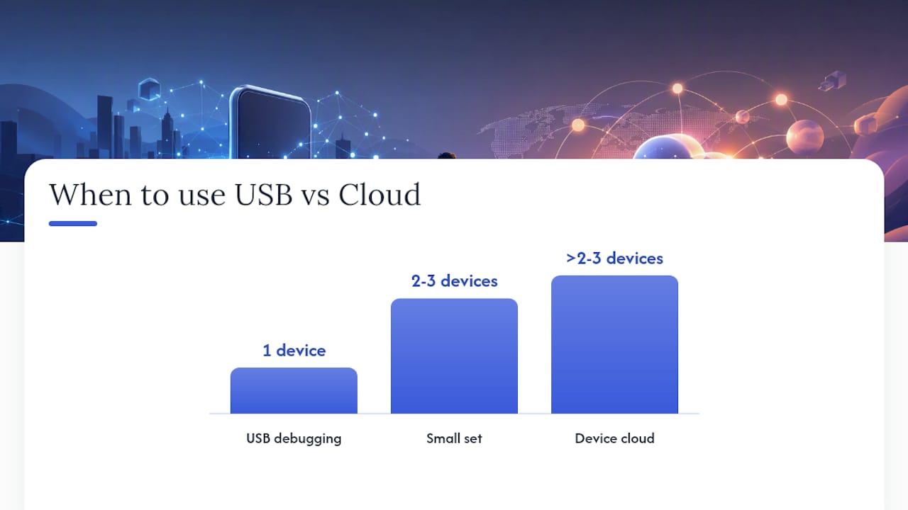
When to skip the cable and go straight to a device cloud: if you're testing on more than two or three device models, if your team is distributed, or if you need to verify behavior on a specific OS version you don't own. USB debugging is fast and free for one device; it doesn't scale.
Which tool should you use? Emulators, previewers, and real-device clouds compared
Browser emulation is the right choice for speed. Real devices are the right choice for accuracy. The gap between them matters most for performance, touch interactions, and Safari iOS rendering.
For daily development, pick one or two fast tools: Chrome DevTools for layout and Firefox Responsive Design Mode for cross-browser spot checks. Reserve BrowserStack or a physical device for pre-release verification. The open-source Mobile Viewer and MobileViewer.pro are useful when you need to share a quick visual preview with a non-technical stakeholder who doesn't have DevTools open.
Mobile Moxie's Page-oscope adds a useful angle for marketers: side-by-side device comparisons for landing pages, with country-aware rendering. The Mobile Simulator extension on the Chrome Web Store is another lightweight option that adds device frames and presets directly inside Chrome without opening DevTools.
BrowserStack's responsive testing tool covers hundreds to thousands of real devices and browsers, with network throttling and local testing tunnels built in. That breadth is overkill for a daily CSS fix but exactly right for a release candidate going to production.
How to run performance and accessibility checks for mobile
The fastest way to get a mobile performance baseline is Google Lighthouse, built directly into Chrome DevTools. Run it on the Mobile setting and you get scored results for Core Web Vitals alongside specific recommendations.
Step-by-step:
- Open Chrome DevTools (F12 or Cmd+Option+I).
- Click the Lighthouse tab (you may need to click the ">>" arrow to find it).
- Under "Device," select Mobile.
- Check the categories you want: Performance, Accessibility, Best Practices, SEO.
- Click Analyze page load. Lighthouse throttles the connection and CPU to simulate a mid-tier mobile device.
- Review the scores. Focus on:
- Largest Contentful Paint (LCP): should be under 2.5 seconds.
- Total Blocking Time (TBT): a proxy for First Input Delay; lower is better.
- Cumulative Layout Shift (CLS): should stay below 0.1.
- Click any flagged item for a specific fix recommendation.
Beyond Lighthouse scores, run through this checklist manually on a real device or in DevTools:
- Viewport meta tag: confirm
<meta name="viewport" content="width=device-width, initial-scale=1">is present. Missing this tag is one of the most common reasons a site renders at desktop width on mobile. - Touch target size: buttons and links should be at least 44×44 CSS pixels. Tap anything interactive and check whether it's easy to hit with a thumb.
- Font size: body text should be at least 16px. Smaller text forces users to pinch-zoom, which breaks the reading flow.
- Form inputs: test every form field on a real device. Check that the correct keyboard type appears (numeric for phone fields, email keyboard for email fields) and that autocomplete attributes are set.
- Orientation handling: rotate to landscape and confirm the layout doesn't break or overflow.
- Accessible labels: run the Accessibility section of Lighthouse and check that all images have alt text and all form inputs have visible labels.
For mobile conversion optimization, performance and UX are directly linked. A one-second improvement in LCP can meaningfully shift bounce rates, particularly on mobile where users are less tolerant of slow loads.
When can you trust emulation, and when do you need a real device?
Emulation is sufficient for most layout and CSS work. Real devices are required when the behavior involves hardware, OS-specific rendering, or performance under actual mobile CPU constraints.
Use emulation (DevTools / browser tools) when:
- Checking breakpoints and responsive layouts.
- Debugging CSS, flexbox, or grid issues.
- Verifying viewport meta behavior.
- Running Lighthouse audits for a performance baseline.
- Sharing a quick visual preview with a teammate.
Use a real device or device cloud when:
- Testing Safari on iOS — WebKit rendering differences are real and won't appear in Chrome DevTools.
- Verifying touch interactions, scroll behavior, or gesture-based UI.
- Checking animations and transitions that rely on GPU compositing.
- Testing CPU-heavy rendering (carousels, canvas, video).
- Validating payment flows, camera access, or hardware sensor use.
- Running final QA before a production release.
Main emulator limitations to keep in mind:
- The desktop rendering engine (Blink in Chrome) runs underneath the simulated viewport. Safari-specific bugs won't appear.
- Touch latency is approximated, not real.
- Hardware sensors (accelerometer, gyroscope, NFC) are simulated, not physical.
- Mobile GPU behavior and memory constraints aren't replicated.
- OS-level font rendering, system UI overlaps (notch, home indicator), and keyboard behavior differ from real hardware.
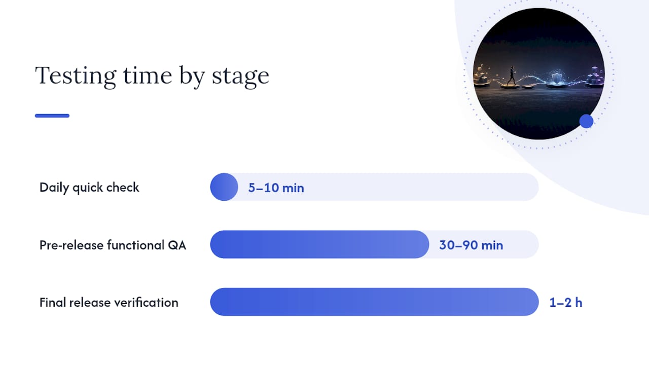
Recommended workflow with rough time estimates:
- Daily quick check (5–10 minutes): Chrome DevTools Device Toolbar for layout, one pass through Lighthouse on Mobile. Fix obvious issues before they accumulate.
- Pre-release functional QA (30–90 minutes): Remote debug on one iOS device (Safari Web Inspector) and one Android device (Chrome adb). Test all interactive flows: forms, navigation, modals, checkout.
- Final release verification (1–2 hours): BrowserStack Live or a small physical device matrix covering the top two or three devices your analytics show. Confirm real-device behavior matches what DevTools suggested.
A practical rule of thumb: if the issue is visual or CSS-related, DevTools will find it. If it involves interaction, performance under real CPU load, or Safari-specific behavior, a real device will find it and DevTools won't.
Checklist for mobile A/B tests and keeping scripts lightweight
Before you run any experiment on mobile, measure your baseline. A/B test scripts that load synchronously on first paint can inflate LCP and TBT, which skews both the user experience and the test results themselves.
Pre-experiment checklist:
- Run Lighthouse (Mobile) on the control page and record LCP, TBT, and CLS scores before adding any experiment script.
- Test the experiment variant on the same device profiles you used for the baseline — not just desktop DevTools.
- Use feature flags and staged rollouts so you can push the variant to a small percentage of mobile traffic first and monitor Core Web Vitals before full rollout.
- Confirm experiment scripts load asynchronously and do not block the critical rendering path.
- Validate fallback behavior on a throttled connection (Slow 3G in DevTools) to confirm the page renders correctly if the experiment script fails to load.
- Monitor Core Web Vitals in Google Search Console or your analytics platform during the experiment window.
Pro Tip: Prefer experiment snippets under 10KB. Lazy-load any experiment assets that aren't needed on first paint, and never place a synchronous experiment script in the <head> without a timeout fallback. A script that blocks rendering for 200ms on a mid-tier Android phone will depress conversion in the variant group, making a winning experiment look neutral.
Gostellar's 5.4KB script is designed specifically around this constraint. For marketers running experiments on mobile-heavy traffic, script weight isn't a secondary concern — it's a variable in the experiment itself. Keeping it minimal is the only way to isolate the variant's effect from the script's performance cost.
For a deeper look at how mobile UX testing connects to conversion outcomes, the relationship between script load time and experiment validity is worth understanding before you scale any test.
A practitioner's view on daily mobile testing habits
The teams that catch mobile issues early share one habit: they don't treat mobile testing as a separate phase. A quick DevTools toggle at the start of any layout task takes under 10 seconds and catches the obvious problems before they compound. Nightly Lighthouse runs in CI catch performance regressions before they reach staging. Weekly real-device checks on two or three representative phones catch the interaction bugs that emulation misses.
For marketers, the timing of A/B tests matters as much as the setup. Running an experiment before you've verified mobile performance on the variant is a common mistake. If the variant loads 300ms slower on a mid-tier Android device, you're not testing the copy or the CTA — you're testing the performance penalty. Run Lighthouse on both control and variant before you start the experiment, and keep a small matrix of two or three devices that represent your actual mobile audience.
Automating simple checks removes the friction that causes teams to skip them. A scheduled Lighthouse run in your CI pipeline (GitHub Actions, CircleCI, or similar) takes about 30 minutes to set up and gives you a performance trend line across every deploy. Pair that with a shared Slack or Teams alert when LCP or CLS crosses a threshold, and the whole team stays aware of mobile performance without anyone having to remember to check manually. The collaboration piece matters too: developers and marketers should agree on a short device matrix and acceptance criteria before a release, not after a bug report comes in from a user on an older Samsung.
Gostellar runs experiments without weighing down your mobile pages
Tools like Chrome DevTools, BrowserStack, and Lighthouse give you the visibility to find mobile problems. Running experiments on top of that requires a separate discipline: keeping the experiment script itself from becoming the problem.
Gostellar is built for exactly this tradeoff. Its 5.4KB A/B testing script loads asynchronously and is designed to have minimal impact on Core Web Vitals — so the performance baseline you measured in Lighthouse stays intact when the experiment goes live. The no-code visual editor means marketers can build and launch variants without waiting for a developer, and real-time analytics surface results as they come in.
Key benefits for mobile-focused teams:
- Lightweight script (5.4KB): won't inflate LCP or TBT on mobile.
- No-code visual editor: build variants without touching code.
- Staged rollouts: push to a percentage of mobile traffic first, monitor Core Web Vitals, then scale.
- Free plan available: covers up to 25,000 monthly tracked users.
Gostellar is an A/B testing platform, not a device testing tool — use it alongside the mobile testing workflow above, not instead of it. Start a free account at Gostellar and run your first experiment without worrying about what it does to your mobile performance scores.
Sources
A short list of the authoritative pages referenced throughout this article, each worth bookmarking for your testing workflow.
- Simulate mobile devices with device mode | Chrome DevTools | Chrome for Developers
- Responsive Testing On 3000+ Real Devices & Browsers | BrowserStack
- Mobileviewer
- Mobile Viewer — Free Website Tester & Mobile Preview Tool
- Page-oscope: Preview Websites on Various Phones - Mobile Moxie
- Mobile simulator - responsive testing tool - Chrome Web Store
- Statista
Recommended
Published: 8/7/2026