
High-Impact A/B Testing Examples to boost conversion rates
TL;DR:
- Effective A/B testing focuses on high-traffic, user-facing elements like headlines and forms.
- Top tests can yield up to 34% conversion increases and are often fast to implement.
- Thinking beyond standard practices and experimenting with unexpected variables can lead to breakthrough results.
Most marketers know A/B testing works. The harder question is: which test do you run first? With dozens of variables to choose from, it's easy to waste weeks on low-value experiments while your real conversion problem goes untouched. Top-performing landing pages hit conversion rates above 11.45%, while the median sits between 2.35% and 6.6%. The gap between average and exceptional is almost always closed through smart, targeted testing. This guide breaks down the most effective A/B testing examples across headlines, CTAs, forms, visuals, and layout so you can pick the test that moves the needle fastest.
Table of Contents
- How to choose effective A/B tests
- proven A/B test examples for marketers
- comparing top A/B test types by impact
- situations where each A/B test shines
- Why smart marketers rethink 'best practices' in A/B testing
- Launch your next high-impact A/B test with stellar
- frequently asked questions
Key Takeaways
| Point | Details |
|---|---|
| High-impact tests | Headline and form field experiments often yield the largest conversion gains. |
| Data-driven decisions | Use proven examples to prioritize A/B tests that match your goals. |
| Comparison strategies | Tables and summaries help quickly prioritize which test type suits your needs. |
| Iterative success | Continuous testing and learning produce the biggest lifts over time. |
How to choose effective A/B tests
Not every A/B test is created equal. Some will shift your conversion rate by double digits. Others will cost you two weeks of traffic and teach you almost nothing. Before you start, you need a framework for picking the tests that actually matter.
The highest-impact areas to test are almost always the ones users encounter first or interact with most. Think about your headline, your call-to-action button, your form length, your page layout, and your hero image. These elements shape a visitor's first impression and directly control whether they stay or leave. Landing page conversion benchmarks show a wide range from 2.35% to 11.45%, and the pages at the top share one trait: they were tested relentlessly on the right variables.
Here's what to prioritize when selecting your next test:
- High traffic first. Test elements on the pages that get the most visitors. You need enough data to reach statistical significance quickly.
- One variable at a time. Change only one thing per test. If you swap both the headline and the button color, you won't know which change drove the result.
- Business goal alignment. Each test should connect to a specific outcome: a lead form submission, a purchase, or a demo booking. Testing for aesthetics alone wastes time.
- User friction points. Look at your heatmaps and scroll data. Where do users drop off? That's your highest-potential test location.
- Impact on both volume and quality. A test that slightly increases total clicks but brings in unqualified leads isn't a win.
Pro tip: Before picking a test, write down the single metric you expect to move. If you can't name it clearly, the test idea probably isn't ready yet.
Reviewing successful A/B test examples before you design your own experiment saves time and sharpens your hypothesis. A solid A/B testing guide will also help you structure each test so the results are genuinely actionable.
proven A/B test examples for marketers
With selection criteria in mind, see these powerful, data-backed A/B test examples that real teams have used to move the needle.
-
Testing headline variations. Your headline is the first thing a visitor reads, and it does the heaviest lifting on any landing page. A benefit-driven headline almost always outperforms a feature-driven one. A well-run headline test example can deliver up to 34% conversion lift, which is a massive return for changing just a handful of words.
-
shortening your lead form. Every field you add to a form is a potential exit point. Teams consistently find that removing a single field increases completions by around 18% per field removed. If your form asks for phone number, company size, and job title upfront, try stripping it back to just name and email and watch what happens.
-
CTA button copy variations. "Submit" is the worst performing button label in most industries. Test it against action-oriented copy like "Get my free report" or "Start saving today." The specificity signals exactly what happens next, which reduces hesitation and builds confidence.
-
Hero image or visual swaps. This is the most underestimated test type. Replace a stock photo with a real customer photo, or swap a static image for a short product demo animation. Teams in ecommerce and SaaS consistently find that authentic visuals outperform polished but generic ones.
Key stat: A single headline variation can lift conversions by up to 34%, and removing one form field adds roughly 18% more completions. These aren't marginal gains.
Pro tip: When testing CTA copy, the button label and the headline should tell the same story. If your headline promises speed, your CTA should reinforce it. "Get results fast" beats "Learn more" every time.
For teams focused on improving conversions across multiple campaigns, rotating through these four test types systematically is more effective than chasing one-off ideas.
comparing top A/B test types by impact
After reviewing individual examples, compare them side-by-side to choose which fits your campaign best.

| Test type | Average lift range | Time to results | Impact level | Best for... |
|---|---|---|---|---|
| headline | 10% to 34% | 1 to 2 weeks | Very high | All page types |
| CTA button copy | 8% to 25% | 1 to 2 weeks | High | Landing pages, product pages |
| Form length | 10% to 50%+ | 2 to 3 weeks | Very high | Lead gen pages |
| Hero image or visual | 5% to 20% | 2 to 4 weeks | Medium to high | ecommerce, SaaS |
| Page layout or structure | 5% to 15% | 3 to 5 weeks | Medium | Complex pages |
| Social proof or testimonials | 5% to 18% | 2 to 3 weeks | Medium | B2B, service pages |
A few things stand out when you study this table. Headlines and form fields deliver the highest average lifts and produce results the fastest. That's why most experienced growth teams start there. Landing pages that top 11.45% conversion didn't get there by accident. They iterated through these exact test types with discipline.
Here's how to read this table for your next experiment:
- Run headline and CTA tests first if you need fast wins with limited traffic.
- Move to form and visual tests once you have a validated message and enough data volume.
- Don't skip layout or social proof tests. They're slower but often reveal structural problems that no headline fix can solve.
For more targeted inspiration, explore landing page testing ideas organized by campaign type and goal.
situations where each A/B test shines
To act decisively, see how real teams pick which test matches each critical funnel challenge.
| Campaign challenge | Best test type | Why it works |
|---|---|---|
| High bounce rate on landing page | headline variation | Users leave because the message doesn't match their expectation |
| Low form completion rate | Form length reduction | Every extra field adds friction and mental effort |
| Users scroll past the CTA | CTA button copy or placement | The offer isn't clear or compelling enough to stop the scroll |
| Low trust or high hesitation | Social proof or testimonial swap | Real customer voices reduce risk perception |
| Poor mobile conversion | Layout or visual swap | Desktop-designed pages often perform poorly on smaller screens |
| ecommerce product page drop-off | Hero image or video test | Product visuals are the primary trust signal for purchase intent |
"Top performers don't just run more tests. They run the right tests, faster, and use each result to sharpen the next hypothesis."
Think about it this way: if your analytics show visitors landing and bouncing within five seconds, a form test won't help. The problem is the message, and that points directly to a headline test. But if users scroll to the form and abandon it, a length reduction is the obvious move. Real teams use their landing page performance data to diagnose the issue before picking the fix.
Meanwhile, test strategies for marketers in competitive verticals often include running two tracks simultaneously: one safe, high-confidence test and one experimental test designed to challenge assumptions. This approach is how top performers achieve conversion rates above 11% while everyone else stagnates.
- Match every test to a specific symptom in your analytics
- Use session recordings to confirm which element is causing the problem
- Track micro-conversions like scroll depth and click rate alongside your main goal
Why smart marketers rethink 'best practices' in A/B testing
Here's something the standard optimization playbook won't tell you: over-relying on conventional test types creates a ceiling. If every competitor in your space is testing headlines and CTAs using the same formulas, you're not gaining an edge. You're just catching up.
The marketers who see the biggest leaps often test the things nobody expects. A playful testimonial written in a customer's actual words. A countdown timer that triggers only on return visitors. A hero image that shows the problem, not the solution. These tests feel risky precisely because they break from what feels "safe."
The lesson isn't that headlines and forms don't matter. They absolutely do, and the data backs that up. The lesson is that breakthrough results come from testing beyond the obvious. Why standard testing gets stale is a real phenomenon, especially for teams that have already run dozens of iterations on the same page.
Our recommendation: run one "wild card" test per testing cycle. Keep your core tests structured and data-driven, but carve out space for one experiment that surprises users. You'll fail more often, but when one lands, the lift is disproportionate.
Launch your next high-impact A/B test with stellar
The examples in this article aren't theoretical. Teams running headline tests, trimming form fields, and swapping CTAs are seeing real, measurable lifts every day. The gap between knowing what to test and actually running those tests quickly is where most growth stalls.
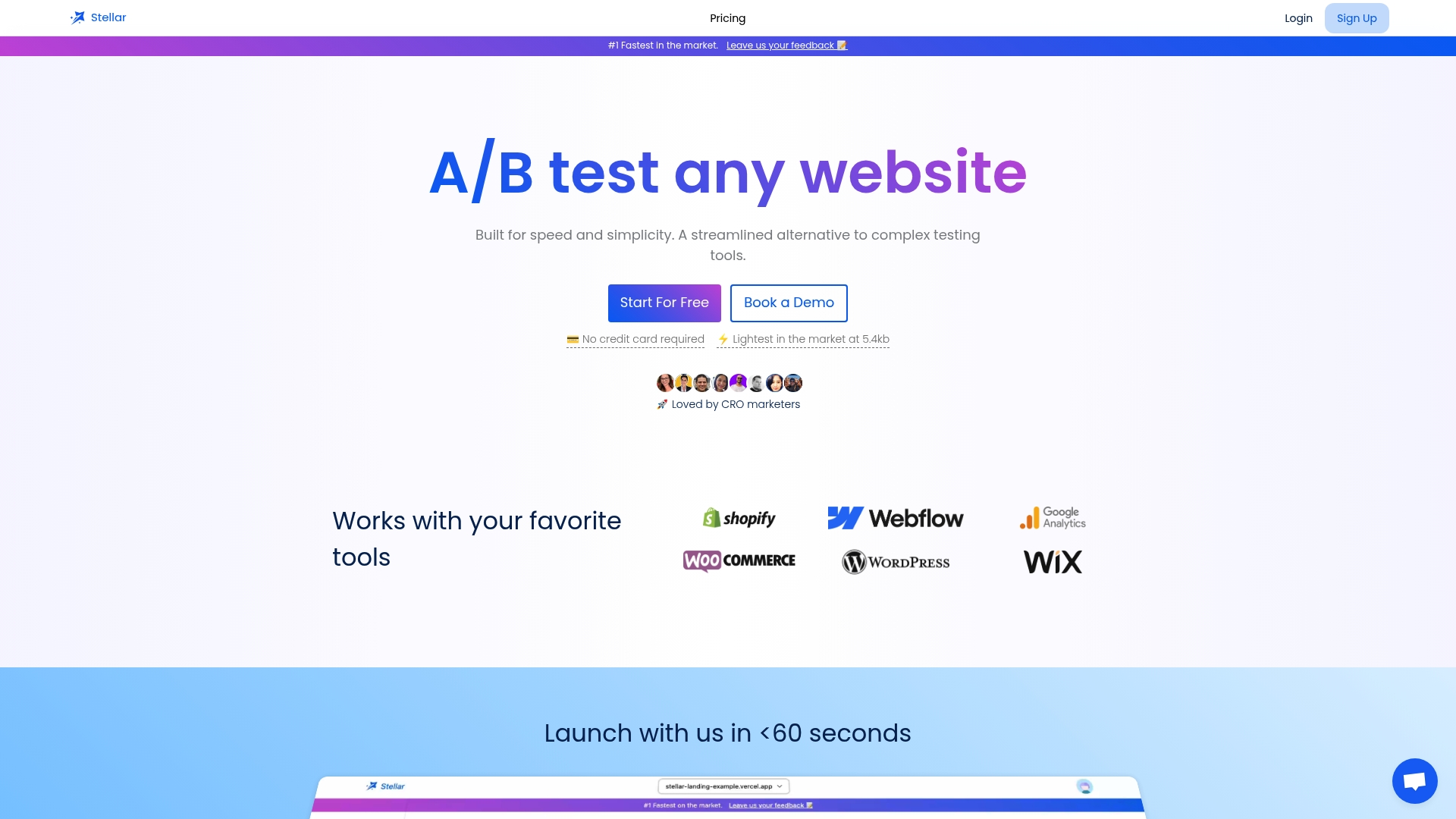
Stellar was built to close that gap. With a no-code visual editor, real-time analytics, and a 5.4KB script that won't slow your site, you can launch your first test in minutes, not weeks. Whether you're starting with A/B testing ideas from this article or already have a hypothesis ready, try the platform and see how fast experimentation can actually move your numbers.
frequently asked questions
What is a real-world example of A/B testing?
A real-world example is testing two different headlines on your landing page to see which drives more completions. This single change can deliver up to a 34% lift in conversions.
Which A/B test delivers the quickest impact?
Headline and CTA button copy tests typically show fast, significant results because they require minimal traffic to reach significance. Data shows headline tests can produce a 34% conversion lift within one to two weeks.
How do A/B tests improve conversion rates?
A/B tests remove guesswork by revealing which version of a page element performs better with your actual audience, enabling continuous, evidence-based iteration. Over time, these compounding improvements move you from median performance toward top-tier rates.
What's the best variable to test first?
Start with your headline or form field count, as both consistently show the highest average lifts: up to 34% for headline changes and 18% more completions per form field removed.
Recommended
Published: 4/23/2026