
Optimize Ecommerce Sales: A 30-90 Day Action Plan
The fastest way to increase ecommerce revenue is to fix leaks in the traffic you already have, not chase more of it. That means attacking page speed, checkout friction, and product-page clarity before you spend another dollar on ads. Every visitor who abandons a slow page or a confusing checkout is money you already paid to acquire, walking out the door.
Three priorities beat everything else on the list:
- Fix mobile load speed and Largest Contentful Paint (LCP). Slow pages lose buyers before they see your offer.
- Strip out checkout friction. Forced account creation, late-revealed fees, and long forms kill completed orders.
- Rework your highest-traffic product pages. Clarity and trust signals there move more revenue than a new landing page ever will.
Pro Tip: Spend 30 minutes today running your top product page and checkout flow through PageSpeed Insights and a real phone. Whatever breaks first is your biggest leak. Fix that this week before touching anything else.
Key Takeaways
Revenue growth in ecommerce comes from recovering existing purchase intent through speed, checkout, and product-page fixes before scaling new traffic acquisition.
| Point | Details |
|---|---|
| Fix speed first | Every one-second load delay can cost roughly 7% in conversions, so prioritize mobile LCP and script audits. |
| Simplify checkout | Remove forced accounts and disclose shipping costs early, the top two abandonment drivers Baymard identifies. |
| Optimize top pages first | Rank product pages by revenue per visit and fix the top 10 to 20% before touching the long tail. |
| Test with guardrails | Define sample size and minimum detectable effect before launching a test, and stage rollouts to protect analytics. |
| Test without slowing your site | Gostellar's sub-5.4KB script and no-code editor let teams validate fixes like checkout changes without adding load time. |
Table of Contents
- Seven Quick Wins You Can Ship This Week
- Why Does Site Speed Affect Ecommerce Conversions?
- What Makes a Product Page Convert?
- How Should Navigation and Search Be Structured?
- How Do You Reduce Checkout Abandonment?
- How Do You Build a CRO Testing Roadmap?
- What Retention Tactics Actually Increase Repeat Purchases?
- Who Are Your Customers, and How Should You Target Them?
- What UX Principles Matter Most for Ecommerce?
- How Should You Use Customer Feedback to Improve Your Store?
- How Do You Improve Traffic Quality Across Marketing Channels?
- Should You Add Live Chat and Support Tools?
- Try a Performance-First Way to Test Your Store
- Frequently Asked Questions
- Sources
Seven Quick Wins You Can Ship This Week
You don't need a redesign to move revenue. You need a short list of fixes that a small team can deploy in days, not quarters. Here are seven, ranked by how fast they typically pay off.
- Enable guest checkout. Forced registration is one of the top reasons shoppers abandon carts, according to Baymard Institute's checkout research. Time: 1 to 3 hours. Difficulty: low.
- Compress and preload your hero image. A bloated header image delays everything below it. Time: 30 minutes. Difficulty: low.
- Remove one heavy third-party script. Chat widgets, review plugins, and old tracking pixels pile up fast. Audit and cut one. Time: 1 hour. Difficulty: low to medium.
- Show a shipping estimate on the cart page. Surprise costs later in checkout are a top abandonment trigger. Time: 2 hours. Difficulty: medium.
- Turn on wallet payments (Apple Pay, Google Pay, Shop Pay). One-touch payment reduces the number of fields a mobile shopper has to fight with. Time: 2 to 4 hours. Difficulty: medium.
- Add trust badges near your primary CTA. Security seals, return policy links, and review counts reduce hesitation at the moment of decision. Time: 1 hour. Difficulty: low.
- Find and fix one broken or mislabeled CTA button. Run a quick click-map or just click through your funnel on mobile. Time: 30 minutes. Difficulty: low.
- Bundle these into a single sprint. Pull in one developer, one designer, and whoever owns analytics.
- QA every change on an actual phone, not just a resized browser window, before you call it done.
Pro Tip: Assign someone to watch conversion rate and bounce rate daily for a week after shipping. If a "quick win" quietly breaks something, you want to know in days, not at month end.
Why Does Site Speed Affect Ecommerce Conversions?
Every second of load delay costs you sales, and the effect is bigger than most store owners assume. Research from Thunder Page Speed's Shopify optimization guide puts the hit at roughly 7% in lost conversions per one-second delay. Stack a few seconds of bloat across a homepage, category page, and checkout, and you've quietly erased a meaningful chunk of your funnel before a shopper ever reaches "buy."
Speed also feeds your acquisition math twice over. Thunder Page Speed notes that faster pages improve the quality signals search engines and ad platforms reward, which lowers your cost per click and improves organic rankings at the same time. You're not just converting more visitors, you're paying less to get each one.
Mobile is where this bites hardest. Salesforce's ecommerce optimization research found that shaving even one second off mobile load times can meaningfully lift conversion rates, and Statista's device-level ecommerce data shows mobile now carries a large and growing share of both visits and orders. If your mobile experience is an afterthought, you're optimizing for the smaller half of your traffic.
What to measure and where
Test five page types, not just your homepage: homepage, your best-selling product page, a category page, the cart, and checkout. Capture four Core Web Vitals metrics on each:
- LCP (Largest Contentful Paint): how fast the main content appears.
- CLS (Cumulative Layout Shift): whether elements jump around as the page loads.
- INP (Interaction to Next Paint): how responsive the page feels when someone taps a button.
- TTFB (Time to First Byte): how fast your server responds before rendering even starts.
Add total page weight in kilobytes. Anything over 2 to 3 MB on a product page is worth investigating.
Practical fixes that actually move these numbers
Switch product images to WebP or AVIF formats, which compress far better than JPEG without visible quality loss. Preload your hero image so the browser fetches it immediately instead of discovering it late in the page's render sequence. Lazy-load everything below the fold, images, reviews, related products, so the browser isn't wasting bandwidth on content nobody's scrolled to yet. Audit every third-party script (chat, reviews, personalization, ad pixels) and defer the ones that don't need to load immediately. Serve static assets through a CDN, and load custom fonts with font-display: swap so text doesn't disappear while fonts download.
Run diagnostics with Google PageSpeed Insights, Lighthouse, and WebPageTest, each surfaces slightly different bottlenecks.
Pro Tip: Never push a script change straight to 100% of traffic. Stage it to a small percentage first, watch Core Web Vitals for 24 to 48 hours, and only then roll it out fully. A "small" tracking snippet has taken down conversion rates before.
What Makes a Product Page Convert?
A product page converts when a shopper can answer three questions in under ten seconds: what is this, does it work for me, and can I trust this store. Everything on the page should serve one of those three jobs.
Above the fold, prioritize a large, zoomable hero image, a price that's impossible to miss, availability status, and a primary "Add to Cart" button that doesn't compete visually with anything else. Below that, stack scannable selling points (not paragraphs), a shipping estimate, size or variant selectors with real swatch previews, and review counts. SEMrush's ecommerce optimization framework recommends treating product-page layout as its own optimization pillar, separate from broader site SEO, because the conversion job here is narrower and more urgent than a category or blog page.
Trust signals belong close to the CTA, not buried in a footer. Return policy, security badges, and review snippets all reduce the hesitation that shows up right before someone clicks "buy." A product-page SEO and conversion guide from Baby Love Growth makes a similar case: pages that pair strong on-page SEO structure with clear conversion signals tend to outperform pages optimized for only one or the other.
Merchandising moves that lift average order value
Contextual recommendations ("frequently bought with") work better than generic "you might also like" carousels because they're tied to actual purchase behavior. Bundles let you present a higher price point as a better deal rather than a bigger ask. Cart add-ons, small, low-friction extras suggested right before checkout, are one of the easiest AOV levers to test. Scarcity and urgency messaging ("3 left in stock") can work, but use it only when it's true; fabricated urgency erodes trust fast once a shopper notices the same "3 left" message a week later. Free-shipping thresholds raise average order value reliably, but set the threshold against your actual margin data, not a round number that sounds nice.
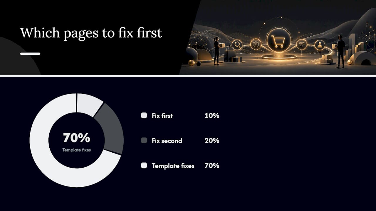
Which pages to fix first
Not every product page deserves the same attention. Rank pages by revenue per visit (RPV), then start with the top 10 to 20% by traffic and revenue combined.
| Page tier | Optimization priority | Typical focus |
|---|---|---|
| Top 10% by revenue | Fix first, test heavily | Imagery, trust signals, CTA placement |
| Next 20% by traffic | Fix second | Copy clarity, mobile layout |
| Long tail (low traffic/revenue) | Template-level fixes only | Apply site-wide template improvements, skip individual testing |
Pro Tip: On mobile, move your trust badges and shipping estimate above the "Add to Cart" fold line, not below it. Mobile shoppers scroll less before deciding to abandon than desktop shoppers do.
How Should Navigation and Search Be Structured?
Shoppers who can't find what they want don't complain, they just leave. Site architecture is the quiet layer of ecommerce optimization that most teams get to last, even though it touches every session.
Keep your category hierarchy shallow, ideally no more than three clicks from homepage to product. Write real descriptive copy on category pages instead of a one-line placeholder; it helps both shoppers scanning for relevance and search engines trying to understand what the page is about. Use breadcrumbs consistently, and canonicalize filtered or sorted URL variations so you're not splitting SEO value across a dozen near-duplicate pages.
- Set sensible filter defaults (in-stock only, relevant sort order) instead of showing everything unsorted.
- Preserve filter selections in the URL so shoppers can share or bookmark a filtered view.
- Watch faceted navigation performance closely; too many filter combinations can quietly balloon your indexed page count and slow crawl efficiency.
- Add autocomplete and typo tolerance to onsite search; a shopper who types "sneekers" shouldn't get zero results.
- Enable "quick add to cart" directly from search results to shorten the path to purchase.
- Review search analytics monthly for popular queries and, more importantly, zero-result queries, which flag gaps in inventory or product naming.
- Add breadcrumb and product schema markup so search engines can render richer results.
Getting this right compounds. Better internal linking through categories and breadcrumbs feeds SEO, while better search and filters feed conversion, and they reinforce each other over time.
How Do You Reduce Checkout Abandonment?
Checkout is where the most revenue quietly disappears, and it's usually self-inflicted. Baymard Institute's checkout research identifies unexpected costs revealed late in the process, forced account creation, and checkouts that are simply too long as the top drivers of abandoned carts. None of those require a redesign to fix.
Run through this checklist:
- Remove forced account creation. Guest checkout should always be the default, with account creation offered as an option after purchase, not a gate before it.
- Disclose all costs early. Shipping, taxes, and fees should appear on the cart page, not as a surprise on the final screen.
- Cut required fields to the minimum. Every extra field is a chance for someone to give up.
- Support wallets and local payment methods. Apple Pay, Google Pay, and region-relevant options reduce typing and build trust simultaneously.
- Test the entire flow on mobile, on a real device. Desktop QA misses touch-target and keyboard issues that kill mobile completions.
Cart abandonment recovery deserves its own sequence, not a single reminder email. A workable template: an onsite exit-intent prompt for shoppers about to leave, a first recovery email within an hour, a follow-up at 24 hours (sometimes with a modest incentive), and a final SMS or email nudge at 72 hours for higher-value carts. Segment the offer by cart value; a shopper abandoning a $30 cart and one abandoning a $300 cart shouldn't get the same treatment.
Transparency does double duty as trust-building. Shipping estimates on the product and cart pages, a visible return policy link in the footer, and a security badge sitting right next to the payment fields all lower the hesitation that shows up at the exact moment someone is about to pay you. If you're running promo codes, reveal them progressively rather than making a shopper hunt for a "Have a code?" link buried below the fold.

For a deeper walkthrough of sequencing these fixes, our ecommerce checkout optimization guide covers the full rebuild process.
Pro Tip: Measure checkout completion rate as a percentage of sessions that actually started checkout, not total site sessions. Blending the two hides whether your problem is getting people into checkout or keeping them there.
How Do You Build a CRO Testing Roadmap?
A testing roadmap works when you stop treating every idea as equally worth running. Score each proposed test on expected impact, your confidence it'll work, and the effort to build it, then run one major test per month alongside two or three smaller validation tests. That cadence keeps your team shipping without drowning in half-finished experiments.
Build Grow Scale's revenue optimization framework frames this as a systems problem across five levers: checkout friction, average order value, retention, pricing, and measurement. Testing in isolation, one popup at a time, tends to produce small, disconnected wins. Testing against a framework tends to compound.
Here's the metric set worth tracking on every test:
| Metric | How to calculate | Why it matters |
|---|---|---|
| Conversion rate | Orders ÷ sessions | The baseline health check for any funnel stage |
| Revenue per session | Total revenue ÷ sessions | Captures AOV and conversion rate together in one number |
| Checkout completion rate | Completed orders ÷ checkout-initiated sessions | Isolates checkout-specific friction from top-of-funnel issues |
| Average order value (AOV) | Total revenue ÷ number of orders | Shows whether merchandising and upsell tactics are working |
| Cohort LTV | Revenue per customer cohort over a fixed window | Reveals whether you're acquiring customers worth keeping |
| MER (Marketing Efficiency Ratio) | Total revenue ÷ total marketing spend | A blended view of paid efficiency across all channels at once |
| CAC payback | Months to recover acquisition cost from gross margin | Tells you how fast a new customer becomes profitable |
A workable example hypothesis: "Adding a shipping-cost estimate to the cart page will increase checkout-initiated sessions by reducing surprise-cost abandonment." Before launching, define which metric you expect to move (checkout initiation rate), calculate the sample size you need to detect a meaningful lift, and set a minimum detectable effect so you're not calling a coin-flip result a win.
Guard your analytics while you test. Exclude internal traffic, make sure your test tool isn't double-counting conversions, and use a script light enough that it doesn't itself become the thing slowing your page down, which would quietly bias your own results. Server-side experiments and staged rollouts reduce that risk further, letting you validate a change on a small traffic slice before it touches your full audience. Our guide on ecommerce website testing walks through building this kind of lightweight test plan step by step, and our ecommerce performance metrics breakdown goes deeper on calculating LTV and MER correctly.
- Prioritize tests where impact and confidence are both high, even if effort is high too.
- Don't run more than one major test on the same page at the same time; overlapping tests corrupt each other's results.
- Document every test outcome, including the failed ones. A pattern of tests that don't work often reveals a wrong assumption worth fixing at the source.
What Retention Tactics Actually Increase Repeat Purchases?
Getting a second purchase costs far less than getting the first one, which makes post-purchase flows some of the highest-ROI work in ecommerce. The four moments that matter most: order confirmation, shipping updates, product education, and a well-timed cross-sell or win-back message.
- Day 0: Order confirmation with clear next steps and a subtle cross-sell for a complementary product.
- Day 3-7: Shipping and delivery updates paired with product education, how to use it, care instructions, or setup tips.
- Week 3-6: A review request combined with a relevant cross-sell based on the original purchase.
- Month 3: A win-back or replenishment message, especially valuable for consumable products with a predictable reorder cycle.
Track repeat purchase rate, cohort LTV, churn broken out by acquisition cohort, and subscription conversion and churn if you offer one. Revenue per user over time is the metric that tells you whether all this is actually compounding or just generating busywork.
- Test subscription offers on consumable or replenishable products; the recurring-revenue lift is usually worth the operational overhead.
- Build a referral program that rewards both the referrer and the new customer; one-sided incentives convert less.
- Treat transactional pages, order confirmation, shipping tracking, as cross-sell real estate instead of dead ends.
Who Are Your Customers, and How Should You Target Them?
Not every shopper deserves the same message. Segmentation starts with behavior, not demographics: first-time visitors, cart abandoners, repeat buyers, and high-LTV customers each need a different offer and a different tone.
First-time visitors respond to trust signals and clarity, not discounts, they don't know if they trust you yet. Cart abandoners need friction removed or a modest nudge, covered in the checkout recovery sequence above. Repeat buyers respond well to loyalty framing and early access to new products. Your highest-LTV segment, often a small fraction of total customers, deserves the least discounting and the most white-glove treatment; they're already convinced, so protect the margin instead of eroding it.
Build segments around purchase recency, frequency, and monetary value (a classic RFM model), then layer in behavioral signals like browsing category or device type. A shopper who only ever buys on mobile during evening hours should see a different email send time than someone who buys from a desktop at work.
Email and ad targeting both improve once segmentation is in place. A generic "20% off everything" email to your entire list wastes the goodwill you could spend more precisely, on a first-purchase incentive for new subscribers, a replenishment reminder for consumable buyers, or an early-access preview for your top-tier repeat customers. Segmentation isn't about sending more messages, it's about sending fewer, better-targeted ones that don't train your list to wait for a discount before buying anything.
What UX Principles Matter Most for Ecommerce?
Good ecommerce UX follows a few consistent principles rather than a checklist of trendy features. Clarity beats cleverness every time: a shopper should never have to guess what a button does or where a link leads.
Consistency matters more than most teams realize. If your CTA button is blue on the homepage and green on the product page, you're forcing a shopper to relearn your interface mid-session. Keep button styles, iconography, and navigation patterns identical across every page type.
Design for thumbs, not cursors. Most of your traffic is on mobile, per Statista's device data cited earlier, so tap targets need real spacing, forms need appropriately sized input fields, and critical actions (Add to Cart, checkout) should sit within comfortable thumb reach rather than requiring a stretch to the top of the screen.
Reduce cognitive load at every decision point. A product page with fifteen competing calls to action confuses more than it converts. One primary action per screen, with secondary actions visually subordinate, keeps the shopper moving forward instead of stalling to figure out what to click.
Progressive disclosure, showing detail only when it's needed, works better than dumping everything at once. Size charts, shipping calculators, and detailed specs can live behind a tap or expand, keeping the main page lean while still giving thorough shoppers the depth they want.
Finally, design for the return visit, not just the first one. Saved carts, remembered preferences, and a search history that actually helps returning shoppers find what they looked at last time all reduce the friction of coming back to finish a purchase they started days earlier.
How Should You Use Customer Feedback to Improve Your Store?
Customer feedback tells you what your analytics can't: why someone almost bought and didn't. Surveys, reviews, and support transcripts are a research asset most stores collect and then never actually read.

Post-purchase surveys work best when short, one to three questions, sent within a day of delivery while the experience is fresh. Ask what almost stopped them from buying, not just how satisfied they are; the first question surfaces friction you can fix, the second just produces a vanity number.
Exit-intent surveys on the cart or checkout page catch abandonment reasons in the moment, which is more useful than trying to reconstruct intent later from analytics alone. Even a simple one-click "what's stopping you?" with three or four options (price, shipping cost, need more info, not ready) gives you directional data fast.
Review content is a feedback channel too, not just social proof. Mining product reviews for recurring complaints, sizing runs small, color looks different in person, often surfaces product-page fixes (better photos, a sizing chart, clearer material descriptions) that are cheaper to implement than any ad campaign.
Close the loop visibly. When feedback leads to a fix, whether that's a clarified size guide or a new payment option, mention it somewhere customers will see it. It signals that the surveys aren't decorative, and it makes the next round of feedback requests feel worth answering.
How Do You Improve Traffic Quality Across Marketing Channels?
More traffic isn't the goal if it's the wrong traffic. A channel sending high volume at low conversion rate is often draining budget rather than building revenue, and the fix is usually channel-level, not landing-page-level.
Audit each channel by conversion rate and revenue per session, not just click volume or cost per click. Paid social often drives cheap clicks with weaker purchase intent than paid search, where someone actively typed what they wanted. That doesn't make social worthless, it means the landing experience and offer need to match the colder intent that channel brings.
Organic search traffic tends to convert well when it's landing on pages that actually match query intent, category and product pages optimized with the structure covered earlier, rather than a generic homepage. SEMrush's optimization framework treats keyword-to-page matching as a core pillar precisely because mismatched intent kills conversion even when the traffic volume looks healthy.
Blend your channel metrics using MER (Marketing Efficiency Ratio) instead of judging each channel in isolation by its own attributed conversions. Attribution models increasingly undercount channels like organic and email that influence purchases without getting last-click credit, so a channel-by-channel view alone can push you to overinvest in whatever converts easiest on paper.
Email and SMS remain some of the highest-quality traffic sources available, since the audience already opted in and, ideally, already trusts you. Growing that list through non-discount incentives (early access, content, loyalty perks) protects margin better than training new subscribers to expect a coupon before they'll hand over an email address.
Should You Add Live Chat and Support Tools?
Live chat earns its place on product and checkout pages specifically, where a hesitating shopper is one quick answer away from either buying or leaving. It's less valuable bolted onto every page as a floating widget nobody asked for.
The highest-value placement is checkout and high-consideration product pages, items with sizing questions, technical specs, or a higher price point where shoppers naturally have pre-purchase questions. A chat widget on a $15 impulse-buy product page adds clutter more than value.
Response time matters more than the tool itself. A chat widget that goes unanswered for twenty minutes damages trust worse than not having one at all, since it signals someone's watching and then apparently isn't. If you can't staff live responses during your peak traffic hours, a well-built FAQ or a chatbot handling common questions (sizing, shipping times, returns) beats an unanswered chat bubble.
Weigh the performance cost too. Chat widgets are exactly the kind of third-party script that quietly adds load time, the same load time this entire playbook is trying to protect. Choose a lightweight implementation, load it asynchronously, and test its impact on your Core Web Vitals before rolling it out site-wide, not after.
A performance-first experiment example
One team running a lightweight test on a checkout page swapped a single-page checkout for a two-step version, splitting shipping and payment into separate screens. The split ran on half of checkout-initiated sessions over three weeks, deployed through a script under 6KB so it added no measurable load time. The two-step version showed a meaningful relative lift in checkout completion, likely because the single-page version felt longer at a glance even though it asked for the same information.
- Keep any test script under roughly 10KB to avoid regressing Core Web Vitals.
- Load test scripts asynchronously, never in a way that blocks page render.
- Roll out to a small traffic percentage first, watch for 48 hours, then expand.
- Have a one-click rollback ready before you ever hit 100% of traffic.
- Verify in analytics that the test didn't inflate or deflate unrelated funnel metrics.
Pro Tip: If your test tool's script weighs more than the page element you're testing, you're not running an experiment, you're running a new performance problem.
What repeatable wins actually move revenue?
Across store after store, the same three levers keep paying off: speed, checkout simplification, and AOV architecture built around real merchandising, not just discounts. Everything else on this list matters, but those three compound faster than anything else you'll test this year.
If your team is short on engineering time, start with the no-code fixes: guest checkout, wallet payments, and cart-page shipping estimates. None require a developer sprint, and all three attack proven abandonment drivers directly. Run your first test on checkout completion rate before touching anything upstream in the funnel; it's the metric most sensitive to quick, reversible changes.
Test with a script light enough that it can't become the problem it's trying to solve. A testing platform that adds meaningful load time is working against the exact goal this playbook is built around.
Try a Performance-First Way to Test Your Store
Every fix in this playbook works better when you can prove it before rolling it out everywhere, and that's exactly where most teams stall: testing tools that are either too complex to set up quickly or heavy enough to undo the speed gains you just fought for. Gostellar runs on a script under 5.4KB, small enough that it won't compromise the Core Web Vitals work covered earlier, and its no-code visual editor lets a marketer build a test without waiting on a developer.
Dynamic keyword insertion lets you personalize landing pages by traffic source without building separate pages for each campaign, and goal tracking connects directly to the metrics that actually matter, checkout completion, AOV, revenue per session, rather than vanity click counts. It integrates directly with WordPress, Shopify, Webflow, Wix, Squarespace, Framer, and Bubble, so setup doesn't mean ripping out your current stack.
Start small: pick one test from this guide's quick wins, a shipping estimate on the cart page or a two-step checkout, and stage it to a limited traffic percentage first. Check Gostellar's plans to see which tier fits your monthly traffic, including a free plan for stores under 25,000 monthly tracked users, and launch your first test this week.
Frequently Asked Questions
What does it mean to optimize ecommerce, exactly?
Optimizing ecommerce means systematically improving the parts of your store, site speed, product pages, checkout, and post-purchase flows, that convert existing traffic into revenue, rather than simply driving more visitors to a site with the same conversion problems.
How long does ecommerce optimization take to show results?
Quick wins like enabling guest checkout or compressing images can show measurable movement in checkout completion or bounce rate within one to two weeks. Deeper changes, like restructured navigation or a full retention sequence, typically need 60 to 90 days to show a stable trend.
What's the single highest-impact fix for most stores?
For stores with slow mobile pages, speed fixes usually pay off fastest since a one-second delay can cost roughly 7% in conversions. For stores already fast, checkout friction, particularly forced account creation, is typically the next biggest lever.
Do I need a developer to start optimizing my ecommerce site?
No. Many of the highest-impact fixes, guest checkout toggles, wallet payment activation, shipping estimates on the cart page, are configuration changes available in most ecommerce platforms without custom development.
How do I know which test to run first?
Score potential tests by expected impact, your confidence it'll work, and effort required, then start with high-impact, low-effort changes like cart-page shipping transparency before moving to complex, high-effort redesigns.
Sources
- Ecommerce CRO and checkout research — Baymard Institute
- Ecommerce website design optimization and best practices — Salesforce
- Shopify store optimization guide: speed, SEO & CRO — Thunder Page Speed
- Ecommerce website optimization: 12 strategies to increase sales — SEMrush
- E-commerce website visit and orders by device — Statista
Recommended
Published: 8/19/2026