
Test First: Fix Copy and Form Friction on Landing Pages
An optimized landing page is one built for a single purpose: it delivers exactly what your ad promised and removes every obstacle between arrival and conversion. The single highest-impact change you can make is aligning your page message with your traffic source and simplifying your primary call to action and form. Get those two things right and you typically see higher conversion rates and lower acquisition costs before you touch anything else.
TL;DR:
- Shopify reported an A/B test in which removing site navigation increased conversions by as much as 28%; compare the result with your baseline.
- Keep one primary CTA above the fold and repeat identical wording after persuasive sections; competing calls to action can divide attention.
- Use A/B tests for headline or button changes; reserve multivariate tests for higher traffic, and judge winners by revenue or ROAS, not conversion rate alone.
- On mobile, use a single column and defer nonessential scripts; test load time on a device because slow pages can lose visitors before seeing your offer.
- Use deadlines only when they are genuine; reset countdown timers erode trust, while specific testimonials placed beside the CTA address hesitation at decision time.
Table of Contents
- What Is Landing Page Optimization and Why Does It Matter?
- What Business Outcomes Come From Optimizing Landing Pages?
- Core Principles and a Prioritized Playbook for Landing Pages
- Mobile, Speed, and SEO Basics That Affect Conversions
- Form Design Rules That Cut Abandonment
- Copywriting and CTA Techniques That Increase Clarity
- How to Test Landing Pages and Which Metrics Matter
- A Prioritized Checklist You Can Run This Week
- Setting Up Fast Experiments Without a Developer
- How Social Proof and Urgency Influence Conversion Decisions
- Visual Hierarchy Principles That Guide the Eye
- What High-Performing Landing Pages Tend to Have in Common
- Finding Problems Before You Guess at Fixes
- Personalizing Landing Pages Without Overcomplicating Them
- Should You Build Your Own Testing Tool or Buy One?
- Where Gostellar Fits When You Need to Move Fast
- FAQ
- Sources
What Is Landing Page Optimization and Why Does It Matter?
Landing page optimization, often shortened to LPO, is the practice of improving a page's layout, copy, and technical performance so more visitors complete a specific action. That action might be a signup, a purchase, a demo request, or a lead form submission. Unlike a homepage, which has to serve many audiences and goals, a landing page exists for one campaign and one outcome.
This distinction matters because a landing page lives downstream of a specific promise. Someone clicks an ad for "free shipping on running shoes" and expects to land on a page about running shoes with free shipping, not a general catalog page. Google Ads guidance states that landing pages must mirror the ad's call to action and offer to maintain relevance, and that relevance is a core input into Quality Score. A low Quality Score raises your cost per click, so misalignment is not just a conversion problem, it is a budget problem.
A product page, by contrast, has to answer every possible buyer question because it serves organic search, repeat visitors, and comparison shoppers alike. A landing page can afford to strip all of that away because every visitor arrived with the same context.
The practical goals of LPO usually fall into a few buckets:
- Lead generation pages optimize for form completions, often gated behind an incentive like a guide or discount.
- E-commerce landing pages optimize for add-to-cart or purchase completion with minimal distraction from the product.
- Signup and trial pages optimize for account creation, usually with the shortest possible form.
- Event or webinar pages optimize for registration, often using urgency tied to a date.
Each goal changes what "optimized" looks like, but the underlying discipline stays the same: match the promise, remove friction, measure the result.
What Business Outcomes Come From Optimizing Landing Pages?
The payoff for landing page optimization shows up in two places: your conversion rate and your cost per acquisition. When a page converts more visitors from the same traffic, you get more customers without spending more on ads, which directly improves your return on ad spend.
Removing navigation links from a landing page increased conversions by as much as 28% in an A/B test reported by Shopify. That single change illustrates a broader pattern: distractions compete with your conversion goal, and every link that is not the CTA is a potential exit.
Beyond the immediate lift, better landing pages tend to improve metrics further down the funnel. A page that sets accurate expectations produces visitors who are a better fit, which can reduce churn and support higher retention after signup. SEMrush frames a full optimization approach as the combination of testing, technical fixes, and content adjustments, with results measured against conversion KPIs and campaign ROAS rather than isolated metrics like bounce rate alone.
The outcomes worth tracking include:
- Conversion rate, the share of visitors completing your primary goal.
- Cost per acquisition, which drops as conversion rate rises for the same ad spend.
- Quality Score, which affects how much you pay per click in search campaigns.
- Return on ad spend (ROAS), the ultimate measure of whether optimization work paid for itself.
None of these move in isolation. A page that loads faster and matches its ad more closely tends to improve all four at once, which is why landing page work often delivers a better return than adding more ad spend to an underperforming page.
Core Principles and a Prioritized Playbook for Landing Pages
Every high-performing landing page rests on five principles: relevance to the traffic source, clarity of message, a single focus, low cognitive load, and visible support when visitors hesitate. These are not equally weighted. Teams that chase visual polish before fixing message clarity usually see smaller gains than teams that fix copy and form friction first.
Here is the order that tends to produce the largest returns, based on where visitors actually drop off:
- Copy and messaging. Fix the headline, subheadline, and value proposition so they match what the visitor expects from the ad or link they clicked.
- Forms. Cut every field that is not essential to the next step, and restructure the layout to reduce decision fatigue.
- Trust signals. Add testimonials, security badges, or client logos near the point of decision, not buried in a footer.
- Visuals. Use images and video that support the message rather than decorate the page.
- Visual polish. Refine spacing, color contrast, and animation only after the above are solid.
This order reflects a simple reality: a beautifully designed page with a confusing headline converts worse than a plain page with a clear one. Messaging and form friction tend to produce the largest median lifts in practice, while visual-only changes often yield smaller improvements by comparison.
Relevance comes first
If your ad says "50% off your first order," your headline should say that too, in the same words, above the fold. Any gap between the ad promise and the page headline creates doubt, and doubt kills conversions before a visitor even scrolls. This is also why Google Ads ties relevance directly to Quality Score: a mismatched page wastes both the visitor's attention and your ad budget.
Clarity and focus work together
A landing page should answer three questions within the first screen: what is this, who is it for, and what do I do next. Every other element on the page should support one of those three answers. If a block of text or an image does not support one of them, it is a candidate for removal.
One of the simplest ways to enforce focus is removing the site navigation entirely from the landing page. Visitors who came from an ad do not need a path to your blog or careers page, they need a path to the conversion goal. That single change was behind the 28% conversion lift reported by Shopify, and it costs nothing to test.
Cognitive load is the hidden conversion killer
NN/g research identifies four principles for reducing cognitive load on forms: structure, transparency, clarity, and support. A visitor who has to think hard about what a field means, or whether a step is almost done, is a visitor who is more likely to abandon. The same logic extends to the whole page: fewer decisions, clearer labels, and visible progress all reduce the mental effort required to convert.

A headline formula that works across industries
A dependable structure is who + what + benefit. For example: "Busy marketers launch A/B tests in minutes, without a developer." It names the audience, states the action, and leads with the payoff, all in one sentence. Headlines that lead with abstract claims like "innovative solutions" fail this test because they skip the benefit entirely.
CTA placement matters as much as CTA copy
Place your primary call to action above the fold, and repeat it after any section that builds a case for conversion (a testimonial, a feature explanation, a pricing table). A single CTA repeated three times in a long page outperforms three different calls to action competing for attention.
Pro Tip: Run a one-week test where you remove all navigation links from your landing page and measure conversion rate against your current baseline before making any other change.
Our guide to designing effective landing pages walks through layout and hierarchy decisions in more depth if you want to go further on the design side before moving into technical work.
Mobile, Speed, and SEO Basics That Affect Conversions
Technical performance is not a separate concern from conversion, it is often the first friction point a visitor experiences, before they read a single word of your copy. A page that loads slowly or breaks on a phone screen loses visitors regardless of how good the message is.
Mobile visitors now make up a large share of ad traffic for most campaigns, and Google Ads guidance on mobile optimization notes that many mobile visitors abandon a page if it loads slowly, which makes speed and mobile layout a direct conversion lever rather than a technical afterthought.
Practical steps that make the biggest difference:
- Use a single-column layout on mobile so visitors never have to pinch, zoom, or scroll sideways.
- Compress and lazy-load images so the first screen renders before the rest of the page finishes downloading.
- Serve assets through a CDN to cut latency for visitors far from your origin server.
- Defer non-critical scripts, including chat widgets and non-essential tracking pixels, so they load after the main content.
- Audit third-party tags regularly, since each added script increases load time and the chance of a rendering conflict.
A page that loses even a second of load time can see a meaningful drop in conversions, which is why Google Ads treats mobile speed as a core part of landing page quality. The exact effect varies by industry and traffic source, but the direction is consistent across campaigns: faster pages keep more visitors engaged long enough to see your offer.
On the SEO side, keep each landing page focused on one keyword or one search intent, with a single H1 that states the offer plainly and a logical heading structure underneath it. SEMrush recommends this same single-focus approach for both search engines and, increasingly, AI-driven search tools that parse page structure to understand what a page offers. Clear headings and one topic per page help both audiences get the same answer quickly.
For a deeper technical walkthrough, our guide on increasing landing page speed covers specific tactics for cutting load time without sacrificing design. We also have a mobile-specific breakdown in our guide to optimizing mobile landing pages.
Form Design Rules That Cut Abandonment
Forms are where good landing pages often lose the visitors they worked hard to attract. The fix is not a redesign, it is applying a disciplined framework to every field you ask for.
The EAS framework, eliminate, automate, and simplify, gives a clear process for cutting form friction. NN/g's research on this approach recommends removing any field that is not essential to the immediate next step, automating what can be inferred (using geolocation to prefill city and state, for example), and simplifying what remains so each field takes the least possible effort to complete.
Combine that with cognitive load reduction and you get a short list of rules that consistently improve form completion:
- Use a single-column layout so the eye never has to decide which field comes next.
- Apply progressive disclosure by showing only the fields needed for the current step, then revealing more as the visitor commits.
- Add a progress indicator on multi-step forms so visitors know how much is left.
- Validate inline, flagging an error the moment a field loses focus rather than after the full form is submitted.
- Mark optional fields explicitly instead of marking required ones, since most fields on a lead form should be required by design.
- Write error messages in plain language that tell the visitor exactly what to fix, not a generic "invalid input."
Structure, transparency, clarity, and support are the four pillars NN/g ties to form completion, and each rule above maps to one of them. A progress indicator provides transparency. A plain-language error message provides support. A single-column layout provides structure.
Pro Tip: Count every field on your current form, then try removing the one that feels "nice to have" rather than necessary. A shorter form almost always outperforms a longer one when the extra fields do not directly serve the immediate next step.
Copywriting and CTA Techniques That Increase Clarity
Copy is the first thing a visitor evaluates, often within seconds of landing, and it either confirms they are in the right place or sends them back to search results. The headline formula of who + what + benefit gives you a reliable starting point, but the call to action deserves just as much attention.
CTA copy works best when it describes the outcome rather than the mechanics of clicking. "Start your free trial" tells a visitor what happens next in terms they care about, while "Submit" or "Click here" tells them nothing. Button copy that names the benefit, paired with a color that contrasts clearly against the background, consistently outperforms generic labels.
Placement strategy matters alongside wording:
- Put one CTA above the fold so visitors who are ready to convert do not have to scroll to find it.
- Repeat the CTA after each persuasive section, such as a testimonial block or a feature list, rather than relying on a single button at the bottom.
- Keep the CTA copy consistent across repetitions so visitors recognize it instantly on a second look.
Microcopy, the small lines of text near a form or button, can reduce the anxiety that stops a visitor from committing. A line like "No credit card required" next to a signup button removes a specific objection before it forms. Similarly, a one-line trust statement near a form, such as a mention of a security certification or a money-back guarantee, addresses hesitation at the exact moment it would otherwise cause an exit.
For more detail on structuring these elements, our guide to copywriting for landing pages covers headline variations by industry, and our breakdown of optimizing call-to-action buttons goes deeper into testing button wording and placement. For additional guidance on crafting CTAs with current examples, see this guide to effective CTAs.
How to Test Landing Pages and Which Metrics Matter
Testing turns guesses about what might convert better into evidence. The method you choose depends on your traffic volume and how many variables you want to test at once.
- Use A/B testing when you want to compare two versions of a page that differ in one or a few deliberate ways, such as a headline or a CTA color. This is the right default for most teams because it is simple to set up and interpret.
- Use multivariate testing only when you have enough traffic to test multiple variables simultaneously and need to understand how they interact, since it requires a larger sample to reach reliable conclusions than a simple A/B test.
- Define your primary metric before launching the test, whether that is form completions, purchases, or another single conversion event, so you are not tempted to shift goalposts mid-test.
- Run the test long enough to reach statistical significance, accounting for weekly traffic patterns like weekday versus weekend behavior, rather than stopping as soon as one version looks ahead.
- Tie the result back to revenue or ROAS, not just conversion rate, since a version that converts more visitors but attracts lower-intent leads can hurt revenue even while improving the top-line metric.
SEMrush's guide to landing page optimization frames testing as one of three pillars alongside technical fixes and content adjustments, and recommends tying measurement to conversion KPIs and campaign ROAS rather than vanity metrics.
A simple way to organize your test priorities:
| Test type | Best for | Traffic needed | Primary metric |
|---|---|---|---|
| A/B test | Single-element changes (headline, CTA, image) | Lower traffic, faster results | Conversion rate |
| Multivariate test | Multiple interacting elements tested at once | Higher traffic required | Conversion rate by combination |
| Sequential test | Iterative changes over time, one at a time | Any traffic level | Conversion rate trend |
Every test should start with a written hypothesis that names the change, the expected effect, and the metric you will use to judge it, along with a rough timeframe for how long you expect to run it before deciding. This keeps a test from dragging on indefinitely or being cut short before it produces a reliable answer. Our A/B testing ideas page has concrete hypothesis templates you can adapt directly.
A Prioritized Checklist You Can Run This Week
Start with the changes that take the least effort and produce the fastest signal, then move to medium-term fixes once the quick wins are in place.
Quick wins (do today):
- Confirm your landing page headline matches your ad headline word for word.
- Remove the site navigation bar from the landing page entirely.
- Move your primary CTA above the fold if it is not already there.
- Cut your form down to only the fields required for the immediate next step.
Medium-term fixes (this week):
- Set up a headline A/B test comparing your current version against a who + what + benefit rewrite.
- Add one trust signal, a testimonial or client logo, directly next to your CTA.
- Compress your mobile layout to a strict single column and test load time on a real device.
Writing a test hypothesis:
A usable hypothesis follows this pattern: "If we [change], then [metric] will [increase/decrease] because [reasoning], and we will know within [timeframe]." For example: "If we remove the navigation bar, then form completions will increase because visitors will have fewer exit paths, and we will know within two weeks of traffic."
Our 15-minute landing page optimization guide walks through this exact sequence for teams that need results without a long project timeline.
Setting Up Fast Experiments Without a Developer
Running the checklist above requires a way to launch changes and measure results quickly, and that is where tooling choice affects how often you can actually test. A heavy testing script that slows page load works against the very conversion rate you are trying to improve, which makes script weight and setup speed part of the optimization problem, not just a technical detail.
A lightweight script, in the range of a few kilobytes rather than hundreds, reduces the performance risk of running tests at all. Pairing that with a no-code visual editor means a marketer can launch a headline or CTA variant without waiting on developer time, which shortens the gap between hypothesis and result.
A practical setup checklist for any testing tool you use:
- Define your primary goal event (form submission, purchase, signup) before building any test.
- Set up event tracking for secondary metrics like scroll depth or button clicks to understand why a version wins or loses.
- Build a KPI dashboard that surfaces conversion rate and revenue impact in one place, not spread across disconnected reports.
- Use dynamic keyword insertion where relevant, so the headline automatically reflects the exact search term or ad variant a visitor clicked.
Getting this setup right once means every future test runs faster, which compounds over a year of iteration far more than any single page redesign.
How Social Proof and Urgency Influence Conversion Decisions
Visitors rarely make a conversion decision on logic alone. Two persuasion techniques consistently show up on high-performing pages: social proof and urgency, and both work by reducing the perceived risk of acting now rather than waiting.
Social proof, in the form of testimonials, client logos, review counts, or usage statistics, reassures a hesitant visitor that other people like them made the same decision and were satisfied with it. Placement matters here: a testimonial sitting far from the CTA does less work than one positioned directly beside the button, at the exact moment a visitor is deciding whether to click.
Urgency works differently. It does not reduce risk, it raises the cost of inaction, usually through a deadline, limited availability, or a time-sensitive discount. Urgency only works when it is genuine. A countdown timer that resets on every page visit erodes trust the moment a visitor notices, and that lost trust tends to hurt conversions more than the urgency tactic helps.
Both techniques work best in combination with clarity rather than as a substitute for it. A page with a confusing offer does not get fixed by adding a countdown timer, and a vague testimonial ("Great product!") does less work than a specific one naming a concrete result. The strongest version of either technique is specific: a real number, a named use case, a real deadline tied to an actual event like a seasonal sale.
Visual Hierarchy Principles That Guide the Eye
Visual hierarchy is the order in which a visitor's eye moves across your page, and a well-designed landing page controls that order deliberately rather than leaving it to chance. The goal is to guide attention from the headline, to the supporting value proposition, to the CTA, without competing elements pulling focus away.
Size, contrast, and whitespace do most of the work. A headline set noticeably larger than body text signals importance immediately. A CTA button in a contrasting color against a neutral background draws the eye even in a quick glance. Generous whitespace around your most important elements, rather than cramming the page with content, gives each element room to register before the eye moves on.
Alignment and consistency matter just as much as individual elements. Text blocks and images aligned to a consistent grid read as organized and trustworthy, while inconsistent spacing or competing fonts create a subtle sense of disorder that visitors register even if they cannot articulate why. Keeping a page visually calm supports the low cognitive load principle covered earlier: a cluttered layout asks the brain to work harder to find what matters, and that extra effort shows up as a lower conversion rate.
What High-Performing Landing Pages Tend to Have in Common
Rather than naming specific companies, it helps to look at the pattern that repeats across pages that convert well in reported tests. The 28% conversion lift from removing navigation, reported by Shopify, is a clear example of a small structural change producing a measurable result, and it points to a broader pattern: pages that remove every element unrelated to the single conversion goal tend to outperform pages that try to do more.
High-performing pages generally share a few traits. The headline matches the traffic source closely enough that a visitor feels no gap between what they clicked and what they see. The form asks for the minimum information needed to take the next step. Trust signals sit near the decision point rather than in a footer no one scrolls to. And the page loads quickly enough that none of this matters more than it has to, since a slow page loses visitors before they ever see the headline.
The lesson from these patterns is less about copying a specific layout and more about discipline: every high-performing page is a page where someone removed things, not just added them. Treating a landing page as a packing list of required elements usually produces worse results than treating it as a filter for anything that does not directly serve the conversion goal.
Finding Problems Before You Guess at Fixes
Before changing anything, you need to know where visitors actually struggle, and that requires looking at behavior rather than guessing from intuition. Three tools work together to build that picture: analytics, session replay, and heatmaps.
Analytics tells you the aggregate numbers: how many visitors arrived, what percentage converted, and where in a multi-step funnel they dropped off. This is the starting point, since it tells you whether a problem exists and roughly where, but it does not explain why.
Session replay fills that gap by showing you individual visitor sessions as recordings, so you can watch someone hesitate over a field, scroll past your CTA without clicking, or abandon a form halfway through. Watching even a handful of replays on a page with a known drop-off point often reveals a friction source that no amount of aggregate data would surface on its own, like a confusing label or a field that is easy to miss.
Heatmaps aggregate that same behavior across many visitors into a visual map, showing where clicks, taps, and scroll attention concentrate. A heatmap that shows visitors clicking on an element that is not actually a link is a direct signal that your design is creating false expectations.
Used together, these three tools move you from "our conversion rate is low" to "visitors are abandoning at the phone number field on step two," which is a problem you can actually fix.
Personalizing Landing Pages Without Overcomplicating Them
Personalization on a landing page means adjusting the message a visitor sees based on something you already know about them, usually the search term they used or the ad they clicked. The simplest and most reliable form of this is dynamic keyword insertion, where the page headline automatically reflects the exact phrase a visitor searched for, so someone who searched "running shoes for flat feet" sees that exact phrase in the headline rather than a generic one.
This works because it reinforces the relevance principle covered earlier: the closer your headline matches the visitor's own words, the less cognitive effort it takes them to confirm they are in the right place. Beyond keyword insertion, personalization can extend to showing different hero images or offers based on the campaign source, location, or returning-visitor status, though each added variation increases the complexity of testing and maintaining the page.
The practical guidance here is to start with the highest-leverage form of personalization, matching headline language to search intent, before building more elaborate dynamic content. A page with ten personalized variants that nobody has tested properly is worse than one well-tested default page, so treat personalization as a testing problem as much as a content problem.
Should You Build Your Own Testing Tool or Buy One?
The build versus buy decision usually comes down to team size and how often you need to launch tests. A homegrown testing setup gives you full control over data and performance, but it requires ongoing developer time for every new experiment, which slows iteration speed exactly when speed matters most.
A dedicated SaaS testing platform makes sense once your team runs tests often enough that developer dependency becomes the bottleneck, or once your traffic volume is high enough that even small conversion gains translate into meaningful revenue. The tradeoff to watch closely is performance impact: any script you add to a landing page should be evaluated for its effect on load time, since a testing tool that slows your page down can erase the very gains it is meant to help you find.
When evaluating a platform, check its script size, confirm it supports the no-code changes your team makes most often, and verify it integrates with the site builder you already use.
Where Gostellar Fits When You Need to Move Fast
Everything in this guide depends on being able to test a change quickly without waiting on engineering time, which a fast testing platform can help close. A platform that runs on a lightweight script around 5.4KB can launch tests without noticeably slowing down pages, and a no-code visual editor enables building headline or CTA variants directly without requiring coding.
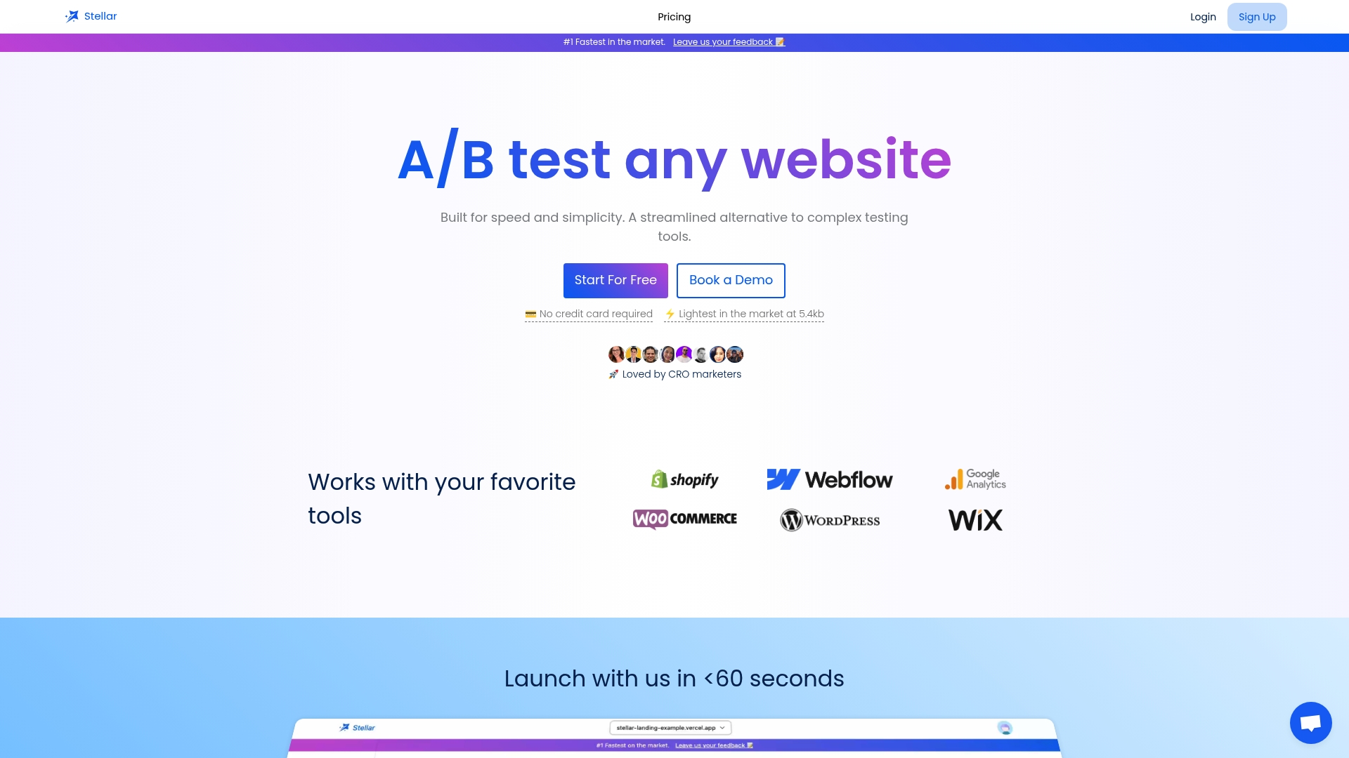
A few specifics that align with the checklist in this guide include features such as dynamic keyword insertion to automatically match headlines to visitor search terms, advanced goal tracking linking test results to meaningful conversion events, real-time analytics updating as data arrives, and integrations with popular site builders to simplify setup.
If you want to try this on a live page without commitment, our Sandbox plan is free for businesses tracking under 25,000 monthly users, and it is a practical way to see whether a lightweight testing setup fits your workflow before moving to a paid tier.
FAQ
What is a SEO optimized landing page?
An SEO optimized landing page targets a single keyword or search intent, uses that focus in its headline and meta tags, and structures its content with clear headings so search engines and AI tools can understand the offer quickly. SEMrush recommends this single-focus approach specifically because it helps both traditional search ranking and newer AI-driven search results.
What is an optimal landing page structure?
An optimal structure leads with a headline that matches the traffic source, followed by a clear value proposition, a single prominent CTA above the fold, supporting trust signals near the decision point, and a simplified form with only essential fields. Removing the site navigation from this structure has produced a conversion lift of up to 28% in reported A/B tests.
How do you optimize landing page experience?
Optimizing landing page experience starts with matching your page content to your ad's call to action and offer, since Google Ads ties this relevance directly to Quality Score. From there, reducing form friction using principles like structure, transparency, clarity, and support, as outlined by NN/g, improves completion rates further.
What two actions are needed to optimize a landing page?
The two highest-impact actions are aligning your page message with your traffic source, so the headline mirrors what the ad or link promised, and simplifying your primary CTA and form to remove unnecessary fields and distractions. Together these two changes typically produce the largest gains before any visual redesign work.
Sources
- Few Guesses, More Success: 4 Principles to Reduce Cognitive Load in Forms - NN/g
- Optimize your ads and landing pages - Google Ads Help
- Landing Page Optimization Tips for Your Online Store (2026) - Shopify
- Landing page optimization guide - SEMrush
Recommended
Published: 10/7/2026