
Conversion Rate Optimization: A Safer 30–60 Day Plan for Marketers
Focus on your highest-traffic, highest-value pages first, then pair prioritized UX fixes with A/B testing. Conversion rate is simply conversions divided by visitors, multiplied by 100, and even a small lift compounds across your existing traffic without requiring a bigger marketing budget.
TL;DR:
- Rank pages by traffic volume and revenue potential, then score impact and effort from 1 to 5; prioritize high traffic checkout pages with quick fixes.
- Set a hypothesis and sample size from baseline conversion and minimum detectable lift, then run one to two weeks without stopping early.
- Only about 2% of leading US and European ecommerce sites earn a good checkout usability rating; offer guest checkout and reveal shipping and taxes early.
- Meet performance targets of LCP at 2.5 seconds or less, INP below 100 milliseconds, and CLS below 0.1, especially on mobile.
- Use A/B tests for moderate traffic; multivariate tests need eight times the traffic when testing three elements with two variations each.
Table of Contents
- Core metrics and why conversion optimization matters
- Proven strategies: prioritized tactics from high-impact to tactical
- Prioritize and test: an experimentation framework for A/B testing
- Landing pages and CTAs that earn the click
- Checkout and form optimization for ecommerce and lead gen
- Measurement and attribution: what to track and avoid
- Technical performance: Core Web Vitals and conversion impact
- Personalization and segmentation for relevance
- A performance-first platform for running this playbook
- Multivariate testing versus A/B testing
- Integrating CRO with marketing automation and CRM systems
- User behavior analysis: heatmaps, recordings, and surveys
- Mobile conversion rate optimization strategies
- What to prioritize this quarter
- Start testing your highest-impact page this week
- FAQ
- Sources
Core metrics and why conversion optimization matters
The math behind optimizing conversion rates is simple, but it's worth spelling out before you touch a single page. Conversion rate equals conversions divided by total visitors, multiplied by 100.
What counts as a "conversion" changes by page type: a purchase on a product page, an email signup on a blog post, a demo request on a pricing page. Average order value (AOV) and revenue per visitor (RPV) round out the picture, since a higher conversion rate on low-value traffic can still underperform a modest rate on high-intent visitors.
Lifting the rate to 2.5%, a modest and common target, pushes revenue to $75,000 with zero added traffic spend.
Benchmark ranges vary widely by industry and channel, which is why HubSpot's 2026 CRO guide stresses prioritizing tests on high-impact pages rather than chasing an industry average that may not apply to your funnel. Paid search traffic typically converts differently than organic or email traffic, so segment your baseline before setting a target.
- Conversion rate = (conversions ÷ visitors) × 100, measured per page or funnel step.
- AOV tells you whether a conversion is actually worth chasing.
- Revenue per visitor combines both metrics into a single prioritization signal.
- Channel-level benchmarks vary enough that a blended site average can mislead you.
Proven strategies: prioritized tactics from high-impact to tactical
Not every page deserves equal attention. Start by multiplying traffic volume by revenue potential to find pages where a conversion lift produces the biggest dollar impact, then run a quick impact times effort score (1 to 5 on each) to rank your backlog. A high-traffic checkout page with a one-line copy fix will usually beat a low-traffic blog post redesign, even if the redesign looks more impressive.
Once you've ranked your pages, work through tactics in roughly this order of typical impact:
- Clarify the headline and value proposition. Visitors decide whether to stay within seconds, so the headline should state the specific outcome, not a vague brand tagline.
- Rewrite CTA language and reposition buttons. Swap generic phrases like "Submit" for action-specific language like "Get my quote," and test placing the CTA above the fold versus after a short trust section.
- Add social proof near the decision point. Customer counts, review snippets, or client logos placed next to the CTA reduce hesitation at the exact moment it matters.
- Introduce appropriate urgency. Limited-time offers or low-stock indicators work when they're accurate, since fabricated scarcity erodes trust over repeat visits. A FOMO popup generator can surface real-time social proof notifications without engineering work.
- Reduce the number of decisions per page. A pricing page with five tiers and ten add-ons creates decision fatigue; narrowing choices or recommending a default plan usually lifts completion rates.
- Build single-goal landing pages. A page built for one campaign with one CTA consistently outperforms a general page asked to serve multiple traffic sources.
- Tighten microcopy around form fields and buttons. Small clarifications, like explaining why you need a phone number, reduce abandonment at the margin.
- Fix visual hierarchy. Make sure the eye travels from headline to supporting detail to CTA without competing elements pulling attention sideways.
Our internal CRO checklist walks through this same prioritization logic with quick-win templates you can adapt page by page.
When deciding which element to test first, favor changes with the most views and the least implementation friction: headline and CTA copy can often ship same-day, while layout overhauls require design and engineering time. A peer-reviewed framework for digital retailers found that combining company, customer, and statistical perspectives to identify sales-influencing touchpoints produces better prioritization than testing ideas in isolation, with Bayesian regression evidence supporting the approach.
Pro Tip: Test one variable at a time on your highest-traffic page before testing multiple variables on lower-traffic pages, so your first wins build organizational confidence in the process.
Prioritize and test: an experimentation framework for A/B testing
Every experiment starts with a hypothesis, not a hunch. A workable template reads: "Because [observation or data point], we believe changing [specific element] will [expected direction of change] on [primary metric], because [reasoning]." Writing it this way forces you to name your primary metric before you launch, which prevents retroactively picking whichever number moved.
Before launching, run a sample-size check. Firebase's A/B testing documentation recommends planning sample size around your baseline conversion rate and minimum detectable effect, since underpowered tests produce noisy results that look like wins or losses by chance.
Once data starts coming in, resist the urge to call a winner the moment the needle crosses significance. Firebase's guidance emphasizes reading confidence intervals and point estimates together rather than fixating on a single p-value, because a p-value alone doesn't tell you the size or reliability of the effect. Checking results daily and stopping as soon as they look good, commonly called peeking, inflates your false-positive rate.
- Write the hypothesis before you build the variant, not after.
- Calculate minimum sample size using your baseline rate and the smallest lift worth detecting.
- Watch secondary and guardrail metrics (bounce rate, average order value) so a win on one metric isn't hiding a loss elsewhere.
- Let the test run a full business cycle, typically one to two weeks minimum, before evaluating results.
A peer-reviewed framework for digital retailers found strong statistical support for touchpoint-based prioritization, with Bayesian regression evidence reinforcing that structured, data-backed test selection outperforms ad-hoc experimentation.
Landing pages and CTAs that earn the click
The hero area of a landing page carries most of the conversion weight, so it deserves a checklist of its own. Above the fold, you need a headline stating the specific benefit, a subheadline that adds a credibility detail, a visible CTA, and a trust signal like a review count or client logo. Skip any one of these and visitors scroll away before you've made your case.
CTA testing deserves its own iteration cycle. Commitment-based phrasing ("Start my free trial") often outperforms passive phrasing ("Submit"), and removing competing links or navigation from a dedicated landing page keeps attention on the single goal. Our guide to designing effective landing pages covers layout patterns worth testing against your current template, and a partner breakdown on crafting effective CTAs for 2026 digs further into wording variations if you want more test ideas.
Micro-interactions matter more than most teams assume:
- Inline form validation flags errors as users type instead of after submission, cutting frustration at the exact friction point.
- Hover and focus states on buttons signal interactivity and reduce hesitation clicks.
- Progress indicators on multi-step forms set expectations and reduce mid-flow abandonment.
- Instant visual feedback after a click (a loading state, a confirmation checkmark) reassures visitors the action registered.
Our complete guide to A/B testing for landing pages walks through setting up and reading these tests end to end, and our list of 10 A/B testing ideas for landing pages gives you a starting backlog if you're short on ideas.
Checkout and form optimization for ecommerce and lead gen
Checkout is where conversion optimization pays off fastest, because visitors here have already decided to buy. Baymard Institute's checkout research finds that most ecommerce checkouts are mediocre, with only about 2% of leading US and European sites earning a "good" usability rating, which means most sites are leaving recoverable revenue on the table.
A practical roadmap for fixing checkout:
- Ship quick wins first. Offer guest checkout, display full cost (including shipping and tax) before the final step, and allow users to edit their cart without leaving the flow.
- Tackle medium-term fixes. Reduce form fields to only what's necessary for fulfillment, and add adaptive inline error messages that explain exactly what needs correcting.
- Plan longer-term redesigns. Restructure multi-page checkouts into a shorter flow once you've validated which friction points matter most through testing.
Before investing engineering time, isolate how much abandonment is actually UX-caused versus driven by price sensitivity or shipping cost shock. Baymard's cart abandonment research breaks down common causes like unexpected extra costs and mandatory account creation, which helps you build a defensible revenue-upside estimate before pitching the fix to stakeholders. Our ecommerce checkout optimization guide goes deeper into sequencing these fixes for 2026 traffic patterns.
Measurement and attribution: what to track and avoid
Your experiment results are only as trustworthy as your instrumentation. Pick one primary metric per test, tied directly to your hypothesis, and choose two or three secondary guardrail metrics that would reveal a hidden cost, like a lift in signups paired with a drop in paid conversions.
Attribution traps are easy to fall into when multiple campaigns or tests run simultaneously. Overlapping experiments on the same page can contaminate each other's results, and misconfigured event tracking (duplicate fires, missing conversion events on mobile) silently distorts your numbers before you even look at statistical significance.
- Define your primary metric and guardrails before launch, not after reviewing early results.
- Audit event tracking for duplicate fires or missing conversions, especially across device types.
- Use feature flags to roll out winning variants incrementally rather than flipping 100% of traffic at once.
- Validate that your analytics and experimentation tool agree on visitor counts before trusting either one.
Incremental rollouts also function as a safety net: if a winning variant underperforms at scale, you catch it before it's live for your entire audience. This discipline matters more as teams run more simultaneous tests, since uncaught instrumentation errors compound across every experiment built on faulty baseline data.
Technical performance: Core Web Vitals and conversion impact
Page speed isn't a developer's side concern, it's a direct lever on your conversion rate. The widely used performance targets are an LCP (Largest Contentful Paint) of 2.5 seconds or faster, an INP (Interaction to Next Paint) under 100 milliseconds, and a CLS (Cumulative Layout Shift) score below 0.1. Pages that miss these thresholds tend to see measurable drops in conversions as visitors abandon slow-loading or visually unstable pages.
Practical fixes marketers should push for:
- Compress and lazy-load images below the fold.
- Defer noncritical JavaScript so it doesn't block the initial render.
- Audit and trim third-party scripts, since each added tag adds load time.
- Choose testing and analytics tools with a lightweight script footprint to avoid adding your own performance drag.
A lightweight script matters more than it sounds: every additional kilobyte on a page competes directly against your Core Web Vitals targets, and testing tools are often among the heaviest third-party scripts on a page.
Perceived performance techniques help bridge the gap while heavier assets finish loading. Skeleton screens and instant feedback states give visitors a sense of progress, which reduces perceived wait time even when actual load time hasn't changed.
Personalization and segmentation for relevance
Personalization works best when it starts simple. Segment visitors first by traffic source, campaign, and new-versus-returning status before attempting anything more granular, since these three dimensions usually explain the largest behavioral differences with the least setup effort.
From there, tactical personalization options include dynamic headlines that reflect the keyword or campaign a visitor arrived from, product recommendations based on browsing history, and progressive profiling that asks for one additional piece of information per visit instead of a long form upfront. Dynamic keyword insertion on landing pages is a low-effort way to make paid traffic feel like it landed on a page built specifically for that search.
- Segment by source, campaign, and visitor type before anything more complex.
- Use dynamic headlines to match ad or search intent to landing page copy.
- Apply progressive profiling instead of front-loading every form field.
- Check that each personalized segment still has enough traffic to reach statistical significance before calling a result.
Guard against over-fragmenting your experiments: splitting traffic into too many segments spreads your sample thin and delays the point where any single test reaches reliable significance. If you're optimizing for mobile app installs alongside web conversions, tools like Apptenium's ASO platform can help you extend this same segmentation thinking into app store listing performance.
A performance-first platform for running this playbook
Running the playbook above requires a tool that doesn't slow down the pages you're trying to improve. We built Gostellar around a 5.4KB script specifically so experiments don't become the performance problem they're meant to fix. The no-code visual editor lets you build and launch variants without pulling in engineering time, dynamic keyword insertion personalizes landing pages automatically, and advanced goal tracking paired with real-time analytics means you see results as they happen rather than waiting on a weekly report. A free tier is available for businesses under 25,000 monthly tracked users, so you can start immediately.
A workable 30 to 60 day plan:
- Week 1-2: Audit your highest-traffic pages for quick technical and copy fixes.
- Week 3-4: Launch three prioritized tests on your top pages using the impact times effort framework.
- Week 5-8: Review results, ship winners, and roll the next batch of tests into your backlog.
Multivariate testing versus A/B testing
A/B testing compares two full versions of a page against each other, changing everything between variant A and variant B as one bundled difference. Multivariate testing instead changes several elements independently within the same test, say headline, image, and CTA color at once, then measures which combination of those elements performs best together.
The tradeoff comes down to traffic volume. A/B tests reach statistical significance faster because they split traffic into only two groups, making them the right default for most small to medium-sized sites. Multivariate tests split traffic across every possible combination of your variables, so a test with three elements at two variations each needs eight times the traffic of a simple A/B test to reach the same confidence level.

Use A/B testing as your default, especially on pages with moderate traffic or when you're testing a single clear hypothesis. Reserve multivariate testing for very high-traffic pages where you specifically need to understand how elements interact with each other, rather than simply which full-page version wins. Most marketing teams run far more A/B tests than multivariate tests simply because the traffic math favors it.
Integrating CRO with marketing automation and CRM systems
Conversion data gets more valuable once it connects to what happens after the conversion. If a landing page variant lifts form submissions but the leads it generates close at a lower rate in your CRM, you haven't actually improved anything that matters to revenue. Connecting your experimentation platform to your CRM or marketing automation tool closes that loop.
Practical integration points include passing experiment variant data into your CRM as a lead attribute, so sales and marketing can see which test group a lead came from, and triggering automated nurture sequences based on which landing page variant a visitor converted on. This lets you measure downstream outcomes, like close rate or lifetime value, not just the top-of-funnel conversion event.
This kind of integration also protects you from a common mistake: optimizing for a conversion event that's easy to move but disconnected from revenue. A form that converts more visitors but generates lower-quality leads isn't a win, it's a trade you haven't fully evaluated yet. Checking automation and CRM data periodically against your test results keeps your experimentation program honest about what actually drives revenue.
User behavior analysis: heatmaps, recordings, and surveys
Quantitative data tells you what happened; behavioral analysis tells you why. Heatmaps show where visitors click, move their cursor, and how far they scroll, which quickly reveals whether your CTA is getting seen at all or buried below the fold on most screen sizes.
Session recordings go a step further by replaying individual visitor sessions, surfacing moments of hesitation, repeated clicks on non-interactive elements, or rage clicks that signal frustration. These recordings are especially useful after a test shows a surprising result, since watching a handful of sessions often reveals the mechanism behind a win or a loss that the numbers alone don't explain.
User surveys and on-page polls fill in the gap that behavioral data can't: the visitor's actual reasoning. A simple exit-intent survey asking why someone didn't complete a purchase can surface a concern, like unexpected shipping costs, that would otherwise take weeks of testing to isolate. Combining all three methods, heatmaps for where, recordings for how, surveys for why, gives you a far stronger basis for writing test hypotheses than any single method alone.
Mobile conversion rate optimization strategies
Mobile visitors behave differently from desktop visitors, and treating mobile as a smaller version of your desktop site usually leaves conversions on the table. Thumb-friendly tap targets, sized generously enough to avoid mis-taps, matter more on mobile than almost any other single design factor.
Forms need particular attention on mobile: use appropriate input types so the correct keyboard (numeric, email) appears automatically, and minimize the number of fields visible at once since mobile screens punish long forms more harshly than desktop. Sticky CTAs that stay visible while scrolling tend to outperform CTAs that require scrolling back up to find.
Page weight matters even more on mobile connections, which is part of why Core Web Vitals thresholds carry extra weight for mobile traffic specifically. A page that loads acceptably on desktop broadband can feel sluggish on a mobile connection, and that gap shows up directly in mobile conversion rates. Testing mobile and desktop experiences separately, rather than assuming a desktop win will replicate on mobile, catches these differences before they cost you conversions.
What to prioritize this quarter
If your team has limited bandwidth, spend the first two weeks auditing your three highest-traffic pages, not redesigning them yet. Fix anything broken or confusing, then move straight into a test cadence of one experiment per page per month minimum.
When presenting ROI to stakeholders, skip the vanity metrics and show the simple math: current visitors times current rate times AOV versus the same equation at your target rate. The gap is your pitch.
Pro Tip: Resist testing five changes on one page at once. Broad tests take longer to reach significance and tell you less about what actually worked.
— Juan
Start testing your highest-impact page this week
We built our platform to be a fast way to go from idea to live experiment: a small script, a no-code visual editor, dynamic keyword insertion, and real-time goal tracking, with a free tier available for sites under 25,000 monthly tracked users.
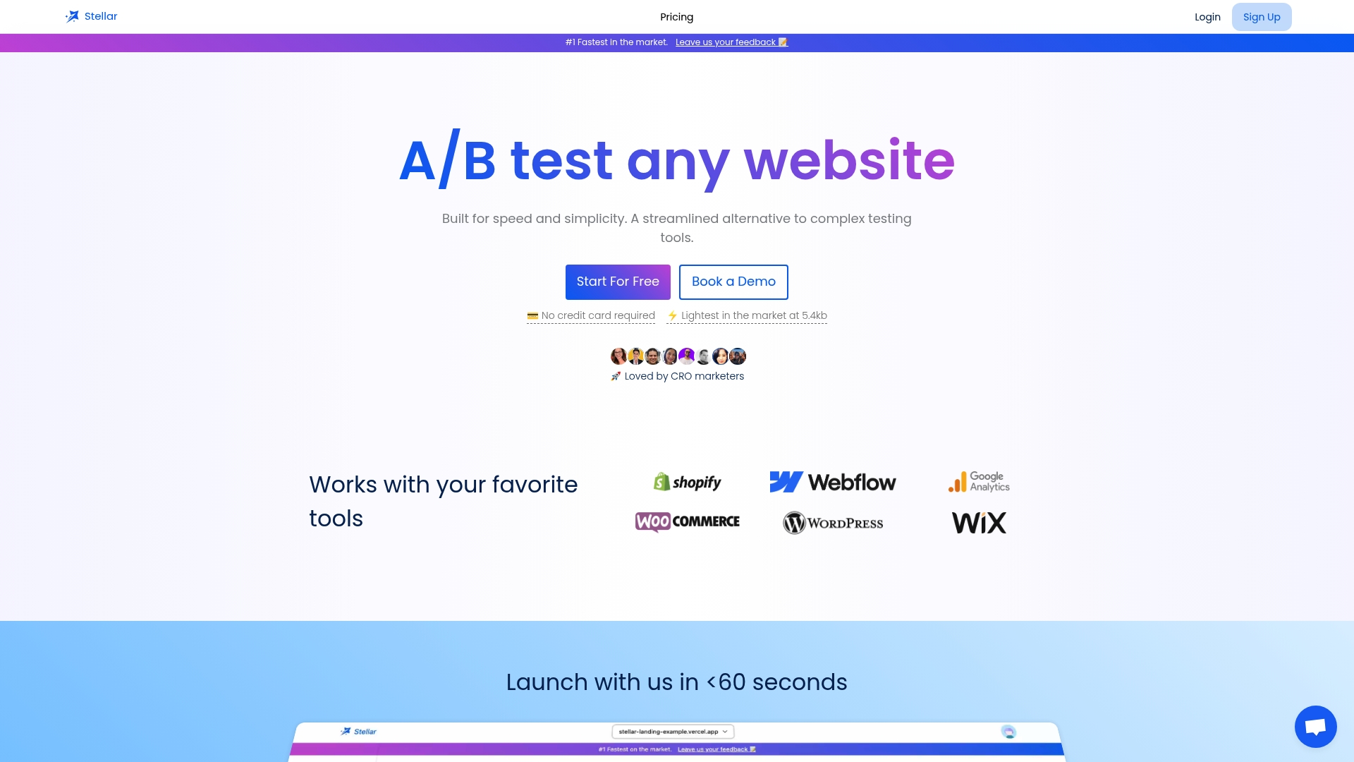
The fastest path to a measurable lift is picking your single highest-traffic landing page and running one well-powered test against it this week, using the prioritization and sample-size guidance above to pick a change worth testing. You can set up your first experiment on Gostellar and have a variant live before your next team meeting.
FAQ
How do you optimize conversion rates?
Prioritize your highest-traffic, highest-value pages, then run well-powered A/B tests on changes most likely to move your primary metric, like headlines, CTA copy, and checkout friction. Measure results against a clear hypothesis and confidence interval rather than a single point estimate, and ship winners incrementally while watching guardrail metrics.
How to maximize conversion rates?
Maximizing conversion rates comes from stacking small, validated wins rather than chasing one big redesign. Combine technical fixes like faster load times, clearer value propositions, and reduced checkout friction with a steady cadence of A/B tests, since HubSpot's 2026 CRO guide points to this prioritized, test-driven approach as more durable than one-off overhauls.
Is conversion rate optimization worth it?
Yes, because a small percentage lift on existing traffic scales revenue without added acquisition cost, and a peer-reviewed framework for digital retailers found statistically strong evidence that structured, touchpoint-based optimization increases sales. It also becomes more valuable as organic traffic growth slows, since converting the visitors you already have costs less than acquiring new ones.
What are the six primary elements of conversion rate optimization?
Definitions vary across sources, but a common version includes value proposition clarity, call-to-action design, trust and social proof, page and checkout usability, technical performance, and continuous testing and measurement. Teams typically prioritize these based on which page type and traffic source they're optimizing.
What should I check before choosing a CRO tool?
Look for a lightweight script that won't drag down your Core Web Vitals, a no-code editor your team can use without engineering support, and clear goal tracking tied to real-time analytics. Confirm the pricing tiers match your traffic volume so you're not paying for capacity you don't need.
Sources
- Checkout UX Best Practices 2025 – Baymard Institute
- Conversion rate optimization (CRO) strategy for 2026
- Developing a conversion rate optimization framework for digital retailers—case study - PMC
- A/B testing concepts — Firebase
Recommended
Published: 10/8/2026