
90 Day Test First Landing Page Optimization for CRO Teams
Landing page optimization is the process of improving a page's message, layout, speed, and forms to convert more of its existing traffic, without spending another dollar on acquisition. The three moves that matter most, in order: make the headline match what the ad or email promised, get the page loading fast on mobile, and simplify your form fields to the essential ones. A marketing manager or CRO lead should own this loop, not a developer working from a ticket queue.
TL;DR:
- Matching the headline, subheadline, and hero image with the ad promise is crucial; even a five-minute message match check can significantly boost conversions.
- Implementing sticky call-to-action buttons and reducing form fields to three or fewer substantially increases conversion rates across many pages.
- Prioritizing mobile performance by achieving sub-two-second load times can meaningfully lift mobile conversion, especially for traffic making up the majority of visitors.
- Running controlled A/B tests on large, high-traffic pages with a clear hypothesis and full-cycle duration yields trustworthy insights about what truly moves the conversion needle.
- Using no-code testing tools that load lightly and provide real-time analytics accelerates experimentation, reduces engineering bottlenecks, and makes iterative landing page improvements feasible at scale.
Table of Contents
- What Is Landing Page Optimization and Why It Matters?
- The LPO Loop: Message Match, QA, Tracking, and Testing
- A Prioritized Checklist of Landing Page Best Practices
- Forms, CTAs, and Reducing Friction Without Losing Lead Quality
- Mobile and Performance: The Fixes That Move Conversion Rate
- How to Run A/B and Multivariate Tests That Actually Hold Up
- Measuring What Actually Matters After You Test
- Stellar in Practice: Faster Experiments, Fewer Engineering Bottlenecks
- Why Persuasion Techniques Still Beat Pure Design Polish
- Segmenting and Personalizing Landing Pages by Visitor Type
- Tools and Software Worth Considering for Landing Page Optimization
- Common Mistakes That Quietly Sabotage Landing Page Optimization
- A 90-Day Roadmap for CRO Teams
- Try a Faster Way to Run Your Landing Page Experiments
- Sources
What Is Landing Page Optimization and Why It Matters?
Landing page optimization (LPO) sits inside the broader discipline of conversion rate optimization (CRO), but it's narrower and more tactical. CRO covers your entire funnel, from ad to checkout to retention email. LPO focuses on one page and one job: turning a visitor who already clicked into someone who converts, whether that means filling a form, booking a demo, or completing a purchase.
The reason this matters more than most marketing tasks is arithmetic, not opinion. Improve the page and your return on ad spend (ROAS) moves without touching your media budget at all. That's the entire pitch for treating LPO as a priority rather than an afterthought.
Benchmarks vary sharply by funnel type, and comparing your page against the wrong one is a common way teams misjudge their own performance. A 2,000-page conversion study found:
- B2B SaaS landing pages have a median conversion rate typical for their funnel type
- Direct-to-consumer (DTC) product pages have a median conversion rate typical for their funnel type
- Webinar registration pages have a higher median conversion rate reflecting their type of funnel
Those gaps exist because the psychological distance between click and conversion differs by category. Registering for a free webinar asks almost nothing of the visitor. Buying a $200 product or booking a sales call asks a lot more, and the conversion rate reflects that friction. Other industry benchmarking, including Unbounce's landing page tips, reinforces the same point: median conversion rates cluster in the low-to-mid single digits for most commercial funnels, with webinars and free-trial offers as the outliers on the high end.
Google's own guidance backs this framing from the advertiser side. Its Ads help documentation recommends landing pages that closely match the ad and keyword that brought the visitor there, load fast on mobile, and offer an obvious next step. That's not a design preference. It directly affects your Quality Score and what you pay per click.
The LPO Loop: Message Match, QA, Tracking, and Testing
Landing page optimization works best as a repeatable sequence, not a one-off redesign sprint. Teams that treat every campaign as a fresh creative exercise burn time relearning lessons they already paid for. Teams that run the same loop every time compound their wins.
Here's the sequence, based on the operating process outlined in Leadpages' guide to landing page optimization:
- Message match audit. Before anything else, confirm the headline, subheadline, and hero image echo the exact promise made in the ad, email subject line, or search query that drove the click. A mismatch here kills conversion before a visitor even scrolls.
- Pre-launch QA. Test every form field, every tracking pixel, and every link on desktop and mobile before traffic hits the page. A broken form on launch day is the most expensive bug in marketing because it silently burns ad spend while looking fine in a quick glance.
- Tracking setup. Confirm your analytics platform fires a conversion event correctly, tagged with UTM parameters that identify the traffic source, campaign, and creative variant.
- Prioritized testing. Start with the highest-friction element, usually the offer or the form, not a button color.
- Lead quality review. Check that the leads or sales coming through actually match your ideal customer profile, not just your conversion count.
Message match and QA are the cheapest steps in this entire loop, and they're also the ones most often skipped under deadline pressure. A five-minute check of ad copy against headline copy costs nothing and routinely catches the single biggest conversion killer on the page: a visitor who clicked expecting one thing and landed on something else.
Lead quality deserves its own line item because conversion rate alone can lie to you. A landing page redesign that adds a "free trial" framing might spike your form-fill rate while quietly filling your pipeline with people who were never going to buy. Track downstream metrics, not just the top-of-funnel number, and revisit the 15-minute audit checklist when you need a fast gut check between full campaign reviews.
Pro Tip: Run your message match audit out loud. Read the ad copy, then read the headline. If you'd have to explain to a stranger why they're related, the visitor will feel that same disconnect and bounce.
A Prioritized Checklist of Landing Page Best Practices
Not every fix on a landing page carries equal weight. Some changes move conversion by a fraction of a percent. Others move it by double digits. The checklist below is ordered by leverage, starting with the items that reliably produce the biggest lifts across the widest range of pages.
Message match and above-the-fold clarity
The first five seconds on a landing page decide most of the outcome. A visitor needs to answer three questions without scrolling: what is this, is it for me, and what do I do next. If your headline doesn't repeat the language from the ad or search query that got the click, you've already lost a meaningful share of visitors. This is the single most important rule in Google's landing page guidance, and it's also the cheapest one to fix, since it's a copy change, not a rebuild.
Above-the-fold clarity means your value proposition, a supporting line of context, and your primary CTA are all visible before any scrolling happens. Everything else, including secondary features, extended proof, and FAQs, belongs below the fold.
CTA placement and the sticky CTA tradeoff
A landing page should have one primary call to action, repeated in visual style but never contradicted by a second, competing offer. The 2,000-page study found sticky CTAs, meaning a button that stays visible as the visitor scrolls, produced an average 11% lift, compared to a 6% lift from simply placing a CTA above the fold and leaving it there.
That gap matters for how you sequence your tests. If you can only run one CTA experiment this quarter, run the sticky version first. Stacking both, a sticky CTA and a separate above-the-fold CTA competing for attention, rarely doubles the benefit. The research pool behind that study notes it can actually create layout friction, since visitors now have two decision points instead of one clear path.
Hero pattern: single stat vs image vs video
The hero section is prime real estate, and teams often default to a large lifestyle photo or an autoplay video because it looks polished in a design review. The data says otherwise for a meaningful share of pages.
The mechanism is specificity. A stock photo of people smiling at laptops tells the visitor nothing concrete. A specific number, especially one tied to a real outcome, gives them a reason to keep reading. Video heroes can work, particularly for products that are hard to explain in text, but they carry a real cost: added page weight, which drags down load time, the exact metric covered in the mobile and performance section below.
Social proof that's specific, not generic
Generic logo strips ("Trusted by leading brands") have become wallpaper. Visitors scroll past them without registering a single name. The insight from the conversion study is that named-customer social proof, meaning a specific company name tied to a specific, quantified result, consistently outperforms vague trust badges.
By the numbers: Across 2,000 tested landing pages, single-stat heroes and named-customer proof points were consistently among the highest-performing patterns, and sticky CTAs delivered roughly 11% lifts versus 6% for static above-the-fold placement.
Formats worth testing, in rough order of impact:
- A named customer quote paired with a specific metric ("Acme Corp cut support tickets by 30% in six weeks")
- Revenue or scale context that signals credibility ("Used by teams managing $50M+ in annual ad spend")
- Third-party review scores with the platform named (a specific G2 or Capterra rating, not just stars)
- Case study links that go one layer deeper for visitors who need more convincing before converting
- Media mentions, but only from outlets your specific audience actually recognizes
Layout, navigation, and reducing exit paths
A landing page built for a paid campaign should have no main site navigation. Every link that isn't the primary CTA is an exit ramp, and visitors take them more often than most marketers expect. Removing the header nav alone often produces a measurable lift, because it eliminates the easiest possible way to leave without converting.
Keep the layout scannable: short paragraphs, a benefit-driven subheadline under every section header, and enough white space that the page doesn't feel like a wall of text on a phone screen. Design principles like these are covered in more depth in Gostellar's guide to designing effective landing pages, which walks through layout hierarchy for teams building from scratch.
Forms, CTAs, and Reducing Friction Without Losing Lead Quality
Every field you add to a form is a small tax on your conversion rate. The question isn't whether to reduce fields, it's how far you can go before the leads coming through stop matching what your sales team can actually close.
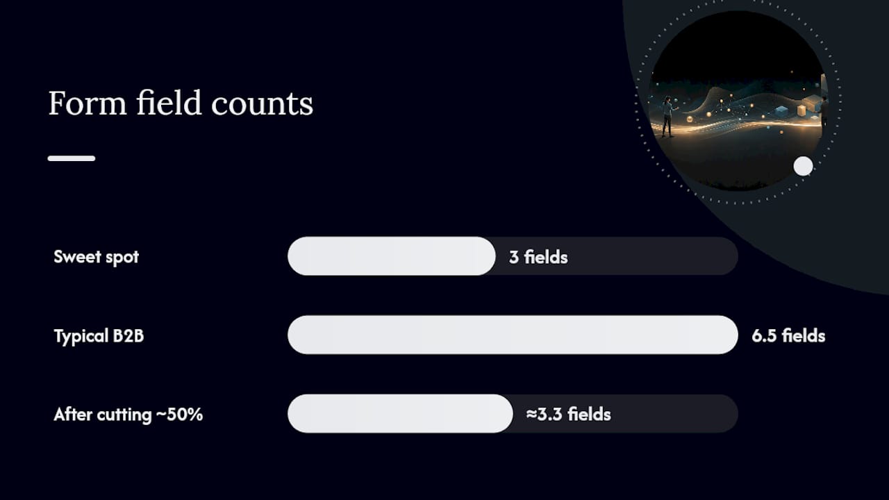
Research on form field counts points to three fields as a common sweet spot for many lead-gen contexts, typically name, email, and one qualifying question. That's a meaningful drop from the five-to-eight-field forms still common on B2B landing pages, and the same research suggests roughly half the fields in a standard form flow are often unnecessary to the actual sales process.
Fields worth cutting first, since they rarely improve lead quality enough to justify the friction:
- Company size dropdowns, when your CRM can infer this from the email domain
- Phone number, unless your sales process genuinely requires a call as the next step
- Job title free-text fields, better handled as a short dropdown or skipped entirely
- "How did you hear about us," which UTM tracking already answers more accurately
Progressive profiling solves the tension between short forms and rich data. Instead of asking for everything up front, capture the minimum on the landing page, then ask follow-up questions on a thank-you page, in a nurture email, or during onboarding. You get the conversion now and the data later, without forcing a visitor to complete a long form before they've decided you're worth their information.
CTA copy is worth its own testing track, separate from field count. Generic verbs like "Submit" or "Learn More" underperform CTAs that state the specific outcome ("Get My Free Audit," "Start My 14-Day Trial"). The partner guide on crafting effective CTAs covers copy patterns worth testing in more depth, including urgency framing and first-person phrasing.
Pro Tip: Test one CTA change at a time, not a full copy-and-color overhaul. If you change the wording, the placement, and the color in the same test, a lift tells you something worked, but not which part.
The most common mistake here is stacking CTAs with different intents on the same page: "Book a Demo" competing against "Download the Whitepaper" competing against "Start Free Trial." Each additional choice adds cognitive load and splits your traffic across offers you can't cleanly measure against each other. Pick one primary conversion goal per page and build everything around it.
Mobile and Performance: The Fixes That Move Conversion Rate
Page speed isn't a technical nice-to-have on a landing page; it's one of the most direct levers on conversion rate available to a marketing team, and it doesn't require a redesign to fix. Shopify's landing page optimization guidance notes that mobile traffic makes up the majority of landing page visits in many contexts, which means a page optimized for desktop and merely "responsive" on mobile is optimized for the minority of your actual visitors.
Largest Contentful Paint (LCP), the Core Web Vitals metric measuring how long it takes the main content to render, has become a standard benchmark for this reason. Treating mobile speed as a conversion lever rather than just a technical score is now standard practice among CRO teams working from current mobile optimization strategies.
Benchmark to aim for: A sub-2-second LCP on mobile is a common target among CRO teams treating page speed as a conversion metric, not just a technical score, per Shopify's landing page guidance.
A practical fix list, roughly ordered by effort versus payoff:
- Compress and lazy-load images below the fold; a hero image alone can account for a large share of total page weight
- Audit third-party scripts (chat widgets, heatmap tools, ad pixels) and remove any that aren't actively used
- Serve assets through a content delivery network (CDN) to cut latency for visitors far from your origin server
- Inline critical CSS so the above-the-fold content renders before the rest of the stylesheet loads
- Defer non-essential JavaScript until after the main content paints
Mobile-first layout rules matter as much as raw speed. Tap targets, meaning buttons and links, need enough size and spacing that a thumb doesn't miss and hit the wrong element; a common guideline is at least 44 by 44 pixels. Forms should use mobile-appropriate input types (a numeric keyboard for phone fields, an email keyboard for email fields) so filling them out doesn't feel like a fight with the device. Detailed technical fixes specific to load time live in Gostellar's guide to improving landing page performance, which is worth a read before your next sprint planning session if speed hasn't been audited recently.
How to Run A/B and Multivariate Tests That Actually Hold Up
Testing is where good landing page instincts get proven or corrected, and it's also where most teams waste time by running tests that never reach statistical validity or by testing the wrong thing first.
A/B testing compares two full versions of a page against each other, usually a control and one variant with a single meaningful change. Multivariate testing (MVT) tests multiple elements at once and measures interaction effects between them, for example headline variant A paired with CTA color 1 versus headline variant B paired with CTA color 2. MVT needs substantially more traffic to reach reliable conclusions, because you're splitting visitors across more combinations. As a rule, reserve multivariate testing for your highest-traffic pages, and default to A/B testing on large, single-element changes everywhere else, an approach reinforced by testing guidance drawn from the 2,000-page conversion study.
Here's a sequence for running a test that actually produces a trustworthy result:
- Write a real hypothesis. Not "test a new headline," but "changing the headline to match the ad's specific offer will increase form completions, because visitors are currently confused about what the page offers."
- Pick one primary metric. Conversion rate on your main goal, decided before launch, not chosen after the fact because it happened to move.
- Calculate a rough sample size. Even a simple online calculator using your baseline conversion rate and expected traffic tells you whether you'll reach significance in a reasonable window.
- Run the test for full business cycles. A test that only runs Monday through Wednesday misses weekend behavior; a full one-to-two week run, minimum, avoids that bias.
- Check for statistical validity before calling a winner. A lift that "looks" real after 200 visitors often disappears by visitor 2,000.
| Test type | Best for | Traffic needed | Typical duration |
|---|---|---|---|
| A/B test | Single large changes (headline, hero, offer) | Moderate | 1–2 weeks minimum |
| Multivariate test | High-traffic pages, interaction effects | High | 3–4+ weeks |
| Sequential single-variable tests | Low-traffic pages needing multiple learnings | Low to moderate | Ongoing, one change per cycle |
Sequencing matters as much as method. Test the biggest business levers first, meaning the offer, the price framing, or the core message, before you touch button colors or spacing. A headline change can move the ceiling of what's possible on a page; a button color rarely does. This is the same logic behind starting the LPO loop with message match rather than visual polish: business-impact changes should always come before micro-design tweaks.
Measuring What Actually Matters After You Test
Conversion rate is calculated as conversions divided by total visitors, but that single number can hide more than it reveals if you stop there. The first refinement every team should make is splitting conversion rate by traffic source.
Beyond the top-line rate, track downstream metrics that reflect actual business value:
- Lead-to-opportunity rate, to catch pages that inflate form fills with low-quality leads
- Cost per qualified lead, not just cost per form submission
- Time-to-conversion, since a page that converts fast versus one that requires multiple visits behaves differently in your funnel
- Bounce rate segmented by device, which often exposes a mobile-specific problem hiding inside a healthy overall number
UTM discipline underpins all of this. Every campaign, every ad variant, and every landing page version needs a consistent UTM tagging structure so your dashboard can actually attribute conversions to the change that caused them. A dashboard with clean events, page views, form starts, form completions, and the final conversion event, lets you see exactly where visitors drop off, rather than guessing based on the final number alone. Quantifying the impact of every fix, rather than debating design opinions in a meeting, is the difference between an LPO program that compounds over time and one that just cycles through redesigns.
Stellar in Practice: Faster Experiments, Fewer Engineering Bottlenecks
Most of the tactics above stall on the same bottleneck: getting a developer to implement the test. A headline change that should take ten minutes turns into a two-week wait in an engineering sprint, and by the time it ships, the campaign it was meant to fix has already ended.
A lightweight, no-code testing setup removes that step entirely. Stellar's script weighs just 5.4KB, light enough that adding it to a page doesn't create the load-time problem this guide just spent a section warning about. That matters because a testing tool that slows down your page is working against the exact metric it's supposed to help you improve.
A few ways this changes what a marketing team can do without engineering support:
- Build and launch a hero or headline variant through a visual editor, no code deployment required
- Use dynamic keyword insertion to auto-match the headline to the ad group or search query that drove the click, solving message match at scale
- Set advanced goal tracking on form completions or button clicks without adding new analytics tags manually
- Read results in a real-time dashboard instead of waiting for a weekly report
Quick experiments worth running in week one: a single-stat hero versus your current image hero, a sticky CTA versus your current static one, and a three-field form versus your existing longer version.
Why Persuasion Techniques Still Beat Pure Design Polish
A landing page can be visually flawless and still convert poorly if it doesn't tap into how people actually make decisions. Persuasion in LPO isn't about manipulation; it's about removing the hesitation that keeps an interested visitor from acting.
Social proof works because humans default to following the behavior of similar people when they're uncertain. That's why named-customer proof outperforms generic trust badges, as covered earlier: specificity signals that real people like the visitor already made this decision and it worked out.
Scarcity and urgency ("3 spots left this month," "Offer ends Friday") can lift conversion, but only when they're true. A countdown timer that resets every time a visitor refreshes the page destroys trust the moment someone notices, and it often takes exactly one screenshot on social media to notice.
Loss aversion tends to outperform pure gain framing in many contexts.
Authority signals, meaning credentials, certifications, or recognizable partnerships, work best when they're relevant to the specific decision at hand. A security certification badge matters enormously on a payment page and barely at all on a newsletter signup.
Reciprocity, giving something useful before asking for anything, is why free tools, calculators, and short guides often outperform a cold "request a demo" CTA for top-of-funnel traffic. The visitor gets value first, which lowers resistance to the ask that follows.
The mistake teams make is stacking every trigger onto one page at once. Pick the one or two that fit your specific offer and audience, and test them deliberately rather than layering on urgency, scarcity, and authority badges until the page feels like a late-night infomercial.
— Juan
Segmenting and Personalizing Landing Pages by Visitor Type
A single landing page trying to speak to every visitor usually ends up speaking clearly to none of them. Segmentation means building or adapting your page based on who's actually arriving, and it tends to produce some of the largest lifts available precisely because it attacks the message match problem at its root.
The simplest form of segmentation is traffic source based. A visitor coming from a comparison-focused search query has different needs than one clicking a retargeting ad after already visiting your site once. The first needs education and proof; the second often just needs a reminder and a clear CTA, since they've already done the research.
Dynamic keyword insertion takes this further by automatically swapping headline or subheadline text to match the specific search term or ad group that drove the click, without building a separate page for every variant. A visitor who searched "landing page software for Shopify" sees a headline referencing Shopify specifically, while a visitor who searched "landing page software for agencies" sees agency-specific language on the same underlying page.
Industry or role-based segmentation works well for B2B products with multiple buyer personas. A page that dynamically shows different social proof, a marketing case study for marketing visitors, a sales case study for sales visitors, tends to outperform a generic page trying to be relevant to both at once.
Returning-visitor personalization is the most underused tactic on this list. A visitor on their third visit doesn't need the same top-of-funnel explanation as a first-time visitor; showing them a more direct offer or skipping the education section entirely respects the fact that they've already been convinced of the basics.
Tools and Software Worth Considering for Landing Page Optimization
The right tool stack for landing page optimization covers three jobs: building and editing pages, running experiments, and analyzing results. Trying to force one tool to do all three often leaves a team compromising on at least one.
For building pages, a visual, no-code editor matters more than almost any other feature if your team doesn't have dedicated front-end development resources. The ability to launch a new hero variant or rewrite a headline without filing a developer ticket is what actually determines whether your testing cadence is weekly or quarterly.
For running experiments, look for a platform with a genuinely lightweight script. A testing tool that adds meaningful load time to your page is fighting against the exact conversion metric covered in the mobile and performance section, since a slower page converts worse regardless of how good the test hypothesis is. Advanced goal tracking, meaning the ability to track micro-conversions like scroll depth or video plays alongside the final conversion goal, helps you understand not just whether a variant won, but why.
For analysis, real-time dashboards beat weekly export-and-review cycles, particularly when you're running several tests across different campaigns simultaneously. Direct integration with the site builder you already use, whether that's WordPress, Shopify, Webflow, Wix, Squarespace, Framer, or Bubble, removes another layer of setup friction that otherwise delays every single test.
A data API matters more than most teams realize until they need it: once you're running LPO at scale across dozens of campaigns, pulling results into your existing reporting stack, rather than manually copying numbers into a spreadsheet, is what keeps the whole program sustainable.
Common Mistakes That Quietly Sabotage Landing Page Optimization
The most expensive mistakes in LPO rarely look like mistakes in the moment. They look like reasonable decisions made under time pressure.
Testing too many things at once. Changing the headline, the hero image, and the CTA color in the same test might produce a lift, but it tells you nothing about which change caused it, which means you can't apply that learning anywhere else.
Wait for a genuine business cycle and a defensible sample size before declaring victory.
Optimizing for conversion rate while ignoring lead quality. A form that's easier to fill out will almost always convert better; that doesn't mean the leads coming through are worth more to your sales team. Track downstream metrics, not just the top of the funnel.
Copying a competitor's landing page pattern without the context behind it. A hero pattern or CTA style that works for one company's audience, price point, and traffic source doesn't automatically transfer to yours. Test it as a hypothesis, not an assumption.
Ignoring mobile because desktop metrics look fine. When mobile makes up the majority of your traffic, a desktop-only review of a landing page is reviewing the minority experience while the majority quietly struggles.
Letting a page go stale. A landing page that hasn't been touched in a year, while your ad creative and audience have shifted underneath it, is running on assumptions that may no longer hold. Message match decays even when nobody redesigns anything.
A 90-Day Roadmap for CRO Teams
If you're starting from scratch, don't try to fix everything in the first month. Three projects, run in sequence, cover most of the leverage available on a typical landing page.
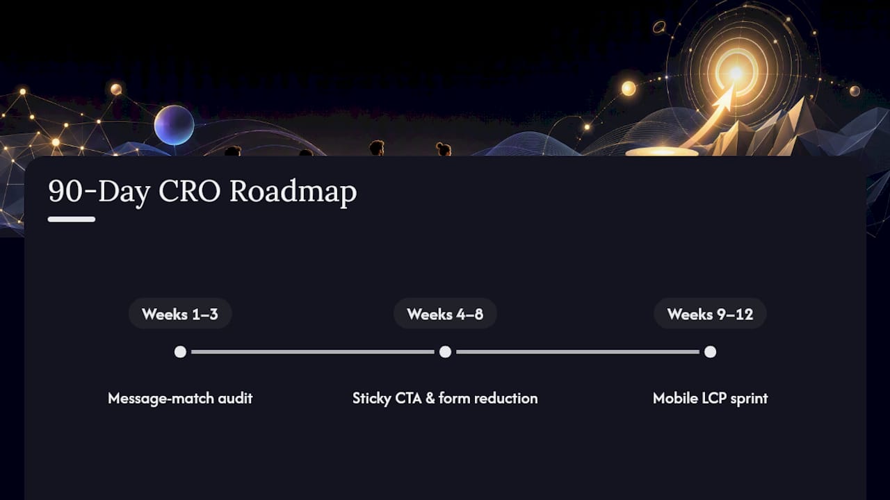
Weeks 1 to 3: message match audit. Pull every active ad and landing page pair, check headline alignment, and fix the mismatches first. This is the cheapest, fastest win available, and it should always come before any structural testing.
Weeks 4 to 8: sticky CTA and form reduction. Implement a sticky CTA and cut your primary form down to three fields if it currently runs longer. Run these as separate A/B tests, not a combined change, so you know which one actually moved the number.
Weeks 9 to 12: the 2-second LCP sprint. Hand your engineering team a focused, time-boxed project: get mobile LCP under two seconds. Pair this with the mobile-specific fixes covered earlier in this guide.
Assign one owner per project, not a committee, and set a single decision point at the end of each phase: did the metric move, yes or no. A marketing manager can usually run phases one and two without engineering support if the testing tool is lightweight enough. Phase three needs engineering time, so book it on the calendar early rather than hoping it fits into a future sprint.
Try a Faster Way to Run Your Landing Page Experiments
Every fix covered in this guide, message match, sticky CTAs, form reduction, hero variants, only pays off if you can actually ship the test without waiting on a development queue. That's the gap Gostellar closes: a 5.4KB script light enough that it won't undo the speed gains you just fought for, paired with a no-code visual editor that lets a marketer launch a headline or CTA variant the same day they think of it.
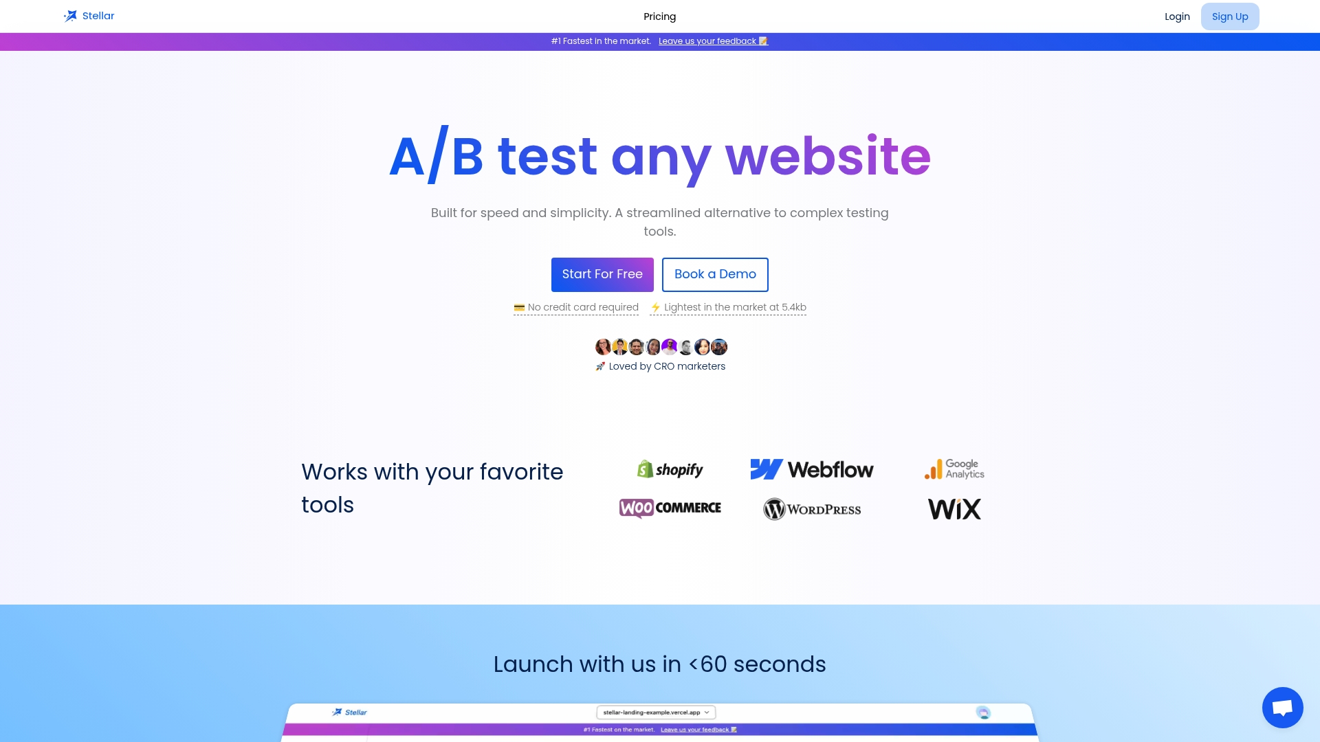
Dynamic keyword insertion handles the segmentation work covered earlier automatically, matching your headline to the ad group or search term that drove the click without building a separate page for every campaign. Advanced goal tracking and real-time analytics mean you're not waiting until Friday's report to know whether Tuesday's test is working. Gostellar connects directly with WordPress, Shopify, Webflow, Wix, Squarespace, Framer, and Bubble, so setup doesn't become its own project.
If your team is tracking under 25,000 monthly users, you can start testing on Gostellar's free plan today and run your first message match or sticky CTA experiment this week.
Sources
- Landing Page Conversion: 2,000 Pages Tested in 2026
- Landing Page Optimization Tips for Your Online Store (2026) - Shopify
- Optimize your ads and landing pages - Google Ads Help
Recommended
Published: 8/30/2026