
Mobile App UX Design: Best Practices for 2026
TL;DR:
- Effective mobile app UX design focuses on creating fast, thumb-friendly flows that deliver value quickly to reduce abandonment. Prioritize metrics like time-to-first-value, platform tap target sizes, and early usability testing to improve retention and engagement. Following platform guidelines, designing for real-world contexts, and iterative testing lead to better retention, user satisfaction, and revenue.
Mobile app UX design is the discipline of creating fast, thumb-friendly, context-aware flows that help users reach value quickly. Get it wrong, and a significant share of your users abandon the app after a single use. Get it right, and you see measurable lifts in day-1 retention, conversion, and long-term engagement.
Three things to act on immediately:
- Measure time-to-first-value. The single metric that predicts early retention better than almost anything else is how fast a new user reaches the moment the app was worth downloading. Nielsen Norman Group's mobile research consistently points to reducing friction in the first session as the highest-ROI fix.
- Follow platform minimums for touch targets. Apple HIG sets 44pt; Android Material Design sets 48dp. Anything smaller causes mis-taps, frustration, and drop-off.
- Test before you build. Running a usability test with five users at the wireframe stage catches up to 85% of major usability problems before a single line of production code is written.
The single measurable outcome to optimize first: get users to their first meaningful action within 60 seconds of opening the app.
Table of Contents
- What mobile app UX design actually is, and how it differs from UI
- Why mobile UX directly affects your retention and revenue
- How desktop and mobile design decisions actually differ
- Core mobile UX principles: a prioritized checklist
- Common mobile UX mistakes and how to catch them fast
- A practical mobile UX design process from research to iteration
- Research-backed benchmarks that should shape your 2026 priorities
- How to validate and measure mobile UX: analytics, testing, and experiments
- Which mobile UI/UX patterns should you use and when?
- Accessibility and inclusive mobile UX practices
- Performance and perceived speed: design tactics that make apps feel fast
- Platform-specific rules: Apple HIG, Material Design, and cross-platform advice
- How to build mobile user personas that actually reflect real usage
- Offline and poor connectivity UX strategies
- Handling different screen sizes and resolutions with adaptive design
- What microinteractions and animations actually do for mobile UX
- Security and privacy UX considerations on mobile apps
- Key Takeaways
- The part most teams get wrong about mobile UX prioritization
- Gostellar makes A/B testing your UX changes fast and low-risk
- Useful sources for deeper study
What mobile app UX design actually is, and how it differs from UI
UX and UI are not the same thing, and confusing them leads to misplaced effort. UX is the structure and behavior layer: the flows, information architecture, error states, empty states, and the logic of how a user moves from point A to point B. UI is the visual and interactive layer on top: colors, typography, icon styles, button shapes. A polished UI cannot rescue poor structural UX. If the flow is confusing or a critical state is missing, no amount of beautiful color work will fix it.
On mobile, UX carries extra weight because the constraints are harsher than on desktop.
- Thumb-driven input. Most users hold their phone one-handed, and 94% of mobile usage happens in portrait mode. Controls placed at the top of the screen are genuinely hard to reach.
- Intermittent connectivity. Users switch between WiFi, LTE, and dead zones constantly. Your app needs to handle degraded states gracefully.
- Limited screen real estate. Every element competes for space. Prioritization is not optional.
- Distracted context. Mobile users are rarely sitting at a desk with full attention. They are in line, on a commute, or glancing at the screen between tasks.
Authoritative references for mobile UX work include Nielsen Norman Group's mobile usability research, UXCam's mobile UX guide, Apple's Human Interface Guidelines, and Google's Material Design. These are not optional reading. They are the shared vocabulary your team and your users already expect.
| Dimension | UX (structure & behavior) | UI (visual & interactive layer) |
|---|---|---|
| Focus | Flows, IA, error states, task completion | Colors, typography, icons, animations |
| Key question | Can users reach their goal? | Does it look and feel right? |
| Primary tools | Flow maps, wireframes, usability tests | Style guides, component libraries, prototypes |
| Failure mode | Confusing navigation, missing states | Mismatched visuals, inconsistent spacing |
Why mobile UX directly affects your retention and revenue
Poor UX is not just an annoyance. It costs money. 25% of mobile apps are abandoned after a single use, with navigation friction, slow performance, and intrusive permission requests as the most common culprits. For an app with 100,000 downloads, that means 25,000 users who never came back.
The business metrics that matter most:
- Day-1 retention: What percentage of users return the day after install? This is the earliest signal of whether your onboarding delivered value.
- Time-to-first-value: How many taps and seconds does it take to reach the core action? Fewer is almost always better.
- Key flow completion rate: What share of users who start a checkout, signup, or core task actually finish it?
- Support ticket volume: A spike in tickets about a specific feature is a UX problem wearing a support hat.
A single UX change can move these numbers significantly. Apps that require registration or multiple setup steps before showing value lose many new users before those users understand what the product does. Removing a forced sign-up wall and letting users experience the core feature first is often the single highest-ROI change a team can make.
Tying UX work to these metrics gives product owners a language finance understands. "We improved the onboarding flow" is a project update. "We cut onboarding steps from six to three and day-1 retention went from 28% to 41%" is a business result.
How desktop and mobile design decisions actually differ
The instinct to port a desktop layout to mobile is understandable and almost always wrong. The differences go deeper than screen size.
- Input method. A mouse is precise; a thumb is not. Hover states, right-click menus, and small click targets all break on mobile.
- Attention and context. Desktop users tend to be task-focused in a stable environment. Mobile users are frequently distracted, interrupted, and time-constrained.
- Screen density. A desktop can show a full data table. Mobile needs progressive disclosure, collapsible sections, and ruthless content prioritization.
- Connectivity variance. Desktop apps usually assume a stable connection. Mobile apps cannot.
- Device capability spread. A high-end iPhone and a budget Android phone running the same app can have wildly different performance profiles.
The practical consequences show up in navigation (bottom tabs instead of top navbars), input design (large fields, smart keyboard types, autofill), and content density (one primary action per screen rather than a dashboard of options).
Pro Tip: Test on a real low-end Android device, not just the simulator. A $150 phone on a 3G connection will expose performance and interaction problems that never appear on a developer's MacBook.

Portrait-first design is not a preference. It is where 94% of mobile usage actually happens, so designing landscape-first and adapting down is working against your users from the start.
Core mobile UX principles: a prioritized checklist
These eight principles are ordered by impact. Fix the top ones first.
-
Minimize time-to-first-value. Count the taps from app open to the first meaningful action. If it is more than three, you have a problem to solve. Every extra step is a place users leave.
-
Design for the thumb zone. The bottom third of the screen is the most reachable area for one-handed use. Primary navigation and key actions belong there. Secondary actions can live higher up.
-
Hit platform tap target minimums. Apple HIG requires 44pt; Material Design requires 48dp. Below those sizes, mis-taps increase and users blame themselves before they blame the app. They still leave.
-
Minimize input friction. Use the right keyboard type for each field (numeric for phone numbers, email for email addresses). Autofill, biometric login, and social sign-in all reduce the effort of getting started. Apps that force account creation before showing value lose a significant share of new users before they ever understand the product.
-
Follow platform conventions. Users on iOS expect the back swipe gesture. Users on Android expect the system back button to work. Breaking these expectations creates confusion that feels like a bug even when it is a design choice. Platform-native conventions reduce cognitive load and lower the time it takes users to learn your app.
-
Keep onboarding brief. Show value before asking for anything. A two-screen onboarding that demonstrates the core feature beats a six-screen tutorial that explains every setting. Defer permissions requests until the moment they are contextually needed.
-
Treat performance as a UX decision. A slow cold start is not an engineering problem that UX can ignore. Budget a maximum cold-start time as a design constraint and design loading states (skeleton screens, progress indicators) that make the wait feel shorter.
-
Build in accessibility from the start. Accessible design is not a compliance checkbox. Sufficient contrast, scalable text, and labeled touch targets make the app better for everyone, including users in bright sunlight or with one hand occupied.
Pro Tip: Wireframe test early. Sketch the three most critical flows on paper or in Figma, recruit five users, and watch them try to complete a task. You will find the biggest problems in an afternoon, before any code exists.
Search often converts better than non-search navigation because it maps directly to high-intent user goals. Make search accessible from the home screen for any app where users know what they want.

Common mobile UX mistakes and how to catch them fast
Most mobile UX failures fall into a short list of repeatable errors. The good news is they are also fast to audit.
The most common mistakes:
- Too many onboarding steps before the user sees value
- Tap targets below the 44pt/48dp platform minimums
- Breaking the back gesture (iOS swipe-from-left or Android system back)
- No offline or poor-connectivity handling
- Generic error messages ("Something went wrong") with no recovery path
- Missing states: no empty state, no loading state, no error state designed for key screens
- Asking for permissions (location, notifications, contacts) before the user understands why
Quick audit checklist:
- Open the app fresh and count the taps to your core value action. More than three? Flag it.
- Swipe from the left edge on iOS. Does the back gesture work everywhere it should?
- Turn on Airplane Mode and navigate. Does the app fail silently, crash, or show a helpful message?
- Tap every button and input field. Do any feel too small or require a second tap?
- Check every keyboard type. Does a phone number field show a numeric pad or a full QWERTY?
- Trigger an error state deliberately. Is the message specific and does it tell the user what to do next?
Each of these takes under ten minutes. Together, they surface the issues most likely to drive abandonment in the first session.
A practical mobile UX design process from research to iteration
A good process catches problems at the cheapest possible moment. Here is a phase-by-phase breakdown.
-
User research and flow mapping. Interview or survey real users (even five conversations reveal patterns). Map the core flows from entry point to value. Deliverables: research notes, user flow diagrams, a prioritized list of jobs-to-be-done. Pair this with customer journey mapping to connect UX priorities to conversion outcomes.
-
Information architecture. Decide what lives where. Group content by user mental model, not by internal team structure. Deliverables: site map or app map, navigation structure.
-
Wireframes for all states. Sketch every screen in its loaded, loading, empty, and error states. Shipping only the success state is the most common root cause of poor first-session experiences. Deliverables: low-fidelity wireframes for every key screen and state.
-
Interaction design and micro-feedback. Define transitions, feedback animations, and system responses (what happens when a user taps a button, submits a form, or pulls to refresh). Deliverables: annotated wireframes or a motion spec.
-
Accessibility audit. Check contrast ratios, touch target sizes, and screen reader labels before moving to high fidelity. Fixing these at wireframe stage costs a fraction of what it costs in production.
-
Prototype testing. Build a clickable prototype and run a usability test with five users. Five users at this stage can catch up to 85% of major usability problems. Deliverables: usability test script, session recordings, prioritized findings.
-
High-fidelity design and handoff. Apply visual design, finalize component specs, and prepare developer handoff documentation.
-
Instrument and iterate. Set up event tracking before launch. Define success metrics. After launch, use analytics and session replay to find where users drop off, then run experiments to fix it.
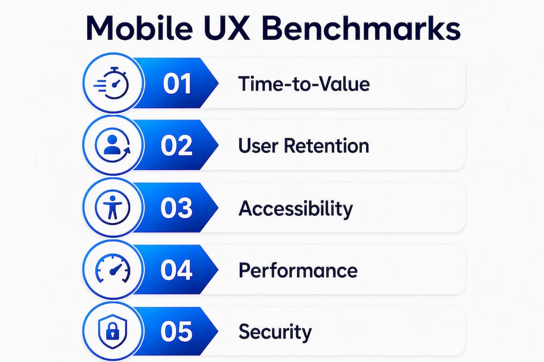
Research-backed benchmarks that should shape your 2026 priorities
These numbers are not abstract. Each one points to a specific design decision.
| Benchmark | Figure | Design implication |
|---|---|---|
| Single-use app abandonment | 25% abandoned after one use | Onboarding and first-session experience are the highest-priority fix |
| Portrait mode usage share | 94% of mobile usage in portrait | Design portrait-first; landscape is an edge case for most apps |
| Onboarding drop from forced registration | 40%–60% of new users lost before understanding the product | Defer sign-up; show value first |
| Usability problems caught with small tests | Up to 85% found with 5 users at prototype stage | Run early, small tests rather than waiting for a full launch |
| Minimum tap target: iOS | 44pt (Apple HIG) | Audit every interactive element before shipping |
| Minimum tap target: Android | 48dp (Material Design) | Same audit applies; check on real devices |
Action checklist based on these numbers:
- Run a tap-count audit on your three most important flows today
- Check whether your app requires account creation before the first value moment
- Schedule a five-user wireframe test before your next major feature ships
- Verify tap target sizes on a real device, not just in the design file
- Set up portrait-mode testing as the default in your QA process
How to validate and measure mobile UX: analytics, testing, and experiments
Gut feel is not a measurement strategy. Here is a practical workflow.
-
Instrument key events. Before anything else, define and track the events that map to your core flows: app open, onboarding step completions, first core action, conversion events, error triggers.
-
Define success metrics. Time-to-first-value, day-1 and day-7 retention, key flow completion rate, and crash-free session rate are the four metrics that cover most UX problems.
-
Run qualitative tests. Session replay tools like UXCam let you watch real users navigate your app without being in the room. You will see hesitation, mis-taps, and rage taps that analytics alone cannot explain. Combine this with moderated usability sessions for deeper insight.
-
Iterate with experiments. Once you have a hypothesis (e.g., "removing the forced sign-up step will increase day-1 retention"), run an A/B test on the mobile app to measure the actual impact before rolling out the change to everyone.
Metrics and how to read them:
- Funnel drop-off rate: A large drop between two steps points to a specific UX problem at that transition.
- Session length vs. task completion: Long sessions are not always good. If users spend five minutes on a task that should take 30 seconds, that is friction, not engagement.
- Retention cohorts: Day-1, day-7, and day-30 retention tell you whether the first-session experience is working and whether the core value is sticky.
- Error event frequency: High error rates on a specific screen are a direct UX signal.
Testing methodology notes:
- Recruit users on realistic devices and connection speeds, not just high-end phones on WiFi
- Run small iterative tests (five users) at low fidelity before investing in high-fidelity design
- Use session replays to identify friction before deciding what to A/B test
For a deeper look at how testing mobile user experience connects to engagement and conversion, the methods above apply directly.
Which mobile UI/UX patterns should you use and when?
Choosing the wrong pattern for a given problem creates confusion even when the visual execution is clean.
- Bottom tab bar: Best for apps with 3–5 top-level destinations that users switch between frequently. High reachability, always visible. Avoid using it for apps with a single primary flow or more than five destinations.
- Top app bar: Works for contextual actions (search, filter, overflow menu) tied to the current screen. Less reachable than bottom navigation but appropriate for secondary controls.
- Floating action button (FAB): Signals the single primary action on a screen (compose, add, create). Use it when there is one clear dominant action. Using multiple FABs on one screen defeats the purpose.
- Bottom sheet: Surfaces contextual options or additional detail without navigating away. Good for filters, share menus, and quick settings. Avoid overloading it with too many options.
- Pull-to-refresh: Intuitive for feeds and lists where freshness matters. Users expect it; omitting it in a feed context feels like a bug.
- Search-first home screen: Search maps to high-intent user goals and often converts better than browsing. For apps where users know what they want (e-commerce, travel, content), make search the primary entry point.
- Progressive disclosure: Show only what the user needs for the current step. Reveal complexity on demand. This is the pattern that makes complex apps feel simple.
| Pattern | Best for | Watch out for |
|---|---|---|
| Bottom tab bar | Frequent multi-destination navigation | More than 5 tabs; single-flow apps |
| FAB | One dominant action per screen | Multiple competing primary actions |
| Bottom sheet | Contextual options, filters | Overloading with too many choices |
| Search-first home | High-intent, known-destination apps | Discovery-first experiences |
| Progressive disclosure | Complex multi-step flows | Hiding information users need upfront |
Accessibility and inclusive mobile UX practices
Accessibility is not a feature you add at the end. It is a quality standard that, when built in from the start, makes the app better for every user, including people using it in bright sunlight, with one hand, or while distracted.
Checklist:
- Contrast ratio of at least 4.5:1 for normal text (WCAG AA standard)
- All interactive elements at or above the 44pt/48dp platform minimums
- Support for Dynamic Type (iOS) and font scaling (Android) so text grows with system settings
- Accessible labels on every icon and image that conveys meaning
- Color is never the sole indicator of status (use shape, text, or pattern alongside color)
- Keyboard navigation works for users who cannot use touch
- Focus order follows a logical reading sequence
Testing instructions:
- Enable VoiceOver (iOS) or TalkBack (Android) and navigate your core flow without looking at the screen. If you cannot complete the task, neither can a screen reader user.
- Increase the system font size to the largest setting and check that text does not overflow or truncate.
- Run an automated accessibility scan (Xcode Accessibility Inspector or Android Accessibility Scanner) to catch missing labels and contrast failures quickly. Automated tools catch roughly 30%–40% of issues; manual testing with VoiceOver/TalkBack catches the rest.
Accessible apps also perform better in app store ratings. Users who encounter accessibility failures leave reviews. Users who do not encounter them just use the app.
Performance and perceived speed: design tactics that make apps feel fast
Raw performance is an engineering problem. Perceived performance is a design problem. Both matter, and designers have more control over the second than they often realize.
- Skeleton screens instead of spinners. A skeleton screen (a gray placeholder shaped like the incoming content) signals that something is loading and gives the user a sense of structure. A spinner just says "wait." Users tolerate skeletons longer.
- Optimistic UI. When a user taps "like" or "send," update the UI immediately and sync in the background. If the sync fails, roll back with a clear message. This makes the app feel instant.
- Offline-first caching. Cache the last known state so users see something useful even when connectivity drops. An empty screen on poor connectivity is a UX failure, not a network failure.
- Cold-start budget. A 3-second cold start feels substantially worse than a 1-second cold start. Set a cold-start time budget as a design and engineering constraint, not just a performance metric.
- Prioritize the critical rendering path. Load and render the content the user sees first. Defer everything else.
- Minimize main-thread work. Heavy computation on the main thread causes jank. Work with engineering to move processing off the UI thread.
Pro Tip: Measure cold-start time and interaction smoothness on a lower-end Android device on a throttled network connection. That is closer to the median real-world experience than your development machine, and it will surface problems your high-end test devices hide.
Platform-specific rules: Apple HIG, Material Design, and cross-platform advice
Following platform conventions is not about limiting creativity. It is about meeting users where their muscle memory already is.
Apple Human Interface Guidelines: practical dos and don'ts
- Do use the system back swipe gesture (right-to-left swipe from the left edge) for navigation. Never intercept or disable it.
- Do place primary navigation in a bottom tab bar for apps with multiple sections.
- Do use SF Symbols for icons to maintain visual consistency with the OS.
- Do support Dynamic Type so text scales with user preferences.
- Do not use Android-style navigation patterns (hamburger menus as primary nav, bottom sheets as primary navigation) in iOS apps.
- Do not place critical actions only at the top of the screen where they are hardest to reach.
Material Design (Android): practical dos and don'ts
- Do use the system back button and gesture navigation (Android 10+). Test both.
- Do follow the 48dp minimum touch target and 8dp spacing grid.
- Do use Material 3 components (NavigationBar, TopAppBar, FAB) so the app feels native.
- Do not use iOS-style tab bars with no labels; Android users expect labeled bottom navigation.
- Do not rely on long-press as the only way to discover an action; it is not discoverable.
Cross-platform advice:
Choose one platform as your primary reference for interaction conventions, then adapt key behaviors per platform. The visual design can share a design system; the interaction model should respect each OS. The most common cross-platform mistake is building one interaction model and shipping it unchanged to both platforms. iOS users who encounter Android back-button behavior, or Android users who lose the system back gesture, notice immediately.
For deeper reading, the Apple Human Interface Guidelines and Material Design documentation are the primary sources. Both are free, regularly updated, and more specific than any third-party summary.
How to build mobile user personas that actually reflect real usage
A desktop persona describes a user sitting at a computer with time and attention to spare. A mobile persona needs to capture something different: the context in which the user is actually holding their phone.
Effective mobile personas include the usage context (commuting, waiting in line, at home on the couch), the device and connectivity conditions (budget Android on LTE vs. iPhone on WiFi), and the interruption tolerance (how often the user is likely to be pulled away mid-task). These details change design decisions in ways that demographic data alone does not.
Build scenarios around specific moments: "Maria opens the app at 7:45 AM on the subway platform with 90 seconds before her train arrives. She needs to check her account balance before she boards." That scenario tells you the app needs to load fast, show the key number immediately, and not require any input to get there. A generic persona that says "Maria, 34, urban professional" does not tell you any of that.
Pair personas with scenario walkthroughs during wireframe reviews. Ask: can this user complete this task in this context? That question surfaces friction that abstract flow diagrams miss.
Offline and poor connectivity UX strategies
Most apps are designed assuming a stable connection. Most users do not have one. Designing for offline and degraded connectivity is not an edge case. It is table stakes for any app used outside a home or office.
The core principle is to never show a blank screen when connectivity drops. Cache the last known state and display it with a clear, non-alarming indicator that the data may be stale. "Showing cached data from 2 hours ago" is infinitely better than "No connection."
For write actions (submitting a form, sending a message, completing a purchase), queue the action locally and sync when connectivity returns. Show the user that the action is queued, not failed. The distinction matters enormously for trust.
Error messages for connectivity failures should be specific and give the user a path forward. "Check your connection and try again" with a retry button is useful. "Error 503" is not. Design the error state the same way you design the success state: with intention, specific copy, and a clear next step.
Test connectivity scenarios deliberately. Use the iOS Network Link Conditioner or Android's built-in network throttling to simulate 3G, poor WiFi, and full offline. You will find failures that never appear in normal testing.
Handling different screen sizes and resolutions with adaptive design
The range of screen sizes in active use today is wider than it has ever been. A well-designed mobile app needs to work on a 4-inch budget phone and a 6.9-inch flagship without requiring two separate codebases.
The practical approach is to design with a flexible grid and relative units rather than fixed pixel values. On iOS, Auto Layout with size classes handles most of the variation. On Android, ConstraintLayout with density-independent pixels (dp) does the same. The key is to test on actual device sizes, not just the default simulator.
Content prioritization matters more at smaller sizes. On a compact screen, secondary information should collapse or move below the fold. On a larger screen, you can surface more context without overwhelming the user. Progressive disclosure handles this gracefully: show the minimum needed, reveal more on demand.
Images and icons should use vector formats (SVG, PDF vectors on iOS) wherever possible so they scale without blurring. Raster assets need to be provided at 1x, 2x, and 3x resolutions to cover the range of pixel densities in use.
One practical rule: design at 390pt wide (iPhone 14 base) and test at 320pt wide (the smallest common iOS size) before finalizing any layout. If it breaks at 320pt, it will break for real users.
What microinteractions and animations actually do for mobile UX
Microinteractions are the small, functional animations that confirm an action, signal a state change, or guide attention. They are not decoration. A button that depresses when tapped confirms the tap registered. A checkmark that animates in after a form submission confirms success. A shake animation on a wrong password tells the user what happened without a word of copy.
The distinction between useful animation and decorative animation matters on mobile more than on desktop. Every animation adds perceived latency. An animation that takes 400ms to complete before the user can proceed is a 400ms tax on every interaction. Keep functional animations under 300ms. Reserve longer, more elaborate animations for moments where the wait is unavoidable (loading a complex screen) or where the animation itself carries meaning (an onboarding illustration).
Reduced motion settings on both iOS and Android let users opt out of animations for accessibility or personal preference. Respect these settings. Use the prefers-reduced-motion media query equivalent on each platform and provide a static alternative for every animated element.
The best microinteractions are the ones users never consciously notice. They just feel like the app is responsive and alive.
Security and privacy UX considerations on mobile apps
Security and privacy are UX problems as much as they are engineering problems. A permission dialog that appears at the wrong moment, a biometric prompt that is confusing, or a privacy policy buried in settings all erode trust and drive abandonment.
Permission timing is everything. Ask for permissions at the moment they are contextually needed, not on first launch. A camera permission request that appears when the user taps "take a photo" makes sense. The same request appearing on the welcome screen does not, and users deny it at much higher rates. Once denied, the user has to navigate to system settings to reverse the decision, and most do not.
Biometric authentication reduces friction and increases security simultaneously. Face ID and fingerprint login are faster than passwords and harder to compromise. Offer them as the default, not as an advanced option buried in settings.
Transparent data practices build trust. When your app collects location, health, or financial data, tell users plainly what you collect and why, in plain language, not legal boilerplate. Apps that explain data use in context (at the moment of collection, not in a 40-page privacy policy) see higher opt-in rates.
Sensitive data display. Mask sensitive information (account numbers, SSNs, card details) by default and require an explicit tap to reveal. This protects users in public spaces and is expected behavior in financial and health apps.
Key Takeaways
Strong mobile app UX design comes down to one discipline: removing every obstacle between the user and the first moment of value, then measuring whether you succeeded.
| Point | Details |
|---|---|
| Prioritize time-to-first-value | Get users to their first meaningful action within 60 seconds; count taps and cut anything above three. |
| Follow platform tap target minimums | Apple HIG requires 44pt; Material Design requires 48dp. Audit every interactive element on a real device. |
| Test early with five users | Running a usability test at the wireframe stage catches up to 85% of major problems before development begins. |
| Defer sign-up to reduce early churn | Apps that force registration before showing value can lose many new users before they understand the product. |
| Gostellar for UX experimentation | Gostellar's lightweight A/B testing lets teams validate UX changes with real traffic before committing to a full rollout. |
The part most teams get wrong about mobile UX prioritization
There is a version of mobile UX advice that treats every principle as equally urgent: fix accessibility, nail performance, perfect your microinteractions, build personas, write better error copy, all at once. For a team with unlimited time and budget, sure. For everyone else, that list is paralyzing.
The honest prioritization looks like this: navigation and onboarding are must-fixes because they determine whether users stay past the first session. Performance and error handling are high-ROI because they affect every user on every session. Microanimations, advanced gesture shortcuts, and visual polish are nice-to-haves that you earn the right to work on after the fundamentals are solid.
Small teams and early-stage products should run research-lite: five user interviews, a paper prototype test, and basic event instrumentation will tell you more than a six-week discovery sprint. The goal is not perfect knowledge before you build. It is enough signal to avoid the most expensive mistakes.
One thing that gets underestimated: instrumentation. Teams that ship without event tracking are flying blind. You cannot prioritize fixes without data, and you cannot measure the impact of changes without a baseline. Set up your analytics before launch, even if it is just five key events. That data will be worth more than any design document six months in.
The teams that build the best mobile experiences are not the ones with the biggest design budgets. They are the ones that test early, measure honestly, and iterate fast.
Gostellar makes A/B testing your UX changes fast and low-risk
Once you have identified a UX hypothesis, the fastest way to validate it is a controlled experiment. Gostellar is built for exactly that: a 5.4KB script that adds no meaningful performance overhead to your app or web experience, a no-code visual editor so you can set up a test without engineering support, and real-time analytics that show you whether the change moved your key metrics.
For mobile UX teams, that means you can test a simplified onboarding flow against the current version, measure the impact on day-1 retention, and make the call with data rather than opinion. Gostellar's goal tracking maps directly to the UX metrics that matter: conversion funnels, completion rates, and engagement events. There is a free plan for teams under 25,000 monthly tracked users, which covers most early-stage products through their first rounds of UX iteration.
Start your first UX experiment free and see whether your next design change actually moves the needle.
Useful sources for deeper study
These are the sources worth bookmarking for ongoing mobile UX work.
-
What is Mobile User Experience (UX) Design? — Interaction Design Foundation — The IxDF's topic overview covers foundational concepts, portrait-mode research, and links to deeper courses. Best for beginners and designers building a knowledge base.
-
User Experience for Mobile Applications and Websites — Nielsen Norman Group — NN/g's research-backed mobile guidelines are the most authoritative checklist available. Best for experienced designers running formal audits or usability test programs.
-
Mobile App UX Principles — Think with Google (PDF) — Google's research-backed principles for mobile app UX, with a focus on search, navigation, and conversion. Best for product managers and growth-focused designers.
-
Apple Human Interface Guidelines — The primary reference for iOS design conventions, tap targets, gesture behavior, and accessibility. Required reading for any iOS designer.
-
Material Design — Google — The primary reference for Android design conventions, component specs, and motion guidelines. Required reading for any Android designer.
Recommended
Published: 8/2/2026