
Survey Analytics: A Practical Workflow for Professionals
Survey analytics turns raw survey responses into testable, decision-ready insights through a short repeatable process. The five core stages are: review your analysis plan, prepare and clean your data, calculate response rates and apply weights, compute summary statistics and run appropriate tests, then present results with clear recommendations. Authoritative guidance from the National Center for Education Statistics (NCES) and applied-survey textbooks used in programs like the University of Michigan's Applied Survey Data Analysis course both anchor this workflow in peer-reviewed methodology.
The workflow applies whether you're running a 50-person employee pulse or a large-scale policy study. What changes is the complexity of each step, not the sequence.
Key Takeaways
Trustworthy survey analytics requires matching your analysis method to your data type, cleaning before you compute, and documenting every decision so results can be replicated.
| Point | Details |
|---|---|
| Follow the five-step workflow | Review plan, clean data, calculate response rates, run statistics, then present results in that order. |
| Match method to data type | Use medians for ordinal scales, means for interval/ratio, and counts for nominal; mismatching inflates error. |
| Validate before reporting | Compare respondent demographics to your frame and replicate key findings unweighted to check stability. |
| Choose tools by reproducibility | Use R or SPSS for complex samples; Excel for quick summaries; Qualtrics or SurveyMonkey for integrated collection and cross-tabs. |
| Code open-text systematically | Build a codebook, check inter-rater reliability, and use AI to accelerate coding only after validating its output against human codes. |
Table of Contents
- What survey analytics is and why it matters for research and decisions
- How data type determines the right summaries and charts
- How to analyze survey data: a step-by-step workflow
- Preparing and checking survey data files
- Sampling, response rates, and weighting: when your results generalize
- Summary statistics and statistical tests: a decision flow for survey data
- Analyzing open-ended responses: manual coding vs. automated approaches
- Which tools should you use for survey analytics?
- Presenting survey results: chart choices, tables, and a report template
- Common pitfalls and best practices for trustworthy survey analytics
- A five-step checklist for survey analysis and reporting
- What working analysts actually get wrong about survey analytics
- Sources
What survey analytics is and why it matters for research and decisions
Survey analytics is the systematic process of transforming structured and unstructured survey responses into findings that support decisions. It differs from general data analysis in one key way: survey data carries design assumptions. The questions were written with specific constructs in mind, the sample was drawn (or not drawn) with a particular population in mind, and the response format constrains which statistics are even meaningful. Ignoring those design assumptions produces confident-looking numbers that answer the wrong question.
Three professional use cases show why the discipline matters:
- Program evaluation. A government agency administers a post-training survey to 800 participants. The analytic goal is to estimate whether satisfaction and self-reported skill gains differ by program site, which requires cross-tabulation and significance testing, not just a global average.
- Customer experience measurement. A product team runs a quarterly NPS survey. The goal is to track score movement over time and identify which driver items predict detractors, which requires trend analysis and regression, not just a top-line score.
- Policy or academic research. A university research team surveys 2,000 households on food security. The goal is to produce population estimates with measures of uncertainty, which requires probability sampling, weighting, and design-based variance estimation.
Each use case demands a different analytic outcome. That's precisely why the five-step workflow exists: it forces you to define what "done" looks like before you open the data file.
How data type determines the right summaries and charts
Matching your analysis to question type is the single most common place analysts go wrong. A mean score on a nominal variable is mathematically computable and analytically meaningless. Getting this right starts with classifying every variable before you touch the data.
Quantitative vs. qualitative. Closed-ended questions produce quantitative data: counts, percentages, means, or ranks. Open-ended questions produce qualitative text that requires coding before it can be counted or compared.
Closed-ended question types:
- Nominal (unordered categories: gender, region, product preference): report counts and percentages; use bar charts or pie charts.
- Ordinal (ordered categories: Likert scales, satisfaction ratings): report medians, mode, and frequency distributions; use stacked bar charts or diverging bar charts. Means are acceptable for Likert scales when the scale has five or more points and the distribution is roughly symmetric, but report the median alongside.
- Interval/ratio (continuous numeric: age in years, spend in dollars, temperature): report means, standard deviations, and ranges; use histograms or box plots.
| Data type | Recommended summary statistics | Recommended chart |
|---|---|---|
| Nominal (unordered categories) | Counts, column percentages | Bar chart, pie chart |
| Ordinal (Likert, rating scales) | Median, mode, frequency distribution | Stacked bar, diverging bar |
| Interval/ratio (continuous) | Mean, SD, min/max, percentiles | Histogram, box plot |
| Open-ended text | Theme counts, representative quotes | Word cloud (exploratory), thematic table |
Special cases worth noting. Ranking questions (rank these five features 1–5) produce ordinal data for each rank position; report the percentage who ranked each item first, or compute average rank. Matrix scales (a grid of Likert items) are a set of ordinal variables, not one variable; analyze each row separately before computing any composite.
How to analyze survey data: a step-by-step workflow
The NCES five-step framework gives you a reproducible path from raw export to report-ready findings: review the analysis plan, prepare and check data, calculate response rates, compute summary statistics and tests, then present results.
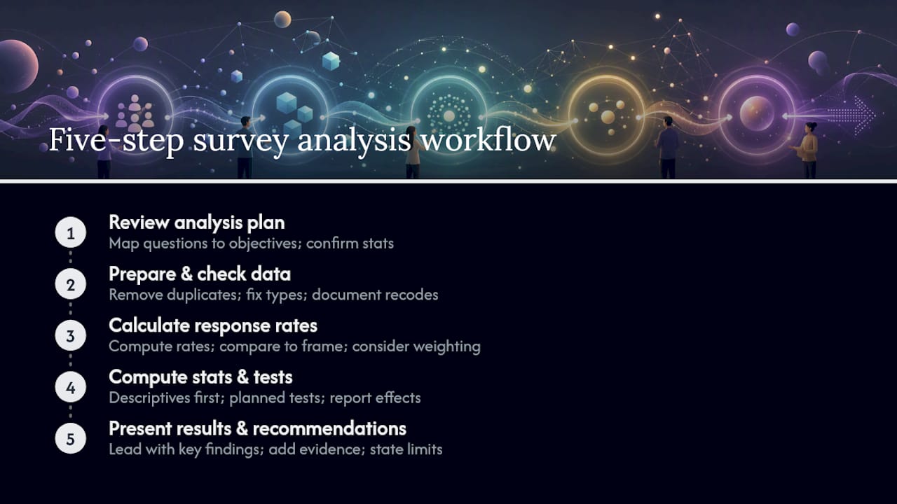
1. Review the analysis plan and map questions to objectives. Before opening a data file, confirm that every research question has at least one survey item mapped to it, and that you know which statistic will answer it. If the analysis plan was written during survey development (as NCES recommends), update it now to reflect any changes in sample size or question wording. This step takes 30–60 minutes for a small study and up to a full day for a large multi-site project.
Checklist: Confirm research questions are still answerable. Flag any items that were dropped or reworded. Identify subgroup comparisons you'll need.
2. Prepare and check data files. SurveyCTO's guidance identifies data cleaning as the most important step, and it's right. Raw exports from any platform contain duplicates, test responses, inconsistent formats, and missing values that will silently corrupt your results if left in place. Budget a significant portion of total analysis time here.
Checklist: Remove test/duplicate records. Check variable types and labels. Apply missing-value codes. Document every recode.
3. Calculate response rates and assess generalizability. A response rate alone doesn't tell you whether your results generalize; it tells you how much nonresponse risk you're carrying. Compare respondent demographics to your sampling frame or a known benchmark. If they diverge, weighting or a nonresponse bias note is required.
Checklist: Compute survey-level and item-level response rates. Compare respondent profile to frame. Decide whether weighting is needed.
4. Compute summary statistics and run significance tests. Start with descriptive summaries for every variable before running any tests. This catches outliers and distribution problems that would invalidate a t-test or regression. Run significance tests only where the research question requires a comparison, and always report effect sizes alongside p-values.
Checklist: Produce frequency tables for all categorical variables. Compute means/medians for scale items. Run planned comparisons. Report measures of uncertainty.
5. Present results and draft recommendations. Lead with the one or two findings stakeholders must act on. Supporting evidence, subgroup breakdowns, and limitations come after. A finding buried in appendix table 7 does not drive decisions.
Checklist: Match each chart to its data type. Write a plain-language summary for each key finding. State limitations clearly.
Pro Tip: Write your analysis plan as a table: one row per research question, columns for the relevant survey items, the planned statistic, and the planned visualization. Updating this table after data collection takes 20 minutes and prevents the most common analytic drift, where analysts answer the questions the data makes easy rather than the questions the study was designed to answer.
Preparing and checking survey data files
Data cleaning is the foundation of trustworthy survey results analysis. Analysts who skip it don't save time; they spend it later explaining anomalies they could have caught in hour one.
Essential cleaning checklist:
- Variable types. Confirm that numeric variables are stored as numbers, not text strings. A Likert item stored as "Agree" rather than "4" will break every calculation silently.
- Label checks. Verify that value labels match the codebook. A "1 = Male, 2 = Female" coding that was reversed during export is a real and common error.
- Duplicates. Flag records with identical respondent IDs or near-identical response patterns submitted within seconds of each other.
- Timestamps and metadata. Unusually fast completion times (under 2–3 minutes for a 20-item survey) signal straight-lining or bot responses. Flag and review before excluding.
- Inconsistent responses. Check skip-logic violations: a respondent who answered "I do not own a car" and then answered car-ownership questions has a data integrity problem.
- Straight-lining. Identify respondents who selected the same response for every item in a matrix scale. These records inflate internal consistency and distort means.
- Missing-value rules. Decide in advance whether missing responses are coded as system-missing, a specific numeric code (e.g., 99), or excluded from denominators. Apply the rule consistently.
Recoding example. Suppose you have a 5-point satisfaction scale (1 = Very dissatisfied, 5 = Very satisfied) and you want to report a "top-2 box" score (the percentage who selected 4 or 5). The logic: create a new binary variable where values of 4 or 5 become 1 and all other valid responses become 0. Missing values stay missing, not 0. The expected outcome is a single percentage you can track across survey waves. Document the derivation rule in your codebook so anyone replicating the analysis gets the same number.
Data documentation. Every recode, derived variable, and exclusion decision belongs in a change log. Record the original variable name, the transformation applied, the new variable name, and the date.
Pro Tip: Keep a "raw" version of your data file untouched. All cleaning and recoding happens in a copy. If a question arises six months later about whether a cleaning step introduced error, you can rerun from the original without guesswork.
Sampling, response rates, and weighting: when your results generalize
Results from a survey generalize to a population only when the sample was drawn from that population using a probability method and nonresponse didn't systematically exclude certain groups. That's a high bar, and most surveys don't fully clear it. Knowing where your study sits on that spectrum determines how confidently you can state findings.
Common sampling methods:
- Simple random sampling. Every member of the population has an equal probability of selection. Clean to analyze, but requires a complete sampling frame and is inefficient for rare subgroups.
- Stratified sampling. The population is divided into strata (e.g., by region or job level) and a random sample is drawn within each stratum. Produces more precise estimates for subgroups and requires stratum-level weights if strata were sampled at different rates.
- Cluster sampling. Groups (schools, hospitals, zip codes) are sampled first, then individuals within selected groups. Reduces fieldwork cost but introduces design effects that inflate standard errors. The Applied Survey Data Analysis program covers design-based variance estimation for this case specifically.
Response rates and nonresponse bias. A survey-level response rate is the number of completed interviews divided by the number of eligible contacts. An item-level response rate is the percentage of respondents who answered a specific question. Low item-level rates on sensitive questions (income, health status) are often nonrandom and can bias estimates for exactly the constructs you care most about.
The critical question is not "Is my response rate high enough?" but "Are the people who didn't respond systematically different from those who did?" Compare respondent demographics to your sampling frame. If your frame is a company employee roster and your respondents skew heavily toward one department, your results describe that department, not the company.
Post-stratification weighting. When respondent demographics diverge from the target population, post-stratification weights correct for the imbalance. Apply this adjustment cell by cell across the demographic variables that matter most for your research questions.

When to skip weighting. Nonprobability samples (convenience samples, opt-in panels, snowball samples) do not have a known selection probability, so post-stratification weights don't fix the fundamental generalizability problem. You can still weight to demographic benchmarks as a transparency measure, but you must disclose the sample's nonprobability nature in your report.
Validation checks: Examine the weight distribution. Extreme weights that are much larger than average destabilize estimates and should be trimmed. Check the effective sample size after weighting; a heavily weighted sample of 500 may have an effective N closer to 200. Run your key findings both weighted and unweighted; if conclusions flip, investigate before reporting.
Summary statistics and statistical tests: a decision flow for survey data
Start with descriptive summaries before running any test. A frequency table or histogram often reveals the answer to the research question directly, without a significance test, and it always reveals whether the data meets the assumptions a test requires.
Which summary statistics to report by question type:
- Nominal variables: counts and column percentages. Never report a mean.
- Ordinal variables (Likert, rating scales): median, mode, and the full frequency distribution. Report means only when the scale has five or more points and the distribution is roughly symmetric; always show the distribution alongside.
- Interval/ratio variables: mean and standard deviation as the primary summary; add median and range when the distribution is skewed.
- Open-ended text: theme counts and representative quotes after coding.
Statistical test decision flow:
Comparing two groups on a categorical outcome? Use a chi-square test of independence. Comparing two group means on a scale variable? Use an independent-samples t-test, after checking variance equality with Levene's test. Comparing three or more group means? Use one-way ANOVA, then post-hoc pairwise tests (Tukey HSD or Bonferroni) to identify which pairs differ. When ordinal data or small samples violate normality assumptions, use nonparametric alternatives: Mann-Whitney U instead of a t-test, Kruskal-Wallis instead of ANOVA. For multivariable relationships (predicting an outcome from several predictors), use regression. Qualtrics' analysis guidance recommends t-tests, ANOVA, and regression as the standard toolkit for checking whether observed differences are likely real.
Design effects and clustering. When your sample uses cluster or stratified designs, naive standard errors computed as if the sample were simple random will be too small. This means your t-statistics are inflated and your p-values are too low. The design effect (DEFF) quantifies this inflation; a DEFF of 2.0 means your effective sample size is half the nominal N. The Applied Survey Data Analysis program covers replicate-weight and design-based variance estimation for exactly this problem.
P-values vs. effect sizes. A p-value below 0.05 tells you the difference is unlikely to be zero; it says nothing about whether the difference is large enough to matter. Always report an effect size alongside: Cohen's d for mean differences, Cramér's V for chi-square tests, or R² for regression. For applied research, a confidence interval around the estimate is often more useful than a binary significant/not-significant verdict.
Pro Tip: Pre-register your analysis plan before you look at the data. Specify which tests you'll run and which comparisons you'll make. This single step eliminates the most common source of inflated false-positive rates in survey research: running 20 comparisons and reporting the 2 that crossed p < 0.05.
For a deeper look at interpreting statistical test results in applied settings, the testing analysis guide from Gostellar covers practical reasoning around significance and effect size.
Analyzing open-ended responses: manual coding vs. automated approaches
Open-text responses add the "why" behind numeric results and should be systematically coded whenever they inform a decision. A satisfaction score of 3.2 is a signal; the 400 verbatim comments explaining it are the diagnosis. Survey data analysis frameworks consistently flag open-text coding as a required step, not an optional one, when text responses are collected.
Manual thematic coding involves a human analyst reading responses, identifying recurring themes, building a codebook, and applying codes to each response. Its strength is nuance: a trained coder catches irony, context, and compound responses that automated systems miss. Its weakness is time and consistency. Two coders working independently on the same 500 responses will disagree on some percentage of them; measuring that disagreement (inter-rater reliability, or IRR) and resolving it is part of the process, not a sign of failure.
Automated approaches fall into three categories:
- Topic modeling (e.g., Latent Dirichlet Allocation): discovers clusters of co-occurring words without predefined categories. Useful for exploratory analysis of large corpora (1,000+ responses) where you don't know the themes in advance.
- Supervised classifiers: trained on labeled examples to assign predefined categories. Fast and consistent once trained, but requires a labeled training set and degrades on out-of-distribution language.
- Semantic search and large language models: can summarize, cluster, and categorize responses with minimal setup. AI-native platforms like Fusion by Citrus Analytics automate much of this pipeline, but their guidance explicitly stresses the need to validate outputs and maintain transparency.
Mini coding checklist:
- Sample 50–100 responses and read them in full before building any codebook.
- Draft a codebook with 5–15 mutually exclusive and exhaustive codes, plus an "other" category.
- Train a second coder on the codebook and independently code 10–15% of responses.
- Calculate IRR (Cohen's kappa or percent agreement). A kappa above 0.70 is generally acceptable for applied research.
- Resolve disagreements by discussion, then apply the final codebook to the full dataset.
- Select 2–4 representative verbatim quotes per major theme for the report.
Pro Tip: When using AI to accelerate open-text coding, treat its output as a first draft, not a final answer. Run the AI codes on your IRR sample first and compare them to your human codes. If agreement is below your threshold, the AI model needs refinement or the codebook needs clearer definitions before you scale to the full dataset.
Which tools should you use for survey analytics?
Choose based on three factors: the complexity of your analysis, your team's technical skills, and whether you need reproducible, auditable code. Infinisynapse's workflow guide frames this as a practical tradeoff between speed and rigor, and that framing holds.

Qualtrics. Best for teams that collect and analyze in one platform. Its built-in cross-tabulation, significance testing, and dashboard tools handle most applied research needs without exporting data. Particularly strong for customer experience programs and employee surveys where consistent question wording lets you benchmark performance over time. Less suited for complex sample-design adjustments or custom modeling.
SurveyMonkey. A practical choice for quick, small-to-medium surveys where the priority is speed and accessibility. Its analysis features cover frequency tables, basic cross-tabs, and simple trend charts. For anything requiring weighted estimates or multivariate modeling, you'll need to export to a statistical package.
Microsoft Excel. The default for analysts who need to share results with non-technical stakeholders without requiring specialized software. PivotTables handle cross-tabulations well; the Analysis ToolPak adds basic t-tests and regression. The ceiling is low: no design-effect corrections, limited automation, and no reproducible scripting. Use it for quick top-line summaries and final report tables, not for primary analysis on complex samples.
IBM SPSS. The standard in academic social science and market research for decades. Its complex samples module handles stratified and clustered designs with proper variance estimation. Syntax files make analyses reproducible. The learning curve is moderate, and licensing costs are significant. Best for teams running large-scale surveys with probability samples where design-based inference is required.
R. The most flexible option for analysts comfortable with code. Packages like survey, srvyr, and lavaan cover everything from basic weighted estimates to structural equation modeling. The tidyverse ecosystem makes data cleaning and visualization fast. Reproducibility is built in: a script run today produces the same output in two years. The tradeoff is a steeper learning curve and longer setup time for one-off projects. The Applied Survey Data Analysis program uses R extensively for teaching complex-sample methods.
Picker's guide:
- Quick top-line summaries, small samples, stakeholder-ready tables: Excel
- Integrated collection, cross-tabs, and dashboards without exporting: Qualtrics or SurveyMonkey
- Complex sample designs, weighted inference, reproducible code: R or IBM SPSS
- Exploratory open-text analysis at scale: AI-native platforms, validated against manual coding
Pro Tip: Don't pick tools by brand recognition. Pick them by asking: "Can I reproduce this analysis in six months without remembering every click?" If the answer is no, you need a scripted workflow in R or SPSS syntax, even if the analysis itself is simple.
For a broader view of how analytics tools fit together in a research or marketing stack, the integrating analytics tools guide from Gostellar covers pipeline thinking that applies directly to survey workflows.
Presenting survey results: chart choices, tables, and a report template
Lead with the one or two findings stakeholders must act on. Every other element, supporting data, subgroup breakdowns, methodology notes, and limitations, comes after. A report that buries its headline in section 4 doesn't get read past section 2.
Visual guidelines by data type:
- Categorical data (nominal/ordinal): horizontal bar charts for single-select items; stacked bar or diverging bar charts for Likert scales (showing agree/disagree split clearly). Pie charts work only when there are four or fewer categories and the point is part-to-whole.
- Scale and continuous data: histograms for distribution shape; box plots for comparing distributions across groups; line charts for trend data across survey waves.
- Subgroup comparisons: small multiples (the same chart repeated for each subgroup) outperform a single cluttered chart with six overlapping bars.
- Figure annotation: every chart needs a title that states the finding, not just the variable name. "Satisfaction with onboarding, by department" is a label. "Engineering reports the lowest onboarding satisfaction (median = 2)" is a finding.
Short report outline template:
- Executive summary (1 page): top 2–3 findings, recommended actions, and a one-sentence methods note.
- Methods and representativeness (1–2 pages): sample design, response rate, any weighting applied, and a demographic comparison to the target population.
- Topline results (as many pages as needed): one chart or table per key variable, with a plain-language interpretation sentence under each.
- Subgroup analyses: cross-tabulations and significance tests for planned comparisons only. Flag any subgroup with fewer than 30 respondents as unreliable.
- Open-text themes (if applicable): 3–5 major themes with representative quotes and theme frequency counts.
- Limitations: nonresponse risk, any known frame coverage gaps, and cautions about generalizability.
- Recommended next steps: specific, time-bound actions tied directly to findings.
Dashboards vs. static reports. Dashboards work when stakeholders need to monitor a metric over time and will return to the data repeatedly (NPS tracking, employee engagement pulse). Static reports work when the audience needs a one-time briefing with a clear narrative arc. Mixing the two, a static executive summary backed by a live dashboard for exploration, is often the strongest combination for large programs.
For practical guidance on turning analyzed findings into data-driven marketing decisions, Gostellar's resource covers the translation from numbers to strategy.
Pro Tip: Annotate every figure with its base N. N = 1,200. Stakeholders rarely ask about sample size, but they should, and the annotation removes the need.
Common pitfalls and best practices for trustworthy survey analytics
Most analytic errors in survey research are not statistical. They're procedural: decisions made too fast, documentation skipped, or assumptions left unchecked. The following checklist covers the ten highest-impact failure modes.
Top-10 pitfalls checklist:
- Sampling bias. The sample doesn't represent the population because certain groups were systematically excluded from the frame or less likely to respond.
- Low response rates without nonresponse analysis. Reporting results without checking whether nonrespondents differ from respondents.
- Straight-lining. Respondents who selected the same answer for every item in a matrix scale inflate consistency and distort means. Flag and review before including.
- Mislabeled variables. A reversed coding scheme or a label applied to the wrong variable produces results that are directionally wrong and hard to catch without a codebook check.
- Over-slicing small subgroups. Reporting cross-tabulations for subgroups with N < 30 produces unstable estimates with wide measures of uncertainty. Suppress or flag these cells.
- Confusing correlation with causation. A regression showing that training hours predict satisfaction doesn't mean training caused the satisfaction increase.
- Ignoring design effects. Using simple-random-sample standard errors on a clustered sample produces p-values that are too small and measures of uncertainty that are too narrow.
- Mis-reporting weighted vs. unweighted results. Mixing weighted and unweighted figures in the same table without labeling them.
- Failing to pre-register the analysis plan. Running exploratory analyses and reporting them as confirmatory inflates false-positive rates.
- Poor documentation. An analysis that can't be replicated six months later because the cleaning steps weren't recorded.
Red-flag tests and validation steps:
- Compare respondent demographics to a known benchmark (census data, HR records, industry statistics). Divergence above 10 percentage points on a key variable warrants a weighting or representativeness note.
- Check for extreme weights. Any weight above 5x the mean should be trimmed and the sensitivity of key findings to that trim should be reported.
- Replicate key findings using unweighted data. If the weighted and unweighted conclusions align, your weighting is a refinement. If they contradict, investigate the source of the divergence before publishing.
- For open-text coding, calculate IRR on a random 10–15% sample. A kappa below 0.60 means the codebook needs revision.
Ethics and privacy. Survey analytics in the United States operates under a patchwork of data protection standards, including IRB requirements for academic research, HIPAA for health-related surveys, and general data minimization principles. Participant anonymity should be protected by default: suppress individual-level identifiers before analysis, avoid reporting subgroup results that could identify specific respondents, and store data in access-controlled systems. One practical rule: if a subgroup cell contains fewer than five respondents, suppress the cell entirely.
Pro Tip: Run a "sanity check" on your top-line results before any stakeholder presentation. Ask: does this finding make sense given what we already know? If a result is surprising, that's a reason to check the data, not a reason to celebrate a discovery.
A five-step checklist for survey analysis and reporting
This checklist is derived directly from NCES/REL guidance on survey analysis and reporting. Copy it into your project tracker and check off each step before moving to the next.
-
Review the analysis plan.
- Action: Confirm every research question maps to at least one survey item and a planned statistic.
- Time estimate: 30–60 minutes (small study); 4–8 hours (large multi-site study).
- Who leads: Principal investigator or lead analyst.
- Expanded guidance: See the step-by-step workflow section above.
-
Prepare and check data files.
- Action: Clean raw exports, apply missing-value codes, document all recodes in a change log.
- Time estimate: 2–4 hours (small study); 1–3 days (large study).
- Who leads: Data manager or analyst.
- Expanded guidance: See the data preparation section above.
-
Calculate response rates.
- Action: Compute survey-level and item-level response rates; compare respondent profile to the sampling frame; decide whether weighting is required.
- Time estimate: 1–2 hours.
- Who leads: Analyst, with input from the survey methodologist if weighting is needed.
- Expanded guidance: See the sampling and weighting section above.
-
Calculate summary statistics and run tests.
- Action: Produce frequency tables for all categorical variables; compute means/medians for scale items; run planned significance tests; report effect sizes and measures of uncertainty.
- Time estimate: 2–8 hours (small study); 1–2 weeks (large study with complex modeling).
- Who leads: Analyst or statistician.
- Expanded guidance: See the summary statistics and tests section above.
-
Present results.
- Action: Build charts matched to data types; write plain-language summaries; draft the report using the template above; state limitations clearly.
- Time estimate: 4–8 hours (small study); 1–2 weeks (large study with full report).
- Who leads: Lead analyst, with review by the principal investigator or project manager.
- Expanded guidance: See the presenting results section above.
What working analysts actually get wrong about survey analytics
The conventional wisdom says the hard part of survey analytics is the statistics. It isn't. The hard part is the 40 minutes before you run a single test: deciding what question you're actually trying to answer, and whether the data you have can answer it honestly.
Most analysts I've seen struggle not with chi-square or regression, but with the temptation to let the data drive the question. You collect 800 responses, you open the cross-tab tool, and you start slicing by every demographic variable available. Something will look significant. It usually does. The problem is that you've just run 30 implicit hypothesis tests and reported the two that crossed p < 0.05. That's not analysis; it's pattern-matching with a false confidence wrapper.
The fix is boring but effective: write down the three questions you need to answer before you open the data. Then answer those three questions first, completely, before you explore anything else. Exploratory analysis is valuable, but label it as exploratory in the report.
A second tradeoff that rarely gets discussed honestly: speed vs. reproducibility. A quick Excel pivot table gets you to a stakeholder meeting in two hours. A documented R script gets you to the same meeting in four hours and lets you rerun the entire analysis in 20 minutes when the client asks for a different cut six weeks later. For a one-time report, the Excel approach is defensible. For any recurring survey, the scripted approach pays back its setup cost within two cycles.
On presenting uncertainty to nontechnical audiences: measures of uncertainty confuse most stakeholders. What works better is a plain-language range.
Sources
These resources cover the methods, software examples, and training materials referenced throughout this guide.
- Survey methods for educators: Analysis and reporting of survey data (part 3 of 3)
- Survey Data Analysis and Best Practices for Reporting - Qualtrics
- How to analyze data from a survey: A step-by-step guide - SurveyCTO
- Applied Survey Data Analysis – Survey Methodology Program
- Survey Data Analysis: A Complete Workflow (2026)
- Fusion by Citrus Analytics: AI Survey Analytics & Reporting Platform
Recommended
Published: 8/11/2026