What Your Website for Mobile Apps Must Actually Do
A website for mobile apps has one job with three parts: show the core experience fast, hand visitors a clear path to install or sign up, and give you enough data to keep improving that path. Miss any one of those and the site becomes decoration instead of a growth channel.
Start with three moves before you touch anything else. First, write a value proposition that fits in one sentence and pair it with a device mockup showing the actual screen users open first, not a generic dashboard. Second, add real install mechanics: app store badges linked with universal links, a smart banner for mobile visitors, or a working PWA install prompt if that's your path. Third, run a basic split test on your hero and CTA before you assume the design is done.
What does "working" look like? Benchmarks vary by category, but a healthy app landing page typically converts a meaningful slice of visitors into either a download click or a lead form completion, and enterprise-style app sites often measure leads per 1,000 visits instead of raw downloads. Track both if you're not sure which model fits.
- Show the primary task, not the full feature list
- Add app store badges, universal links, or a PWA install button above the fold
- Test one headline and one CTA variant before launch, then keep testing after
Key Takeaways
A website for mobile apps succeeds when it shows the core task fast, removes friction from the install path, and gets continuously improved through lightweight, ongoing testing.
| Point | Details |
|---|---|
| Lead with the core task | Show the single most-used flow in a device mockup instead of a feature list. |
| Fix the download mechanics | Use correctly linked app store badges, smart banners, or a tested PWA install flow. |
| Add trust signals early | Place ratings, compliance badges, or integration logos before the second scroll. |
| Test lightly, test often | Run headline and CTA experiments with a fast, low-weight script to avoid slowing mobile visitors. |
| Keep the site updated post-launch | Publish a changelog and feature posts so returning visitors see active development. |
Table of Contents
- Live Examples of Websites for Mobile Apps Worth Studying
- What Goes Into a High-Converting App Landing Page
- Can You Simulate the App Experience Without Building It?
- Should You Build a PWA, a Wrapper App, or Go Native?
- Design Patterns That Make the Site Feel Like the App
- How Do You A/B Test an App Website Without Slowing It Down?
- A Fast Launch Checklist and Copy Templates
- Keeping Users Engaged After Launch With Update Content
- The Part of This Process Everyone Gets Backward
- Sources
Live Examples of Websites for Mobile Apps Worth Studying
Copying a screenshot from a random SaaS site gets you nowhere. Copying a pattern that's been tested across hundreds of live sites gets you somewhere fast. Here's what actually shows up on app websites that convert, organized by the job each style does.
Product-first hero with a device mockup. Best when your app's interface is the selling point. A phone frame with the real UI, floating slightly off the page edge, tells visitors exactly what they're getting before they read a word of copy.
Enterprise trust page. Best for B2B or productivity apps selling to teams and IT departments. Todoist is a good reference here: it leads with compliance signals and integration logos rather than screenshots alone, because business buyers care more about "will this break our workflow" than "does it look nice." That's a smart trade when your buyer isn't the end user.
Minimal landing page with a single CTA. Best for early-stage apps or waitlist campaigns where you want zero distraction between the headline and the button. No navigation, no scroll, just a promise and a form.
Immersive demo site. Best when the app's interaction itself is the differentiator, think gesture-based tools or anything with a novel interface. These sites often trade some load speed for an embedded, playable preview.

If you want a library of real examples instead of hypothetical ones, three sources dominate this space. Mobbin is the closest thing to a reference database for app UI, with over 600,000 mobile and web screens and 300,000-plus user flows cataloged for benchmarking. One Page Love curates hundreds of live app and SaaS landing pages specifically, which matters because you're looking at sites that shipped, not concept renders. Awwwards leans more visual and experimental, and its mobile and apps category consistently favors sites with interactive previews and modern front-end techniques over static screenshots.
Pro Tip: Filter Mobbin and One Page Love by "live" or check that the linked site still resolves before you screenshot anything for a mood board. A surprising number of "inspiration" galleries elsewhere include concept work that was never actually built or shipped, and copying an unbuilt layout wastes a design sprint.
Across dozens of examples on these platforms, a few patterns repeat often enough to call them near-universal: a device mockup showing real screens (not stock photography), one CTA that's visually louder than everything else on the page, and some form of trust signal, whether that's a rating badge, a customer logo row, or a press mention, appearing before the second scroll.
What Goes Into a High-Converting App Landing Page
Every strong app website breaks down into the same handful of components. Get these right and the rest of the page is polish.
- The hero and value proposition. One sentence, stated as a benefit, not a feature. "Track expenses without spreadsheets" beats "Advanced expense management software" every time, because it answers the visitor's actual question in under three seconds.
- Device mockups and demos. Show the screen users see immediately after opening the app, framed in a real phone or browser chrome. If you have the budget, an animated demo beats a static mockup, but only if it loads fast and doesn't autoplay sound.
- Download and redirect mechanics. This is where most app sites quietly fail. You need app store badges that link correctly (not to your homepage), ideally with universal links or smart banners that detect the visitor's device and route them to the right store automatically. If you're distributing via QR code at events or on packaging, a smart QR redirect sends iPhone users to the App Store and Android users to Google Play from the same code, instead of forcing everyone through a generic landing step.
- Social proof and trust signals. For consumer apps, that's star ratings and download counts. For B2B and productivity tools, it's closer to what Todoist does: compliance badges, integration logos, and enterprise features called out directly on the homepage, because the buyer is evaluating risk, not just features.
- Pricing and offers. If you have a freemium model or a student discount, say so on the landing page itself. TickTick puts its student and teacher pricing right on its marketing site rather than burying it in an app store description, which removes a friction point before the visitor even downloads.
The mistake most teams make is treating the hero and the download mechanics as separate design problems. They're not. A gorgeous mockup with a broken store link converts at zero no matter how good the copy is.
Can You Simulate the App Experience Without Building It?
Yes, and the options range from cheap to expensive depending on how much fidelity you need. An animated GIF loop is the fastest to produce and works fine for showing a single simple interaction, but it can't respond to user input and often looks choppy on modern displays. A short demo video, ten to fifteen seconds, hosted and compressed properly, gives you sound and narration options but still isn't interactive.
Embedded Figma or Framer prototypes sit in the middle: visitors can actually tap through two or three screens, which builds real confidence before download, but the embed adds load weight and a dependency on a third-party service staying up. Small custom interactive widgets, built specifically for the site, give you the most control and the best performance if built well, but they cost the most in developer time.
Awwwards' own curation of top-performing app sites treats interactive previews as close to a baseline expectation now, not a novelty.
- Lazy-load any embedded prototype so it doesn't block the initial page render
- Require a tap or click to start playback instead of autoplaying video or animation
- Keep a static fallback screenshot ready for visitors on slow connections or with embeds blocked
Should You Build a PWA, a Wrapper App, or Go Native?
There's no universally correct answer here. The right path depends on your budget, your app's need for device features, and how much you care about app store discoverability.
A Progressive Web App is the fastest and cheapest route. You need a web app manifest, a service worker for offline caching, and an installability check that passes on Chrome and Android without much extra work. The catch is iOS: Apple currently limits PWA push notifications and handles the install flow differently than Android does, so test that install experience directly on an iPhone before promising a native-feeling launch.
A WebView-based wrapper sits in between. It packages your existing site inside a thin native shell so it's distributable through app stores, but performance rarely matches a truly native build, and both Apple and Google review wrapped apps more skeptically than they used to, especially if the wrapper adds nothing beyond a browser frame.
Going fully native gives you the best performance and full access to device hardware, but the website's role shifts entirely to marketing and conversion. Deep links and universal links become critical so a marketing click on the site opens the right screen inside the already-installed app instead of just the home screen.
- Decide your primary path (PWA, wrapper, or native) based on required device features, not aesthetic preference
- Prepare store assets early: screenshots, icons, and metadata take longer than developers expect
- Publish a privacy policy and terms of service before submission. Both Apple and Google reject apps without them
- QA the install flow on real devices, especially iOS for any PWA approach
- Confirm deep links resolve correctly from the website into the app before launch
Pro Tip: If you're not sure which path fits, build the PWA first as a fast proof of concept. It's the cheapest way to test whether people actually want to install anything before you invest in native development.
Design Patterns That Make the Site Feel Like the App
The website and the app should feel like the same product designed by the same team, not two separate projects that happen to share a logo. That starts with typography, spacing, and micro-interactions carried over directly from the app's design system rather than a fresh set chosen for the marketing site.
Show the primary flow, not the feature list. Most visitors care about the one thing they'll do most often in the app. Awwwards' curated collections consistently favor sites that lead with a single core interaction over a grid of feature icons, because a grid explains nothing about how the product actually feels to use.
Performance decisions matter as much as visual ones. Serve images in WebP or AVIF, keep your script budget lean, and test Largest Contentful Paint and First Input Delay on an actual mid-range phone, not just your development machine.
- Reuse the app's color palette, type scale, and button styles on the marketing site
- Lead with one task flow instead of a feature grid
- Budget your scripts and images as strictly as you'd budget the app's own bundle size
How Do You A/B Test an App Website Without Slowing It Down?
The metrics that matter here are page-to-download conversion rate, click-to-install rate, sign-up rate for lead-gen models, and post-install activation if you can track it. Most teams only watch the first one and miss where visitors actually drop off.
A few tests consistently move these numbers: swapping the hero headline between a feature claim and a benefit claim, changing CTA button copy from generic ("Download Now") to specific ("Get the App Free"), testing whether a demo autoplays or requires a click, and rewording the text above your app store badges.
- Pick one metric per test. Don't try to move downloads and sign-ups with the same experiment.
- Keep the experiment script light. A heavy testing script adds render delay exactly on the mobile visitors you're trying to convert, which quietly undermines the test itself.
- Run the test long enough to reach a real sample size before calling a winner. A three-day test on 200 visitors tells you almost nothing.
- Prioritize lifts on your core metric over vanity wins on secondary ones.
This is the exact problem Gostellar was built around: a performance-first testing script under 5KB keeps Largest Contentful Paint and First Input Delay low while a test is running, which matters more on app landing pages than almost anywhere else, since a slow hero section kills the mockup-viewing experience before the visitor even reaches your CTA. For more testing frameworks specific to landing pages, Optimizely's landing page best practices cover experiment design in more depth.
A Fast Launch Checklist and Copy Templates
Before publishing, confirm each of these exists on the page: hero with device mockup, one interactive or video demo, a short features section limited to three or four items, a trust signal block, one primary CTA, analytics tracking installed, and a working PWA manifest if you're going that route.
- Consumer template: "[Do the task] without [the pain point]. Download free."
- Enterprise template: "[Solve the business problem] with [security/compliance signal] built in. Book a demo."
- Confirm analytics fires on every CTA click and store badge click before launch, not after.
Keeping Users Engaged After Launch With Update Content
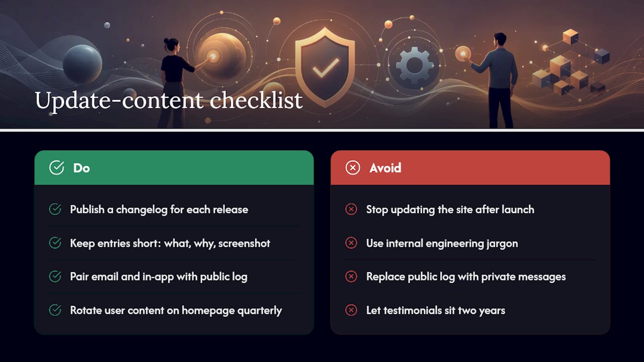
Getting the install is half the job. Keeping the app relevant on your website afterward is what turns one download into a returning user, and most teams stop updating their site the day it launches, which is a mistake.
A simple changelog page, updated with every meaningful release, gives existing users a reason to check back and gives search engines fresh content to index. Keep entries short: what changed, why it matters to the user, and a screenshot if the change is visual. Skip the internal engineering jargon; nobody outside your team cares that you refactored a database call.
Email and in-app messaging work best when paired with a public-facing update log rather than replacing it, since new visitors evaluating the app want proof that it's actively maintained. A stale "last updated" date on a marketing site is one of the fastest ways to lose a hesitant buyer's trust.
Feature announcement posts, even short ones, double as landing pages for specific searches: "expense app with receipt scanning" pulls in different intent than your generic homepage. Treat each meaningful feature as its own small piece of content rather than folding everything into one crowded release notes page.
User-generated content, reviews pulled from app store listings, and short case studies of how someone uses the app day to day, all reinforce that real people rely on the product. Rotate a few of these into the homepage every quarter instead of letting the same three testimonials sit there for two years.
The Part of This Process Everyone Gets Backward
Most teams treat inspiration galleries and conversion testing as separate stages: browse Mobbin and Awwwards for a week, build the site, ship it, move on. That sequencing is the mistake. Inspiration should inform your first draft, not your final one. The websites you'll find on One Page Love got good through iteration, not because someone nailed the layout on the first attempt.
The overrated piece of conventional advice is "match every pixel to the app." You don't need pixel parity. You need the same typography, the same primary color, and the same core flow shown clearly. Chasing exact visual matching burns design hours that would move the needle more if spent on testing headline variants or fixing a broken app store link.
If you take one thing from this article, prioritize the download mechanics and the first test before you touch the visual polish. A beautiful hero with a broken universal link or an untested CTA is a worse outcome than a plain hero that actually converts and gets improved every two weeks. Inspiration gets you started. Testing is what actually moves the number.
— Juan
Sources
- Mobbin — UI & UX design inspiration for mobile & web apps
- App Website & SaaS Landing Page Inspiration — One Page Love
- Mobile & Apps | Web Design Inspiration — Awwwards
- Wix
Recommended
Published: 8/23/2026